Main

January 28, 2009

Scott McCloud on Comics at TED

Scott McCloud talks comics at TED. If you don't know who McCloud is and you're interested in comics, videogames, interactive texts, media theory, or pretty much anything, you should go watch. (Fucking brilliant.) Then go buy his books.

[via Drawn!]

December 11, 2008

Pantone's Color of the Year (2009 Edition)

mimosa.jpg

In a surprise move, Pantone names "Pantone® 14-0848 Mimosa" (above) as their pick for color of 2009.

"The color yellow exemplifies the warmth and nurturing quality of the sun, properties we as humans are naturally drawn to for reassurance," explains Leatrice Eiseman, executive director of the Pantone Color Institute®. "Mimosa also speaks to enlightenment, as it is a hue that sparks imagination and innovation."

Who am I to argue?

[via Fimoculous.com]

December 08, 2008

Mother of All Demos

I meant to post this earlier, but December 9, 2008 is the 40th anniversary of Doug Englebart's "Mother of All Demos": The demo of early hypertext system NLS includes the first known working versions of things like the computer mouse, videoconferencing, email, and hypertext linking.

The Wikipedia link is pretty sparse, considering the geek-quotient of the event; Stanford's MouseSite has more info.)

[via Kick It]

December 03, 2008

Star Wars + Everything Else

John Powers' dense, sprawling, provocative star wars: a new heap (or, How I learned to Stop Worrying and Love the Death Star) filters George Lucas' movie through Kubrick, Kandinsky, Diego Rivera, the Pruitt-Igoe low-income housing projects, Thomas More, Frederic Jameson, OMA, Jane Jacobs, Venturi, and more. It's sort of dizzying, in a good way.

Unlike the residential architecture of Robert Venturi, which invokes bygone palaces, Star Wars was not a retreat to the imagery of past. Lucas was not reacting against the dominant program of faux-industrial imagery, which Venturi righteously criticized. Venturi’s passive ambit of comforting the old with a palatial appliqué had nothing to do with the modernist compulsion to make it new. Lucas, like Smithson, Morris, and Jacobs, dug deep into the dominant ethic of rationalizing the inconsistencies and contradictions of modern senescence. Star Wars built on the radicalism and procedural logic of minimalism and made a bold visual assertion, proposing a future “drawn not from how it ought to be, but from how it is.” In defiance of conventional wisdom, Lucas revealed a place that was modern, but not new, a future long occupied, unfinished, worldly. Modernity is the presumption that the natural environment for man has yet to be built. Lucas was the first to imagine that future built environment as already old.

[via kottke.org]

Grids

Everything for the neomodernist designer (and I say that in a positive way): The Grid System site include ton of material on grid systems in design. Online articles, tools, books, templates, blogs, a Flickr group, and inspirational sites.

I'm going to put this into the template I use as a starting point for all my class syllabi.

[via Ace Jet 170]

Touchscreen Stencils

gesture.jpg

Dan Saffer is releasing the stencils for gestural interface design book he just published, cunningly titled Designing Gestural Interfaces. The stencils, taken from Rachel Glaves' drawings for Saffer's book, are available in multiple formats (OmniGraffle, Illustrator, Photoshop).

On a directly related topic (I so infrequently have a segue), check out Rachel's photo of her process for creating gestural icons.

[via Kick It]

November 29, 2008

Lévi-Strauss at 100

Language is a form of human reason, which has its internal logic of which man knows nothing.

The Savage Mind

Mefi has a nice collection of links to the various celebrations of Claude Lévi-Strauss's 100th birthday.

[via metafilter.com]

November 28, 2008

Yet Another Monome Demo

One of the better demos, though: Primus Luta remixes The Roots on a Monome and, along the way, shows some production techniques not normally covered in ubiquitous online Monome demos (which tend to be more simple, straight-up performance). As CDM points out, Luta is basically using the Monome as a souped-up MPC here.

The video is part one of PEMF (Personal Electro-Magnetic Field); the longish intro is odd (interesting, but still odd); the demo comes in later.)

[via createdigitalmusic.com]

November 27, 2008

Graphic Design in Pentagon Documents

WallStat.com's Down the Rabbit Hole of the Pentagon Graphics Machine collects examples of graphic design in Pentagon documents. Things magazine calls it, "How I Learned to Stop Worrying and Love Clip Art and Excel."

The Army’s are all quite uniform sticking to bar graphs and pie charts and all with a matching color scheme. The Navy’s graphics are less polished with a focus on line charts and the occasional concept map. The Air Force however that really goes over the top in their visualization methods, from baffling to well, more baffling, their graphics really show off what can be accomplished when you lose sight of your audience and forget that sometimes the best way to convey information with with a paragraph or two of text.

[via things magazine]

November 26, 2008

Web Designers and/vs. Web Developers

Simon Mackie at Vitamin asks, "Designers and Developers, Why Can't We All Just Get Along?" This started as a Future of Web Design panel discussion; Mackie provides a small subset of the questions provided by the audience.

Designers: Developers don’t like you because you represent Work and don’t see why said work is wholly necessary. Developers: Designers are scared of you because you are the gatekeeper. This is the dynamic. Discuss.

and

It seems that designers are under pressure to design an exceptional and unique experience and developers are under presssure to produce sites with high performance and little/no errors. Designer’s goals add pressure to developers and vice versa. How can our goals work together intead of causing pressure on each other?

Read the comments for some good answers, discussion, etc.

[via Vitamin]

November 21, 2008

Working through Screens

WtS.jpg

Haven't done more than glance at it, but this looks very interesting: Working Through Screens: 100 Ideas for Envisioning Powerful, Engaging, and Productive User Experiences in Knowledge Work. A 100+ page website/downloadable book/set of condensed idea cards, published under a Creative Commons license.

Working through Screens is a reference for product teams creating new or iteratively improved applications for thinking work. Written for use during early, formative conversations, it provides teams with a broad range of considerations for setting the overall direction and priorities for their onscreen tools. With hundreds of envisioning questions and fictional examples from clinical research, financial trading, and architecture, this volume can help definers and designers to explore innovative new directions for their products.

Working through Screens is built around a suggested overall approach to application design:

Extensive concepting,
based on intensive questioning,
driving visionary, collaboratively defined strategies
for exemplary tools for thought

[via Putting people first]

November 19, 2008

Designing Logos

logo-process.jpg

Cool: Design Walker covers the processes used by seventeen designers to create new logos. With, as you might guess, extensive, in-process examples. Above is one from Chuck Green's tutorial covering logo design for a helicopter transport company.

[via Basement.org]

November 15, 2008

Visual_Output


Richard Devine & Josh Kay from surachai on Vimeo.

[via trash_audio]

Internet of Things Reading List

Dan Saffer posted his "Collection of Good 'Internet of Things' Readings (late 2008 edition)," which includes links to material by and/or about Vint Cerf, Bruce Sterling, The Internet-of-Things Symposium, Mike Kuniavsky, and more.

November 12, 2008

Thar She Blows 2.0

pmd.jpg

The Power Moby-Dick heavily annotates an online version of the novel (which I finally read last summer--this would have been useful if I'd known about it).

(I cribbed the title from the Metafilter post where I found this.)

[via metafilter.com]

November 07, 2008

Workspaces

Deskography. Cool.

What is Deskography?
Deskography is a simple little service where you upload photos of your desk. Why? Well, the idea is that it's fun to invite the world to see where you work.

[via metafilter.com]

November 03, 2008

A Gamer Reviews "Outside"

Somewhat buried in the comments on a mefi link to an article on gamers and media, a gamer reviews this thing called "outside." Here's a short snip from the longer piece:

In terms of the social environment, almost anything goes. Outside has a vast network of guilds, many of its players are active participants in designing the game's social environment, and almost any player will be able to find company to undertake their desired group quests. On the other hand, gold-buying is rife, the outskirts of virtually every city zone in the game are completely overrun by farmers, and the developers have so far proven themselves reluctant to answer petitions, intervene in inter-player disputes, or nerf broken skills and abilities. Indeed this reviewer will go so far as to say that the developers are absent from the game entirely, and have left it to its own devices. Fortunately, server uptime has been 100% from day 1, despite there being only one server for literally billions of players.

[via The Morning News]

October 23, 2008

Floating Personal Networks

UnwiredReview links to an Apple Patent application for, essentially, putting RFID tags in everything (phones, clothing, shoes, bags, cars, etc.), then networking them on the fly. Here's the abstract from the patent app:

Systems and methods are provided for interfacing wireless communications between two devices such that a device devoid of a relatively long-range communications protocol can access that protocol. This may be accomplished by providing a host device having relatively short-range communications circuitry integrated therein, which circuitry may be operative to communicate with relatively short-range communications circuitry of a multi-protocol or long-range communications device that also includes relatively long-range communications circuitry.

Not a completely novel idea, but a step towards actually developing them.

[via Gizmodo]

October 20, 2008

Subliminal Messages

Lars Willem Veldkampf's Typocalpse set at Flickr decodes the subliminal messages that fonts carry.

October 17, 2008

London Underground Tube Map Documentary

Smashing Telly located a 25-minute documentary on the London Underground tube map, a design classic. (The map, not the documentary. Although the documentary itself is pretty good.)

[via kottke.org]

October 16, 2008

Dentistry, Part 2

Desiging the Crown

The dentist visit this afternoon was slightly less painful than the last one (at least at this point), or maybe just geekier--my dentist has his own 3D fabrication machine. (Maybe this is common now. The last time I had reconstructive dental work done, I was on my dad's insurance.) He images the tooth, then builds a 3D model of the crown he wants. One of his assistants sets up the fabrication machine with a porcelain slug and sends the model to it; the fab machine uses high-pressure water to carve the crown out of the slug.

I'm not sure this compensates completely for the smell of burning dental enamel and the pain that's just now waking from its novocaine slumber, but the technology was sort of cool. (A couple of additional images are at my Flickr account.)

October 15, 2008

Diagramming Sarah

putin.gif

Kitty Burns Florey at Slate takes on the momentous task of diagramming some of the more notable sentences of Sarah Palin.

[via things magazine]

October 12, 2008

Slavoj Zizek: What is the Question?

Christopher Lydon's Open Source has an hour-long interview with Slavoj Zizek (which links to an overview as well as a downloadable mp3). Zizek, who Lydon rightly terms "the Elvis of the intelligensia," runs his usual adrenalin-fueled, contingency-filled theory-rant:

Dangerous moments are coming. Dangerous moments are always also a chance to do something. But in such dangerous moments, you have to think, you have to try to understand. And today obviously all the predominant narratives — the old liberal-left welfare state narrative; the post-modern third-way left narrative; the neo-conservative narrative; and of course the old standard Marxist narrative — they don't work. We don't have a narrative. Where are we? Where are we going? What to do? You know, we have these stupid elementary questions: Is capitalism here to stay? Are there serious limits to capitalism? Can we imagine a popular mobilization outside democracy? How should we properly react to ecology? What does it mean, all the biogenetic stuff? How to deal with intellectual property today? Things are happening. We don't have a proper approach. It's not only that we don't have the answers. We don't even have the right question.

What's not to like? See the wikipedia entry on Zizek for more background and links or the International Journal of Žižek Studies.

October 07, 2008

Designers Favorite Fonts

Design O'Blog surveyed a handful of designers to find out their favorite fonts. Nothing earth-shattering, but the rationales offered are interesting. Here's Jeff Fisher's brief testimonial to Palatino:

Years ago I worked on a publication that had a limited font collection, and an even more limited budget for purchasing additional fonts. In researching fonts that would give me a great deal of “bang” for the initial investment, I came across Palatino. It had nicely shaped letter forms, quite a variety in style between regular and italic forms, and great readability as a display, headline and text type. Over the past 25 years it has been a type option I have used for a wide variety of purposes. For a recent Identity project, I was looking for a well-balanced and unique uppercase “P” letterform to initiate the identity for the communications company PavelComm. I immediately thought of Palatino with its graceful, yet professional, uppercase “P.” However, I didn’t necessary like the Palatino treatment of the italic letters used to make up the name. Still, italics were desired to show some movement in the PavelComm corporate identity. I made use of the regular Palatino letterforms I liked so much and then digitally skewed them to give the appearance of the type being italic. In the process a unique identity was created for the company, making use of the font on which I often “fall back” in the design of corporate marketing and promotion materials.

[via etc.]

October 01, 2008

Daphne Oram: (Very) Early Electronic Music

The Guardian has a bio and slideshow on Daphne Oram:

She went on to join the BBC, and, while many of the corporation's male staff were away fighting in the second world war, she became a balancing engineer, mixing the sounds captured by microphones at classical music concerts. In those days, nearly all programmes went out live because recording was extremely cumbersome and expensive. Tape hadn't been invented, and cheap computers were half a century away.

Yet when tape did come along, in the early 1950s, Oram was quick to realise that it could be used not simply for recording existing sounds, but for composing a new kind of music. Not the music of instruments, notes and tunes, but the music of ordinary, everyday sound.

After Oram had finished her day's work, and everyone had gone home, she trundled tape recorders the size of industrial gas cookers from empty studios, and gathered them to experiment late into the night. She recorded sounds on to tape, and then cut, spliced and looped them; slowed them down, sped them up, played them backwards. It must have been like working in a laboratory, or inventing new colours – a new world almost impossible to imagine now.

See the Boing-Boing post I cribbed this link from for additional links, including some audio samples. And there's this earlier post about Delia Derbyshire, Oram's colleague at the BBC Radiophonic Workshop.

[via boing-boing]

September 29, 2008

Dr. Strangelove's War Room

A video interview with Ken Adam, the production designer who created the War Room set for Dr. Strangelove.

[via Super Colossal]

September 28, 2008

Droid: Android's Font

Elizabeth Woyke at Forbes discusses Droid, the font developed by Ascender for Google's phone OS.

The sweet spot--and the final look for Droid--fell somewhere in the middle. Matteson's first design was "bouncy": a look in line with the Google logo's angled lowercase "e." Google passed on the design because it was "a little too mannered," Matteson says. "There was a fine line between wanting the font to have character but not cause too much commotion."

Another proposal erred on the side of "techno" with squared-off edges reminiscent of early computer typefaces. That too was rejected, along with several others, in favor of a more neutral design that Matteson describes as "upright with open forms, but not so neutral as a design like, say, Helvetica."

As Gizmodo points out, it's nice that the font provides some coherence to the Android's design, because the rest of the OS suffers from a jarring inconsistency it describes as a "scrambled UI" and "a mash-up between the Nintendo DS and a '90s Windows desktop manager."

[via ]

September 18, 2008

Evacuated of Meaning

Lebbeus Woods posts DEAD WORDS, a short list of terms that have lost useful meaning for architecture.

original

In the present time of appropriation in art, as well as the mass-merchandizing of brand name products, including those of famous architects, the idea of originality is not only of minimal interest, but, being a form of the radical [see above], rather dangerous. Of far greater interest is the recycling of ideas, products, and modes. Appropriation acquired legitimacy in the post-Modernism of the 70s and 80s, when the recycling of historical styles—including Modernism—was in vogue. Today, it continues in the guise of architectural populism and social realism, where low art, such as squatter architecture, is elevated to high, and presented as avant-garde.

[via LEBBEUS WOODS]

September 06, 2008

Heavy-Duty Sampling

Johannes Kreidler's "Product Placement" (above) a 33-second remix that uses 70,200 samples to create a glitch-heavy masterpiece. (I'm not sure what the criteria are for "masterpiece" in this genre, but Kreidler's clip makes Girl Talk seem like lazy muzak.) Create Digital Music has some background as well as a video of the phone call he made in his attempts to clear copyright for the samples for his work (the licensing agency requires an individual request form to be completed for each sample).

August 29, 2008

Network Paranoia

A week or two back, I noticed an oddity in the confirmation messages I get from PayPal after they've processed a funds transfer: Toward the end of the message, PayPal tells me that I can click on links in the message to see my monthly account statement. Here's a crop of what I see:

paypal.jpg

The messages are, as far as I can tell, legitimate PayPal emails--they come shortly after I actually log into PayPal and complete a transaction, and they're the only confirmation I get from PayPal that my transaction has completed. Does PayPal really think I'll click on a link URL that starts with SECURE.UNINTIALIZED.REAL.ERROR.COM? Perhaps this is some elaborate phishing scam, or PayPal checking to see how gullible is customers are. Or Apple Mail is processing the link in an odd way before displaying it. In any event, it seems to contradict all that advice PayPal and parent company eBay give users about avoiding scams.

I thought this might be a one-time thing, a bug in a server somewhere. But it's happened both times I've transferred funds in the last month. And I haven't, obviously, clicked that link. Ever.

August 25, 2008

Infoviz Art

Check out Slate's slideshow (with commentary), Infoviz Art:

Display an unwieldy mass of data in clever visual form and you may gain über-insight into questions you hadn't yet put into words. That is the promise of information visualization, infoviz for short. The field has long helped scientists, engineers, and businesspeople see the unseen as it emerges from complex data: Users may spot promising molecules for pharmaceutical testing, for instance, or pinpoint glitches in a supply chain. As infoviz has matured, it has also caught fire as an art form, its center of gravity edging further from the pragmatic and closer to the expressive or the whimsically profound.

[via Fimoculous.com]

August 24, 2008

Typographic Zen

Web Zen this week covers typographic zen: the helvetica vs. arial videogame, typographic animations set to Dylan and Zeppelin tunes, Cooper Black: Behind the Typeface (a short documentary on Oz Cooper), and more.

August 21, 2008

Flickr Group: Great Diagrams

John Curran's Great Diagrams in Anthropology, Linguistics, & Social Theory Flickr group is interesting browsing. Appears to mostly be clipped from a wide variety of sources (a Far Side cartoon about anthropologists, the much-reproduced Post Modern Toasties, a model of face-work based on Goffman, etc.).

Pencil: A Mockup Plugin for Firefox

pencil.jpg

Pencil is an open source (GPL v2) sketching/mockup/prototyping environment that works as a plug-in for Firefox 3. Includes stencils (standard or custom), on-screen text editing, alignments, drop-in import of image and text, and image export for finished sketches (which, when combined with simple imagemaps, would make it a useful tool for generating interactive mockups).

August 18, 2008

When the World Was Cool

Society in Decline has a great Flickr set on old commercial signage, which might be used as evidence supporting Aaron Draplin's [nsfw] rant on contemporary graphic design

Sound Design: Short Index of Online Resources

W. Brett Latta at Create Digital Music overviews fifteen web-based resources for learning about sound design: Sections on fundamentals, sound for film, sound for games, and communities/lists.

[via createdigitalmusic.com]

August 13, 2008

Live! Nude! MacBook Pro!

Breaking It Down

For about six months, shortly after a quick cycle of hard drive upgrades, the keyboard and trackpad on my MacBook Pro have occasionally frozen. Last spring I backed it up and erased the hard drive, took it apart, checked all the connections, and restored everything. No luck. The lockups were getting worse, until last week it would sometimes freeze up through reboots seven or eight times before it'd boot in workable shape. Then I wiped the hard drive and rather than just restore the full drive from backup, I installed a new version of the system and only copied over the Documents folder, then went through the twenty-hour process of resinstalling programs from scratch, on the off-chance that there was a scrozzed prefs file somewhere.

No luck. So yesterday I wiped the hard drive again, reinstalled the OS from the install DVD, and today took out the forty-some tiny screws and re-seated all the connections. So far so good. But if that doesn't work, we're looking at using a hammer.

August 04, 2008

Legibility as a matter of perspective

Apparently using only paint and careful design, Axel Peemöller designed carpark signage that looks amazingly distorted and illegible—except for at specific vantage points, when large, colored letters spelling directions such as "In" and "Up" stand out like huge holograms for drivers.

[via Daring Fireball]

Ambient Lapse

Kyle McDonald at MIT has created a bunch of interesting audio/video/music Processing apps, including the Ambient Lapse program shown above (which uses both Processing and SoundStretch).

"Ambient Lapse" is a simple technique for capturing the ambiance of spaces, especially their color and spectral characteristics. It operates on a principle similar to long-exposure time-lapse, but allows exposures to overlap. Instead of producing momentary bursts of specific images, individual objects and well-defined perspectives, we're given vague impressions.

[via createdigitalmusic.com]

August 01, 2008

Color Design as Narrative Device: 101 Dalmations

AnaimationExpressions on color design in 101 Dalmatians, in what's projected as the first of an extensive series. (Disney, I think, is where I learned most of what I know about color design.)

July 30, 2008

Book Repair

A Simple Book Repair Manual. If you're like me, you have a lot of books, some of which are (a) not easily replaceable and (b) in various states of disrepair. (If you're actually like me, you have other issues as well, but we won't go into them at this point.)

[via Lifehacker]

July 24, 2008

Silverback: Guerilla Usability Testing on the Mac

Clearleft's Silverback is $49.95 software for the Mac that does screen recording augmented with screen capture for guerilla usability testing. Uses the small Apple remote that came with your Macbook for adding a chapter markers on the fly. There's a thirty-day free trial version available. Features include changing location, size, and transparency of inset video, tracking click locations on screen, and more. (You can also turn off the inset video, which lets Silverback double as a simple app for creating screencasts.)

The program lacks the advanced features you might find in spendier products like Morae—there's no built-in video editing (use iMovie) and no stats tracking, but for quick, on-location work, it's definitely worth $49.95.

Ten percent of profits from registered copies goes to the Save the Gorillas campaign. ("Silverback," "Guerilla usability testing," "Save the Gorillas." Get it?)

Update: Hicksdesign, which created the Silverback icon, posted a series of design sketches showing how the icon evolved from basic concept through hand sketches to final design.

[via Daring Fireball]

July 23, 2008

Design Novices vs Experts

Noise Between Stations summarizes (and links to) some research on two practices that separate design experts from novices. Experts tend to problem solve top-down/breadth-first and they reframe difficult problems while novices don't.

Obviously, a novice consciously deciding to switch those two behaviors won't automatically make themselves an expert designer. Both expert practices, for example, probably rely on having a rich repertoire of strategies, skills, and experience. But if nothing else, it suggests things that novices might consciously work toward. (I say all this without having looked at the articles referenced. Hey--breadth first.)

[via Vol. 2: design-management.de]

July 22, 2008

Font Conference

Do you sit around idly wondering what it would be like if fonts gathered as a group to vote on membership to some weird, UN-style council? Then this is the video for you. Sort of predictable (Arial Narrow is ethnocentric; Ransom is holding Courier as hostage; Old English is, well, you get it) but still funny. If you're a font geek.

[via Typophile]

Instruments and Playable Text

Stuart Moulthrop guest edits the Iowa Review Web's issue on Instruments and Playable Text:

Judy Malloy, "Concerto for Narrative Data

John Cayley, "riverIsland QT"

Nick Montfort, "The Purpling"

Shawn Rider, "So Random" and "PiTP"

Elizabeth Knipe, "activeReader"

Stuart Moulthrop, "Under Language"

[via Mark Bernstein]

July 21, 2008

"Fail Fast": Prototyping at Pixar

Michael B. Johnson of Pixar, interviewed by Peter Merholz:

The important take-home point, though, is that Pixar loves their films so much, we make them twice :-).

[...] We’d much rather fail with a bunch of sketches that we did (relatively) quickly and cheaply, than once we’ve modeled, rigged, shaded, animated, and lit the film. “Fail fast,” that’s the mantra. With a team of 10-20 people (director, story artists, editorial staff, production designer and artists, and skeleton production management) you can make, remake, and remake again a movie that once it hits 3D will take an order of magnitude more people to execute. The complexity of the task does not ramp up linearly.

Building things and then taking them apart isn't an error; it's a design strategy. "Measure twice, cut once" is fine when you're sawing a sheet of plywood, but it's a limiting strategy with virtual tools. Find an environment that lets you fail fast.

[via Daring Fireball]

Delia Derbyshire Tapes

BBC News has a short piece—with some audio samples—on a cache of 267 audiotapes made in the 1960s and 1970s by Delia Derbyshire, an early BBC Radiophonic Workshop member and electronic audio pioneer who, among other things, created the theme music for Doctor Who (from a score composed by Ron Grainer). The Doctor Who theme is among the more conventional things the Radiophonic Workshop did; these people were seriously ahead of their time. (According to the archivist working with the tapes, Derbyshire "got a bit disheartened and a bit bored with it all when the synthesizer came along and it all became a little too easy.")

The also BBC has a brief page covering Alchemists of Sound, a BBC TV documentary about the Radiophonic Workshop (including some free clips); Sound on Sound ran an extensive piece on the group, although you can only read the first few thousand words before you're asked to pay for a PDF. (Worth the 99 pence if you're interested—I read the piece in print a couple of months ago.)

July 20, 2008

Twitter as Surveillance

Stuart forwarded me this Twitter notification:

Hi, Stuart Selber.

State College Police (StateCollegePD) is now following your updates on Twitter.

Check out State College Police's profile here:

http://twitter.com/StateCollegePD

You may follow State College Police as well by clicking on the "follow" button.

Best,
Twitter

StateCollegePD's twitter feed is actually an interesting idea, despite how ominous Twitter's boilerplate email makes it sound. The PD are using the feed for snow emergency notifications, Penn State football traffic alerts, and other things. I'm not sure how tracking Stuart's writing and reviewing schedule fits into that, but I guess they're just being engaged members of the community.

Chris Marker Weblog

Chris Marker: Note from the Era of Imperfect Memory (a weblog and website).

Chrismarker.org is an randomly-compiled, taxonomically naive and hopefully useful archive of ruminations, bibliographic & filmographic notations, untimely meditations, mnemonic minutiae and other glosses on the cinematic, written, photographic and multimedia work of world-citizen & time-traveler Chris Marker.

We welcome contributions in short article form from the global village that Marker helped to map. We also welcome Chris Marker news, links, memorabilia, aphorisms, quotations, images and stray insights. Contributions from animals are welcome too, of course, including but not limited to cats, owls, giraffes, emus and elephants (слоны).

[via Ballardian]

July 19, 2008

Surveillance

surveillancesaver.jpg

SurveillanceSaver for OS X and Windows screensaver that pulls images from 400+ networked surveillance cameras around the world. The programmers call it a "haunting live soap opera." Creative Commons licensed.

[via things magazine]

Translating Reality: Copyediting Quotes from the Web

Virginia Heffernan at the NYT takes on the difficult issue of quoting casual web texts in more formal publications like the New York Times.

Consider another example. To show that Web users are curious about human reproduction, I might quote kavya on Yahoo Answers, word for word: “How is babby formed? How girl get pragnent?”

But that makes kavya look like an idiot. Readers might miss the sweet earnestness of his question. Maybe he (or she) is 7 or a native speaker of Hungarian. I should cut the kid a typographical break; that’s not an easy question to ask. The cockamamie diction and syntax of Internet English is, possibly, only incidental to his inquiry. A reporter could paraphrase or revise his question — “How is a baby formed?” — lest readers get blinded to the intent of the question by moronizing typos.

But “How is babby formed?” is funny. And who wants to deny readers a chance to laugh and to get the full flavor of Internet-culture wackiness? It’s flat-out lying to pretend that everyone (or anyone) spells well online.

This is something you've run into if you write about the Web much: Do you preserve spelling errors? Do you correct them in brackets? Do you just paraphrase? When and why? It all comes down to (predictably) rhetorical purpose, tempered by maintaining the validity of your data. As Times editor Daniel Okrent says in Heffernan's piece, we've struggled with this issue for a long time in terms of quoting verbal statements (do you spell out accents to give readers the flavor? do you preserve the "and ... uh ... um"?), and there aren't simple answers. (Not a direct quote.)

[via Fimoculous.com]

xkcd channels Sokal

litcrit-comic.jpg

Check this xkcd on posturing and grad student susceptibility by discipline. Written (obviously) from a science/engineering perspective, but, yeah, I see the point (and have been that grad student). (And, yeah, I've way exceeded xkcd's estimate.)

[via Benny]

July 18, 2008

Making Faces: Typographer Documentary

YouTube (obviously) has the trailer for Making Faces, a documentary on typographer Joe Rimmer.

[via P22]

July 12, 2008

Collaborative Editing

Wikipedia has a Lamest Edit Wars page.

Back in the good old days, people would settle this sort of thing with a gunfight; now they do it by toying with an encyclopedia. Truly, the Wikipedia outlook has changed the way things get done. It has changed them from actually getting done to never getting done. On the other hand, nobody gets shot.

[via Fimoculous.com]

July 11, 2008

How Designers Work

Time-lapse video of Matt Willey laying out an article for Royal Academy magazine, trying out different options as he goes. This would be even better if (a) it had a voiceover explaining Willey's decision processes and (b), as Kottke says, if it were on Vimeo or some other site that had better video ("... sometimes YouTube is like watching a UHF station from 200 miles away with the rabbit ears positioned just so").

Still, cool.

[via kottke.org]

July 09, 2008

Backstage with Type Designers

djurek.gif

The Man in Blue asked several type designers to send him samples of their own handwriting. Above is a sample from Nikola Djurek, along with two of his fonts.

[via Drawn!]

July 08, 2008

Style in Technical Documentation

shuresm7a.jpg

I'm testing out a Shure SM7A microphone (great so far), so I downloaded the product manual from Shure's website. This section reads like something out of Monty Python:

ARCHITECTS’ SPECIFICATIONS

The microphone shall be a moving coil (dynamic) type with a frequency response of 50 to 20,000 Hz. The unit shall have a cardioid polar characteristic. The cancellation at the sides shall be approximately 6 dB and the cancellation at the rear shall be 15 to 20 dB. The microphone shall be low impedance with a rated impedance of 150 ohms for connection to microphone inputs rated at 19 to 300 ohms. The microphone output shall be –57.0 dB where 0 dB = 1 milliwatt per Pascal.

The microphone shall have two switches for controlling the frequency response. The first switch is a Bass Rolloff selector switch. One position of this switch provides a flat low frequency response and the second position provides a gradual low frequency rolloff. The second switch is the Mid-Range Emphasis (presence boost) switch. One position of this switch provides a flat mid-range frequency response and the second position raises the level of the mid-range frequency response. The microphone shall be equipped with an integral swivel assembly suitable for mounting on a stand with a 5/8 in-27 thread.

The overall dimensions shall be 189.7 mm (7.469 in.) in length, 148 mm (5.812 in.) in height, and 96 mm (3.775 in.) in width. The weight of the microphone shall be 765.4 g (1 lb., 11 oz.)

The microphone shall be the Shure Model SM7A or equivalent.

I don't usually read mic spec sheets, so maybe all microphone spec sheets have this odd, declamatory tone to them. (Or maybe most mic spec sheets don't include the product engineer's specs statement—the rest of the manual is traditional user product guide-speak.)

[Note: I was making a spam comment sweet and right after I clicked the "Delete" button, I realized I'd deleted a legitimate comment on this post. Sorry about that.

June 30, 2008

Patent as Strategy

CNET summarizes and links to a WSJ report [sub req'd] on Allied Security Trust, a consortium that includes Cisco, Verizon, HP, and more, which is buying patents as a strategy to protect their own patents. Allied claims they're doing this as a strategy to protect against patent trolls [wikipedia], who themselves purchase patents in order to launch legal proceedings against companies they claim are infringing on their (purchased) patents.

Makes your head sort of hurt, doesn't it? On the order of the Crimson Permanent Assurance?

[via CNET News.com]

June 26, 2008

Applications on Paper

Deeplinking has paper sketches of early plans for sites and applications, including Flickr, Vimeo, Twitter (above), and more.

[via boing boing]

June 24, 2008

Microsoft Releases Mac Office 2004 Open XML Converters

If you've been dealing with the hassle of opening Microsoft Office 2007 (Windows) or 2008 (Mac) in your older, Mac 2004 version of Office, Microsoft has finally released the free converters you need to open those files.

As c|net points out, the side effect of Microsoft dragging their feet on this likely relates to the fact that they'd rather you upgraded to a new version of Office rather than continue to use your old one. I upgraded last year primarily so I could stop emailing people to ask them to re-save their documents in a compatible format, but I can't say there's any other feature of Office 2008 that I thought was worth upgrading for. (I've started working as much as possible in Pages, InDesign, or Dreamweaver, then sending people PDFs or URLs unless they need to edit rather than just read/comment, in which case I have to resort to Office. Luckily, that's not a common occurrence since my inability to play well with others means I don't collaborate very often.)

[via CNET News.com]

June 21, 2008

A Day in Brands

janes-day-in-logos.jpg

The ad industry weblog Dear Jane Sample tracks a Typical Friday in Brands of one consumer (herself), displayed as logos over time. What's striking about this (like the 24-hour media diaries I sometimes ask mass media students to keep) is not how large the diaries are—and they are large—but the fact that these diaries are extremely incomplete in most cases—it'd be nearly impossible to actually get through a productive day while still tracking all of the mass media or branded products one interacts with. (The comments to the original post include links to some followup timelines by readers.)

[via things magazine]

Nostalgia

Gas Pumps

In the last month, several people have looked at this image and commented not on the striking colors or arty, degraded reproduction aesthetic of Holga photography, but on the price listed on the gas pumps. They have a point.

June 20, 2008

Communication

Don't confuse legibility with communication.

—David Carson in Helvetica

AP, Fair Use, Weblogs

Robert Cox at the Media Bloggers Association has some interesting backstory on the whole Associated Press/Drudge Retort issue. Which is apparently a lot complicated than either the AP or the Drudge Retort (or anyone else) have portrayed it so far.

So, Drudge Retort got on AP's radar due to the posting of entire articles with exact headlines which all parties agreed constituted copyright violations two months BEFORE the most recent spate of DMCA Take Down Notices. Technically, Drudge Retort got onto AP's radar because those posts were flagged by software used by AP called Attributor. This is a data mining spider similar to the bots and web indexers used by search engines; content companies can use it to track the use of their content on the web. It is very important that people understand this because it makes clear that the AP is not on some wild rampage through the blogosphere, lawyering up to to go after every blogger who quotes an AP story in any way. Yet that is how this story has been portrayed including by a lot of people who should know better but are having too much fun bashing AP.

[via http://www.thepomoblog.com]

June 03, 2008

How IT Thinks About Users

From a ComputerWorld article discussing Apple's plans to make v 2.0 of iPhone conform to corporate IT needs:

"I have nothing against iPhone. It's great," says Manjit Singh, CIO at Chiquita Brands International Inc. "But we're a BlackBerry shop, and I don't think iPhone brings anything new to the table. It has a great user experience, but that's all."

Which sort of says it all. (To be fair, other IT analysts quoted in the article are a little more user oriented.)

[via Daring Fireball]

May 31, 2008

Error Messages

error.gif

Hey, thanks. This was after an initial round with a registration form on the same site that told me that my registration info--for setting up a new, free account to view articles on the site--was incorrect because I hadn't entered a valid email address. There was nothing on the form requesting an email address. The phrase "email address" didn't even appear on the form. So I took a wild guess and went back and entered an email address in the field simply titled "user name". Then I got the error message above. Then I gave up.

May 29, 2008

Elegance in Design

At the Google I/O conference, Marissa Mayer, VP for search products and user experience at Google, discussed how the company A/B tests different page weights, layouts, and other site design features on their live site to see their effects on users. But what I thought was amusing was this tidbit about one of Google's most discussed design features:

Mayer oversaw much of Google's design, but the sparse start page wasn't her doing and wasn't even part of a plan, she said. Instead, it was the design of co-founder Sergey Brin.

Why so minimalist, she wondered? Sergey's response: "We didn't have a Webmaster, and I don't do HTML."

(More at Stephanie Shankland's c|net report, quoted above.)

May 28, 2008

Knowledge

If you're like me (god forbid), you frequently hear poll results about public opinion and are alarmed by the number of people who seem out of step with, I don't know what to call it, common sense? Then I remind myself about ideological structures and the variety of belief and decide I'm just being dogmatic. Then I see things like this Gallup poll on American's General Knowledge Levels. Ben Smith noted (among other things) this item from the survey:

As far as you know, does the earth revolve around the sun, or does the sun revolve around the earth?

Earth revolves around the sun: 79%
Sun revolves around the earth: 18
No opinion: 3

Then I'm back to where I started. I can't decide if the "Sun revolves around the earth" or "No opinion" are more difficult to grok. Who answers this question "No opinion"?

[via Crooks and Liars]

May 27, 2008

Sonic Camera


Sonic Camera from dimitre on Vimeo.

Sonic Camera, a Processing program.

[via Everyone Forever]

May 21, 2008

That's Not a Bug, It's a Feature

Tim Barker's "Error, the Unforseen, and the Emergent: The Error and Interactive Media Art" discusses (as you can probably guess from that title) the productive role of glitches in interactive media:

Rather than thinking of an event as the process by which preformed or preconceived possible information becomes realised, we can only think of an error as coming into being as the unformed and the unforeseen potential is actualised. This potential emerges from unique activities that occur in the process of a system. These unique activities open the system so that unforeseen information may emerge (DeLanda, Intensive Science and Virtual Philosophy 36-37). If a system runs through its process without the potential for error it is essentially closed. It does not allow the potentiality of the emergent or the unforeseen. It is only through allowing the capacity for potential errors that we may provide the opportunity to think the unthought, to become-other, and to hence initiate further unforeseen becomings in the virtual (Rodowick 201). In a sense, when there is potential for an error to emerge in a system, the system cannot be regarded as a pre-formed linear progress; rather, it can only be thought as a divergent process that actualises elements of the virtual.

[via Remix Theory]

May 20, 2008

Five Themes for Interaction Design

Dan Saffer points to a slightly old but still very useful-looking paper about embodied interaction design and re-thinking the current, relatively thin approach to how people interact with computers (and other work technologies/environments): "How Bodies Matter: Five Themes for Interaction Design" [pdf]. Here's a summary from the article's introduction:

This paper presents five themes that we believe are particularly salient for designing and evaluating interactive systems. The first, thinking through doing, describes how thought (mind) and action (body) are deeply integrated and how they co-produce learning and reasoning. The second, performance, describes the rich actions our bodies are capable of, and how physical action can be both faster and more nuanced than symbolic cognition. The first two themes primarily address individual corporeality; the next two are primarily concerned with the social affordances. Visibility describes the role of artifacts in collaboration and cooperation. Risk explores how the uncertainty and risk of physical co-presence shapes interpersonal and human-computer interactions. The final theme, thickness of practice, suggests that because the pursuit of digital verisimilitude is more difficult than it might seem, embodied interaction is a more prudent path.

[via O Danny Boy]

May 16, 2008

The First Phone Book

Christies is auctioning the first-ever telephone book: The Telephone Directory, Vol. 1, No. 1, for New Haven, Connecticut, November 1878.

The instructions provided in the Directory for correct use of the telephone, the first such directions ever published, include much sound advice: "Never take the Telephone off the hook unless you wish to use it....Should you wish to speak to another subscriber... you should...commence the conversation by saying 'Hulloa!' When you are done talking, say 'That is all!', and the person spoken to should say 'O.K.' ... While talking, always speak slow and distinct, and let the telephone rest lightly against your upper lip, leaving the lower lip and the jaw free..." The push button phone bore slightly different requirements: "After speaking, transfer the telephone from the mount to the ear very promptly ... When replying to a communication from another, do not speak too promptly ... Much trouble ensues from both parties speaking at the same time.... No subscriber will be allowed to use the wire for more than three minutes at a time, or more than twice in an hour, without first obtaining permission from the main office... Any person using profane or otherwise improper langauge, should be reported at this office immediately." (pp. 4-5).

[via Gizmodo]

May 15, 2008

The Day There Was No News

(no comment)

[via pretty much everywhere]

May 14, 2008

Hacking Text

Mark Bernstein provides a short, illuminating little account of why symbolic-analytic work relies heavily on (a) knowing your work environment, (b) being able to hack together tools on the fly, and (c) situating both of those into a broader rhetorical purpose. Here's one part, while he's trying to set up a method for assigning reviewers to proposals for WikiSym 2008:

OK. I could scrap the screen, parse it in ruby, dump the result to xml, and get the xml into Tinderbox. But that's a bother.

Instead, I copied the text from Safari to BBEdit, quickly turned it into a tab-delimited file, and pasted it into Numbers. In Numbers, I rearranged the columns so the first column was the title of the paper. Then, I copied the table from Numbers and pasted in Tinderbox, Voila!

  • I get a note for each paper
  • The note title is the paper title
  • I also get new user attributes, already populated, that tell me
    • the paper's identification number
    • its author's name
    • its length in pages

So far, so good! I made new new prototype Paper, and assigned all the papers to use this prototype.

Next, I wanted to distinguish short papers. I added a rule to the prototype:

Rule: if($pages<6){BorderColor=white;} else {BorderColor=black}

Now, short papers have white borders.

The promise of computers was always that they made things easy. And they do, but not always the way a banner ad or 30-second commercial might suggest. Would it be easier to have simply done this work in Excel (or Numbers)? Only if you defined "easier" so that it reduced the problem space to the point that it left out important variables. So in cases like this (as with much symbolic-analytic work), programs like Tinderbox (and the slew of other programs present in Bernstein's workspace) make things "easier" by making them possible at all. So on one hand, doing the things that Bernstein is doing here look amazingly complex to someone without Bernstein's particular set of expertises. But gaining those types of expertise is absolutely crucial for someone who works with data in complex rhetorical contexts. It's not that what Bernstein describes is easy—it's just easier than the other available options for the same problem space.

[via Mark Bernstein]

May 13, 2008

Uncanny Graphic

new-uncanny.gif

Kottke has, I'm assuming, many interesting things to say about the above graphic, but for me the graphic itself is almost more compelling without any accompanying text. In fact, so far I've actually avoided reading any of the other material in his post because I'm guessing that the text will explain what the figure means, and I rather prefer the sense of wild possibility that the figure currently suggests to me. Some things are better left as mysteries.

[via kottke.org]

The Evolution of Game Controllers

gamecontrollers.jpg

Pasta&Vinegar compiles several key resources (w/images) on the evolution of game controllers. Above is a snip from Sock Master's Controller Family Tree.

[via Pasta&Vinegar]

May 12, 2008

Turn teen texting toward better writing

Although usually this topic is covered as a harbinger of the end of civilization, it's nice to see Justin Reich's thoughts at the Christian Science Monitor on how students using MySpace, IM, and weblogs is potentially a very good thing for improving communication skills:

Our student bloggers and digital writers of all backgrounds are part of a journaling culture which America has not seen since the great age of diarists during the Transcendental movement, when Thoreau and Emerson recorded their daily lives for eventual public consumption.

Failure to harness that potential energy would prove a terrible misstep at this junction in American education. As educators, we face two choices. We can scorn youth for their emoticons (J), condemn their abbreviations (Th. Jefferson would have disapproved), and lament the time students spend writing in ways adults do not understand. Or, we can embrace the writing that students do every day, help them learn to use their social networking tools to create learning networks, and ultimately show them how the best elements of their informal communication can lead them to success in their formal writing.

[via Christian Science Monitor | Commentary]

May 11, 2008

Bookshelves

bookshelves.jpg

Books at Home: A weblog about bookshelves. What's not to like?

(Above is an image from a post on Skoom & Slordig's Extended Kast shelves at Covers.)

[via The Mediaburn Radio Weblog]

History of the Color Wheel

gautier-color-wheel.jpg

COLORlovers posts a nice history of the color wheel. Above is Gautier's attempt to illustrate gaps in Newton's Optiks (w/Newton's band of color in the center).

May 09, 2008

Grammar Police

Part of me really likes this: YouTube Comment Snob (a Firefox Extension):

YouTube Comment Snob filters out undesirable comments from YouTube comment threads. You can choose to have any of the following rules mark a comment for removal. Here's the description from the Mozilla download page:

* More than # spelling mistakes: The number of mistakes is customizable, and the extension uses Firefox's built-in spell checker.
* All capital letters
* No capital letters
* Doesn't start with a capital letter
* Excessive punctuation (!!!! ????)
* Excessive capitalization

Then another part of me noticed that, ironically, the description uses asterisks instead an HTML bulleted list. I don't know, maybe Mozilla's extension posting form doesn't let submitters include HTML or something. The Design Police sticker project needs to create Firefox Extension so I can stop getting adhesive all over my monitor.

[via Lifehacker]

May 08, 2008

Wikipedia 1, Common Wisdom 0

barbie

Spork pointed out to me that she'd heard the much-criticized Teen Talk Barbie apparently didn't say, "Math class is hard." Instead, she said the slightly less pithier phrase "Math class is tough."

Which I thought was odd, because I was pretty sure I'd only ever heard the latter phrase (and used it frequently enough that Spork gave me the jar of Barbie heads above with the comment, "I thought you'd like this"). And a guick google search showed 13,000+ plus hits for "Math class is hard," but only 595 hits for "Math class is tough." However, hits on the Wikipedia article showed up for both variations.

Helpfully, the discussion page on the Wikipedia article included a mention that "math is tough" seemed to be a widely repeated urban legend. And for the "math class is hard" variation, referenced in the main page of the Wikipedia article included a source for the "math class is tough" quote, to this 1992 article at New York Times, which includes a quote from Jill E. Barad, then president of Mattel: "In hindsight, the phrase 'math class is tough', while correct for many students both male and female, should not have been included."

May 07, 2008

Working the Wall

Although it's sort of mundane, John King at CNN's use of a large touchscreen during Democratic primary elections last night is sort of interesting. Not so much for the topic (I can barely stomach election coverage at this point in the cycle) but notable for the interactivity in King's zooming the display in and out, then panning around the map of Indiana to show election results, population centers, etc. It'll be interesting to see how (and if) this sort of genre develops. I'm not sure how much this added to the coverage—a well-timed use of standard information graphics would have worked better—but it does allow King to make a lot of decisions about what and how to show things on the fly.

Other interesting technical/rhetorical features include the cuts to a second camera to highlight some text for readability--the control room apparently wanted to focus more tightly on some things than King did, Wolf Blitzer walking into the frame occasionally to offer additional points, etc.

[via The Huffington Post | Raw Feed]

May 01, 2008

Advanced CSS: Homer Simpson

Romàn Cortès uses a bunch of very elegant CSS code to draw Homer Simpson using only letters. Ned Bachelder added some additional code to animate the drawing, so that the characters are drawn on screen one character at a time. Impressive work.

I have to admit, I'd seen a link to this several times over the last few days and skipped it since I assumed it was just some ASCII art. It's not.

[via Daring Fireball]

April 29, 2008

On &

et.jpg

Type shop Hoefler & Frere-Jones cover some history of the ampersand, along with a tour of several different examples.

As both its function and form suggest, the ampersand is a written contraction of “et,” the Latin word for “and.” Its shape has evolved continuously since its introduction, and while some ampersands are still manifestly e-t ligatures, others merely hint at this origin, sometimes in very oblique ways. The many forms that a font’s ampersand can follow are generally informed by its historical context, the whims of its designer, and the demands of the type family that contains it: below, a tour of some ampersands and the thinking behind them, along with an explanation of the storied history of the word “ampersand” itself.

(At top is the ampersand in Cooper Black. Previously on H&FJ: The pilcrow (¶), which most people see only when they accidently turn on "show non-printing characters" in their word processor.)

[via Daring Fireball]

April 28, 2008

Coded Domestic Objects

Martin Dodge and Rob Kitchin's "Software, Objects and Home Space" (a thirty-four page PDF) outlines a taxonomy of "coded domestic objects". A "logject" is basically a domestic object (ranging from mobile phone to a heating/cooling system or a vacuum cleaner) that is

(1) uniquely indexical, (2) has awareness of its environment and is able to respond to changes in that environment that are meaningful within its functional context, (3) traces and tracks its own usage in time and/or space, (4) records that history, (5) can communicate that history across a network for analysis and use by other agents (objects and people), (6) can use the data it produces to undertake what Dodge and Kitchin (2007a) term ‘automated management’ – automated, automatic and autonomous decisions and actions in the world without human oversight and to effect change through the ‘consequences of their assertions’ (Bleecker 2006: 9); and (7) is programmable and thus mutable to some degree (that is, it is possible to adjust settings, update parameters and to download new firmware6). Logjects then enable the kinds of unobtrusive machine-to-machine, machine-to-person and person-to-machine exchanges that are a fundamental trait of pervasive computing and are diverse in their nature. We can identify two main classes of logject: impermeable and permeable.

[via Pasta&Vinegar]

April 25, 2008

Inside the BBC Radiophonic Workshop

BBC News has a nice, five-minute video doc about the BBC Radiophonic Workshop, an early (late 1950s onward) sound effects and experimental music hotbed (most famous, I guess, for supplying sci-fi sounds for Dr. Who). See also entries at wikipedia, some BBC Four clips, and several articles on the history of the workshop.

[via createdigitalmusic.com]

April 21, 2008

DJ Spooky Lecture on Remix Culture and Sampling

Hour and a half video of DJ Spooky on sampling, remix culture, copyright, and more (from a UNC-Chapel Hill talk).

[via Remix Theory]

April 18, 2008

Typographical Errors (Real Type)

Although most people use the term "typo" to refer to any mis-pressed key in text product (often mis-spellings), Receding Hairline discusses ten typos that fall more squarely in the realm of typography: includes both usage rules and keystroke combinations for the obvious smart/typographer quotes, but also lesser-known degree symbols, true ellipses, straight quotes for measurements, hyphens, fractions, and the interpunct.

[via Lifehacker]

April 17, 2008

User Centered Design as Dogma

At the IA Summit this year, Jared Spool's keynote questions the relevance of user-centered design. Putting People First summarizes some key points:

In fact, the UIE researchers found that design teams who tried to adhere to a set methodology and loyally followed a process often struggled and tended to blame the methodology for the failure of the design effort. ‘Finding a new methodology’ was often cited as a possible way of addressing this problem.

Spool placed heavy emphasis on the culture of the firm, suggesting that those firms that celebrated failures were most likely to see real innovation and impactful insights from research, betas and frequent ‘tweak, release & watch’ cycles.

He suggested a preference for ‘informed design’: design informed by a vision, research feedback and tricks & techniques

The link above has additional notes, summaries of responses from the audience at the talk, and Spool's slides from the talk.

It's interesting to watch evolving fields like IA and UxD struggle with complex issues like this: UCD can be useful but, as Spool suggests, it can also be extremely limited when applied dogmatically. And it's often applied just like that: the hammer that makes every design context look like a big, stupid nail. Getting beyond that mindset to something more robust (and, admittedly, more complicated) is necessary.

[via Putting people first]

April 16, 2008

Knowing Jack: Interactive Conversation Principles

Jellyfish, the people behind You Don't Know Jack (among other things), have published a nice, concise overview of principles for interactive conversation: The Jack Principles.

The Jack Principles are the result of 15 years of continuous research and development on Interactive Conversation at Jellyvision. A well-executed interactive conversation encourages you to suspend your disbelief and allow yourself to "feel" that a prerecorded host is talking, listening and intelligently responding to you. This illusion of awareness is the key to the success of Interactive Conversation.

The Jack Principles is the first set of comprehensive guidelines for designing, writing and performing for an interactive conversation.

[via the IxDA discussion list]

FontStruct

fontstruct.jpg

FontStruct offers a free, web-based font construction environment (with a grid and primitives) that outputs TrueType fonts to use on either Windows or Mac. There's also a gallery for sharing fonts created on the site.

Not high end, but probably a useful space for experimenting and teaching about type. (As you can probably tell, I haven't actually used it, but it's on that long, long list of Things I'll Work On After the Semester is Over, I Mean It This Time. Also, there's the fact that the userid and password I registered on the site aren't working yet.)

April 15, 2008

Le Corbusier's A/V Architecture

Interactive Architecture has a nice report (with links to video including the one above as well as other links) to Le Corbusier's poém électronique, extensively audio-visual-enhanced architectural design for the Philip's Company pavilion at the 1958 World's Fair in Brussels.

The whole project was initiated and directed by Le Corbusier, who also created and/or selected the images for the audiovisual show, with the organized sound composed by Edgar Varèse, and the stunning surfaces of the building designed by Iannis Xenakis. The result was a ground breaking immersive environment, since the space of the Pavilion hosted the audio and the visual materials as integral parts of the architectural design.

[via Interactive Architecture dot Org]

April 12, 2008

Live! Nude! Copyediting!

cnet edits.jpg

One of the interesting features in NetNewsWire, the OS X RSS reader I use, is the ability to highlight edits and other changes made to weblog entries after their initial publication. The grammar/style geek in me enjoys watching writers refine their style, catch and fix typos, and generally tweak things.

In the old publishing model, text was more or less fixed once it was published. And I'm sure there are some people who lament the "sloppiness" of online texts that isn't perfect the minute it hits the user's screen the first time. But the tradeoffs between finished text and publishing deadlines, especially for news stories or casual posts to a weblog, are complicated—enough so that it's frequently worth it to post something now with minor (especially surface-level) problems than to have to add in the time for an additional round of copy editing. For everything published.

Take the NNW screenshot above, showing a c|net report on the Yahoo/Microsoft merger. The red highlighted text was deleted and the green added after the initial publication of the story. Some of the edits are completely stylistic: "is not expected," for example, has been replaced with "have left the decision of who" as the story unfolded. This seems like a useful edit. Similarly with the replacement of "converge on" by "negotiate" (although neither version is "more" correct, the latter seems less charged). Were those changes that the writer should have caught the first time around? Possibly. But the story was useful in the initial form but improved in the revision. So the live editing seems like a good compromise. (I'm not sure about the change in the source being cited, from "CNBC report" to "Wall Street Journal," but it's not clear why that change was made—could be an error in the original report or it could be that the WSJ source appeared later.)

In a perfect world, all published text would be utterly polished, tweeked, and always up to date. If by "perfect" you mean extraordinarily dull.

April 06, 2008

Documentaries and Cinematic Truth

Errol Morris' weblog post at NYT has some interesting discussion about the complex role of re-enactments in documentary film:

Critics argue that the use of re-enactments suggest a callous disregard on the part of a filmmaker for what is true. I don’t agree. Some re-enactments serve the truth, others subvert it. There is no mode of expression, no technique of production that will instantly produce truth or falsehood. There is no veritas lens – no lens that provides a “truthful” picture of events. There is cinéma vérité and kino pravda but no cinematic truth.

[via artblog]

March 31, 2008

Color as Intellectual Property

In what Engadget claims is not an early April Fool's joke, T-Mobile's parent company Deutsche Telekom's requested that Engadget discontinue using the color magenta in the Engadget Mobile logotype (you can see both logos at that link—T-Mobile is right: Engadget does use magenta). Here's the text from the first paragraph of the PDF that Engadget posted:

we [sic] write you today regarding certain trademark issues concersing the use by Weblogs, Inc of the color magenta in your website "engadgetmobile.com." Specifically, we have recently learned that your company is using the color magenta in the logo of the Engadget Mobile news blog, in which you feature new developments in the field of mobile technology, including our company and our products. The color is plainly used in a trademark-related way on this website to highlight the headings of different postings.

Engadget quotes this subsequent communication with T-Mobile US's VP of Corporate Communications:

As a trademark owner, from time to time Deutsche Telekom looks at usage that could lead to confusion in the marketplace. The letter sent by DT merely outlines these perspectives and is meant to simply open a dialogue. Engadget continues to pioneer forums for discussion of wireless industry developments and innovation. T-Mobile respects the role Engadget and its readers play in advancing dialog on these important topics.

This is something that's interested me for a long time (see this earlier post): Branding, in late capitalism, wants no distinctions made according to the actual topic: Nike is not a tennis shoe company, it's a lifestyle company. Ditto for Microsoft, Apple, Gap, Starbucks, etc. So the whole framework of trademark as an intellectual property, which attempted to maintain such distinctions, strains under this IP 2.0 pressure. Expect to see more of these over-reaching cease and desist letters..

[via Fimoculous.com]

March 27, 2008

Attention Span

Cory Doctorow has a column at Internet Evolution about interruptive media, multitasking, and focus:

The mature information worker is someone who can manage his queues effectively, prioritizing and re-prioritizing as new items crop up, doing the fast-context-switching necessary to respond to an email while waiting for a file to download or a backup to complete. It's a little like spinning plates, and when you get the rhythm of it, it can be glorious. There's a zone you slip into, a zone where everything gets done, one thing after another clicking into place.

But once you add an interruptive medium like IM, unscheduled calls, or pop-up notifiers of mail, flow turns into chop. The buzz, blip, and snap of a thousand alerts turn plate-spinning into hell, as random firecrackers detonate over and over again, on every side of you, always there in your peripheral vision, blowing your capacity to manage your own queue as they rudely insert themselves into your attention.

I'm not making a bad pun when I say I'm of two minds about this. On one hand, I often need constant, small disruptions in my work processes to (ironically) keep me on task: very loud music, for example, seems to help. The tiny muted bell of incoming email echoes around at the edge of my awareness. The article list in NetNewsWire scrolling in the background as the RSS feeds update provide a background rhythm to my work. The human mind is extraordinarily resilient, and what seems like an interruption to some people is just a lullaby to others. And what seemed like a jarring noise five years ago now sounds like a far-off, distant ching to me now, like wind chimes on the porch. (Talk to anyone who has spent their life living near railroad tracks—the trains don't wake them in the night.

Sure, cognitive research says that interruptions slow people down and confuse them when they're trying to add numbers. I spend very little time trying to add columns numbers.

On the other hand, if Cory Doctorow says those interruptions are a bad thing, at least for him, who am I to argue? But I think this is till all too new for us to get our heads around.

[via Boing Boing]

March 26, 2008

Typewriter Fonts

typewriterfonts.jpg

Walker Art Center's weblog posts some scans from Typographica No. 6, an issue devoted to typewriter fonts (small chunk above).

Anyone who grew up using typewriters to write probably has, like me, both nostalgia and repressed horror: Typewriters developed character, like fingerprints, with each possessing its own quirks and identifiable characteristics (to the point that these characteristics showed up as plot devices in detective novels). But we don't lie to ourselves: They were a major pain in the ass.

[via kottke.org]

March 19, 2008

Sans Comic

sanscomic.gif

As part of an upcoming Dexter Sinister show, Cory Arcangel reset the 2008 Whitney Biennial's press release in Comic Sans. There's a full-size PDF available.

[via rhizome.org]

March 15, 2008

Data, Information, and Art

dumpster.jpg

Mitchell Whitelaw's "Art Against Information: Case Studies in Data Practice," in fibreculture No. 11 looks useful.

Data art involves a creative grappling with the nature of our now ubiquitous data systems. It draws data out, makes it explicit, literally provides it with an image. It also probes data's constitution, potential, and significance. In the process of working pragmatically with data — using it as a generative resource, a way of making — data art is involved in the culturally crucial figuration of data and its contemporary domain. This practice is a concrete exploration of what data is, does, and can do, but it also involves a set of assumptions, narratives and ontologies that construct data as an entity in the cultural imagination. That construction is at the core of this analysis.

The screenshot at top is from The Dumpster, "a portrait of romantic breakups collected from blogs in 2005," one of the pieces analyzed in Whitelaw's article.

Recently a cluster of works have appeared that deal with visualising networked society. Drawing on data from the new ‘social’ web, or blogosphere, they offer us a sense of the unimaginable crowd that now inhabits the network. The Dumpster (2006), by Golan Levin with Kamal Nigam and Jonathan Feinberg, is an interactive visualisation of teenage romantic breakups (Levin et al, 2006) (Figure 1). The artists harvested and classified some 20000 blog posts, analysing them to allow comparison; the work's interface follows the metaphor of the title, as hundreds of coloured circles, each representing a blogged breakup, drop from above and jostle each other. Browsing the breakups displays excerpts of the blog text, and alters the colours of the display to indicate the relative similarity of each breakup to the one currently selected. Sidebars to the interface provide more information on the selected breakup, including date, the gender and age of the author. The Dumpster is engaging and dynamic; simulated physics makes the breakup-circles jiggle and bounce; the interface is packed with detail, and the context-based display allows the user to investigate the multivariate relationships between breakups. As Manovich writes in his essay on the work, it encourages an interplay of attention between the individual and the group; ‘The particular and the general are presented simultaneously, without one being sacrificed to the other’ (Manovich, ‘Social Data Browsing).

[via serial consign - design / research]

Open Library

Joho the Blog mentions the Open Library project, which at heart is primarily an open, web-based library, but much more (which, to me at least, is the interesting part): metadata. Here's a summary from a recent developer's meeting:

While Brewster Kahle financially supports the Open Library, Aaron Swartz is the project's leader. Swartz was introduced and he gave an overview of how the goal of the Open Library is to be implemented, specifically, by amassing as many records describing as many books as possible, saving them to a database, and making the content of the database available through a myriad of ways. Wiki-like web pages. Search. Web Services computing and computer language APIs. Etc. By building relationships with stakeholders and content providers (publishers, retailers, libraries, software publishers, etc.) access to Open Library might provide cover art, summaries, scholarly reviews, popular reviews, full-text versions of the texts in many formats, rankings, discussion forums for each title, tight integration with Wikipedia, tight integration with citation management tools, links to library holdings, scanning & printing on demand services, the ability to harvest records for inclusion with local library catalogs, or even (gasp) the ability to buy the book. By exploiting authority and controlled vocabulary lists, not only will every book have a Web page but author name and subject term might have pages as well, thus creating a veritable "Web of books." This functionality and vision is very similar to the functionality and vision articulated by many proponents of "next generation" library catalogs.

The Guided Tour has some proof of concept demos, including sample metadata for Dave Eggars' A Heartbreaking Work of Staggering Genius, a book that I (oddly) just started re-reading this morning..

[via Joho the Blog]

March 14, 2008

Yo as Gender-Neutral, Third-Person Pronoun

Brief article about academic research published in Academic Speech on the complex uses of "Yo" in speech. Bonus: Sounds cooler than "they" as a gender-neutral, third-person pronoun.

To test the theory, Stotko and Troyer showed kids a cartoon with a goofy-looking person, but the kids couldn't tell whether the person was male or female. Then they asked the kids to write a slang caption for the cartoon. Some of the kids wrote, "Yo crazy," instead of "He or she crazy," or "They crazy." Follow-up research showed that kids definitely intended yo to mean "he or she." They used yo as a pronoun.

The comments to the post above are interesting in their own right for the wide variation the exhibit (in multiple categories)

[Note: At one point, in re-reading my original post, I phased out and changed "third-person" to "second-person," when in fact the whole point of the research was that "yo," a colloquial version of the second-person "you" in some sense, was now being also/instead used as as a substitute for the third-person, gender neutral of "she" or "he." Which is more grammar than I really wanted to get into on a Friday. Or any day.]

[via IxDA Discussion List]

March 12, 2008

Design Processes at Apple

BusinessWeek summarizes a SXSW presentation by Michael Lopp, senior engineering manager at Apple, about Apple's design processes. Not all strategies I use (I think using the term "strategy" when describing my own work would probably connote too much in the way of, say, strategy), but interesting. And it' hard to argue with Apple's track record overall in terms of design.

One thing I do normally do with design/production teams is what Lopp calls "pony meetings" (a term based, I think, on the Calvin and Hobbs cartoon):

This refers to a story Lopp told earlier in the session, in which he described the process of a senior manager outlining what they wanted from any new application: "I want WYSIWYG... I want it to support major browsers... I want it to reflect the spirit of the company." Or, as Lopp put it: "I want a pony!" He added: "Who doesn't? A pony is gorgeous!" The problem, he said, is that these people are describing what they think they want. And even if they're misguided, they, as the ones signing the checks, really cannot be ignored.

The problem, of course, is figuring out what portions actually get a pony and which get a rocking horse or that little stick with yellow yarn glued to the end.

March 11, 2008

Episode X: The TV Universe Implodes

tommy.gif

Crossoverman follows the logical implications of the final episode of St. Elsewhere, in which it's revealed that events of the entire hospital-based series actually took place inside the mind of twelve-year-old Tommy Westphall, an autistic character featured in the series. Given the wide range of other shows that featured crossover stories, scenes, or characters from St. Elsewhere--including Homicide, a series that itself crossed over into series including Law & Order and more than 280 others.

What's odd about this isn't the plot twist at the end of St. Elsewhere--which was interesting, but it is, after all, fiction—but the sheer number of interconnections one can track across such a larger number of shows (the above graphic from Crossoverman is only about 20% or less of the full map). The site also includes textual lists, a clip of that last scene, and more.

[via kottke.org]

Your company's app

yourproduct.jpg

(From stuffthathappens.com.)

Technology design frequently (almost universally) suffers from a condition usually described as "featuritis" or "feature bloat." Designers (frequently not actually designers) struggle to put every capability of their product on the surface, visible in the interface. For that matter, products often attempt to increase their perceived value by jamming in capabilities: it's dessert topping and a floor wax! Products that avoid this—that focus on one key ability—are so rare that they're remarkable, iconic: the iPod, Google's default search interface, the paperclip, the egg.

It's difficult to resist the urge to shove "more is more" into the interface (witness the fact that Noisy Decent Graphics merely posted the above comic to their weblog, whereas I found the need to cram in a bunch of extra words and thoughts, then hide that junk under the <strike> tag, even one more layer that thinks itself "irony").

[via Noisy Decent Graphics]

March 08, 2008

Joseph Weizenbaum, 1923-2008

Computer scientist and AI theorist Joseph Weizenbaum apparently died last week [wikipedia link].

I say "apparently" because back in the late 1980s, I was on the staff of an academic computing journal. All of had been fans of Weizenbaum's work, primarily (for us) ELIZA and the book Computer Power and Human Reason. One day, another staff member on the journal announced that Weizenbaum had died. Since a new issue of the journal was going to press soon, one of us wrote a several page memorial to include in the issue. But at some point, we realized that no one could recall where they'd heard the news of his death, so I was given the assignment to contact MIT for confirmation. I couldn't find a number for Weizenbaum's office or department, but I did locate a number for his colleague Marvin Minsky. I called and, when Minksy's receptionist answered, I explained that we were preparing a memorial article on Weizenbaum, but needed to confirm his death. She said, "I just saw him last week! What happened?"

She put me on hold while she called Weizenbaum's receptionist, who said she'd just seen him that morning. Apparently our information was incorrect.

(As Chuck Palaiuk wrote in Fight Club, "On a long enough timeline, the survival rate for everyone drops to zero.")

March 07, 2008

Mobile User Experience

PMN Mobile User Experience published their 2008 manifesto, a document they ask attendees at their annual mobile telecom conference to respond to. As with most manifestos, the overall content of them is not wildly innovative--they're based on trends--but it's interesting to read them stated in such start form. Here's the first point:

1. Content itself will be the interface of the future

We believe…

Icons are dead and the content itself is the new interface. By stripping away the confusion and clutter of traditional interface elements like menus and scroll bars we can put photos, music and video at the heart of the user experience.

The background

The Series 60 mutlimedia gallery, the CoverFlow system on the iPhone, Google maps... They are all examples of applications where the content itself is at the heart of the user interface. If a user wants to browse music, they should be able to flick through the album art as if they were exploring covers in a record store. Photos should fill the screen and pan and scroll when the phone is moved or tilted.

Photos, calls, texts, music and video should be merged into a single activity log, clearly visible from the home screen. Users think in terms of friends, tasks, days out, favourite songs and web-sites. By separating these elements into individual application silos, the industry is limiting how big a role they play in the mobile experience.

The interfaces of the future will be content-centric and context aware.

To get you thinking

Is it possible to rank photos and web pages on the same level of the interaction hierachy as voice calls and text messages? Can all objects be treated as equals within the mobile interface? Do these sort of icon-lite, menu-free interfaces work on key-driven devices or are they only suitable in a touchscreen environment? How can the user be prompted to explore the interaction possibilities without the traditional on-screen cues?

[via Putting people first]

March 05, 2008

Tracking Leonard Cohen

Michael Bartel tracks the cultural history of Leonard Cohen's "Halleluja" from the 1984 original through Jeff Buckley's influential 1994 cover to Fall Out Boy's 2007 sampling. Includes charts of film/tv usage per year, covers vs. TV/radio usage, and more.

In twenty-five years, Leonard Cohen has gone from a punchline on a TV show [The Young Ones] to a sideways joke mixed with a tribute in Nirvana's "Pennyroyal Tea"--"give me a Leonard Cohen afterworld so I can sigh eternally"--to a totally serious starring role in a song by Fall Out Boy, a band not especially known for their irony. It seems like this has been accomplished by an emotional flattening--reducing a song about the varieties of grace to a mere lament. But this is not the only direction the song could have gone in. Something of Cohen's defiance, sensuality, and triumph could just as easily inform a cover.

Wikipedia has a less focused (although more link-filled) article on the song as well.

[via metafilter.com]

March 02, 2008

"A seemingly random collection of sounds..."

Finalists for the 1st Ballardian Home Movies contest. You'll have to hit the site for the actual movies (YouTube), but here are some various quotes from judges on the winning entries (which, perhaps not surprisingly, sound exactly like what I might predict reviews of home movies based on JG Ballard would sound like):

A static shot, half composed of white, with red material intruding beneath. A seemingly random collection of sounds from talk radio or television are heard, slowly snatches emerge. Mopeds, a body found on a golf course. Murder on the roads, in the suburbs. “They shouldn’t be here,” claims a politician or letterwriter and as if to answer the listener appears to move away

Machine noise, loud and abrasive. A tool kit, saws, cutting tools. The slow reveal of a pile of Ballard titles leads you to wonder if here JG’s works are being recut, sliced, diced and served again. The Day of Creation is the final title to appear. The maker has taken Ballard and chopped him up.

This film chases its own tail, eventually disappearing into the black hole of inner space. Utterly beguiling.

CCTV-positioned footage of a seemingly empty street lined by lock-ups hiding ephemera, memory junk, yesterday’s crashes. Daylight as harsh as the artificial strip lighting. In a denial of creation we return to the water from which we emerged.

[via notes from somewhere bizzare]

March 01, 2008

Graphics & Journalism

NYT's Graphics Director Steve Deuenes answers readers questions about graphics and journalism. It's fairly nice overview (with many links and examples) of information graphics, the differences between static and interactive information graphics, and more.

February 26, 2008

Programmers at Work Update

Updating Susan Lammers' (1989) Programmers at Work [amazon], Leonard Richardson finds out where those 19 programmers went after 1989: John Warnock, Gary Kildall, Andy Hertzfield, Bill Gates, Dan Bricklin, Ray Ozzie, Jeff Raskin, and more (with links).

Programmers at Work was the first book I read about the practices and structures of work, toward the start of my graduate work. Given the fact that most of the interviewees in 1989 were already influential in the quickly exploding computer industry, it's not surprising that most of them are still somewhat familiar names. But still interesting (at least to me).

[via slashdot]

February 09, 2008

Understanding "Begs the Question"

Eric Feezell, this week's Non-Expert at The Morning News, provides a rhetoric lesson on the phrase, "begs the question."

Because it’s been years since I’ve taken any sort of logic class, and since I wholeheartedly disagree with (read: do not understand) the tenets of prescriptive linguistics, I’m going to do some in-depth research on the subject and get back to you.

One Wikipedia… Two Wikipedia… Three Wikipedia…

On the way, Feezell also offers a diagram of the logic suggested by the phrase for those who are visual learners:

begs.gif

[via metafilter.com]

February 08, 2008

Database Writing

narcolepsy.jpg

Philip M. Parker has, in theory, written more than 85,000 books. According to the Guardian UK, Parker, a professor international business in France, has patented a system for specifying a structure for a book, which is then fed a database of information about the book's topic. The book machine outputs a book, basically on demand. Apparently, many of the books offered on Amazon are not actually produced until (or unless) someone actually orders a copy.(This story, btw, is possibly apocryphal, but for several reasons discussed below, also seems perfectly plausible. In addition, a search on Parker's name at Amazon does indeed return more than 85,000 hits.)

Top selling titles by Parker include Webster's Albanian to English Crossword Puzzles, Level 1, The 2007 Import and Export Market for Seaweeds and Other Algae in France, and The 2007-2012 Outlook for Chinese Prawn Crackers in Japan.

What is interesting about this is not that Parker has published 85,000 books—these are not books in the traditional authorial sense. Instead, Parker is occupying and construct a type of book that exists in the margins between book and database. My guess is that these books are something more akin to catalogs, which are a category of the larger conceptual object of "book," but in our culture fly almost completely under the radar. Anyone who works in a technical industry—electronics, genetics, toy manufacturing, audio processing, etc.—is familiar with the huge catalogs common in those industries. About a month ago, for example, Mouser.com sent me a copy of their audio and electronics catalog, apparently because I'd ordered a hundred various, cheap resistors, capacitors, and transformers from them for a small project earlier. The catalog is a monster, thousands of phonebook-thin pages long, weighing several pounds. I have no actual use for the catalog, both because I order such parts only very occasionally and, more importantly, because I use Mouser's online database to place orders. But the existence of that information as simultaneously database and print text highlights the increasingly common collapse between the two conceptual objects.

(See the Metafilter post about Parker for additional links and some interesting discussion.)

[via metafilter.com]

February 06, 2008

Beyond Lorem Ipsum

The Dummy Text Generator spits out fake text, using ten different text bases, for use in design mockups. In addition to the standard lorem ipsum, you can get Cicero (in the original or in English translation), Kafka (below), and more. The DTG will also embed <p> tags and custom CSS for different fonts, weights, line heights, etc., Nice.

But I must explain to you how all this mistaken idea of denouncing pleasure and praising pain was born and I will give you a complete account of the system, and expound the actual teachings of the great explorer of the truth, the master-builder of human happiness. No one rejects, dislikes, or avoids pleasure itself, because it is pleasure, but because those who do not know how to pursue pleasure rationally encounter consequences that are extremely painful. Nor again is there anyone who loves or pursues or desires to obtain pain of itself, because it is pain, but because occasionally

[via etc.]

February 05, 2008

Andy Rooney's Workspace

[via Lifehacker]

Actually, this looks a lot like my workspace, but with fewer blinking lights and cables.

January 27, 2008

Twitter: "The Right Kind of Stupid"

Poynteronline has a nice, quick piece by Mallary Jean Tenor, back in September 2007, on the use of Twitter in news organizations, which starts with this perceptive quote from a software engineer for NYT, who says Twitter is "the right kind of stupid."

"I feel that the next big things will be found by some tinkerer putting a bunch of pieces together in new and interesting ways (remember a light bulb is just some glass and a metal wire)," Harris said via e-mail. "Twitter's just a stupid example of this. Other smart possibilities are out there, things like mapplets in Google, screen savers that show you the news ..."

Tenore documents the ways that news sites like NYT have been using Twitter to keep up with the rapid pace of news (sort of a self-fulfilling prophesy) and user's demands for information streams rather than monolithic blocks of news. The numbers are still very low—NYT's Twitter account only has a little over 1,000 followers (up from under 400 when the Poynter article was written)—but I don't think I'm going out on a limb to guess that we'll see dramatic increases in this this sort of micro news feed, more stripped down than traditional RSS, in the near future.

[via SacredFacts]

January 25, 2008

Space and Sound

circalles.jpg

Serial Design links to and discusses Martijn Tellinga's Circalles (click the "work" box on his site), an exploration of "soundobjects":

Circalles is a piece of music exhibiting qualities of lucidity, transparancy, intelligibility and definition as parameters of musical appropriation. It projects formation as a modest follow up of events: individual soundobjects in particular harmonic relationships, or not, dramatically consistent, or not, as the result of guided chance. Complementary a potential for deviation and hesitation throughout its unfolding, it performs the integration of intented and accidental musical occurence over and between its eight seperated trajectories.

Tellinga emphasizes the spatiality of music, both in the score (above) and the reproduction (eight channels; a two-channel excerpt is available at the site). (See also the Flaming Lips' Parking Lot Experiments and Zaireeka (four CDs for simultaneous, dispersed, mostly synchronized playback) or turntablist transcription method (TTM) or, before that, Charles Ives or Harry Brandt, etc.)

January 15, 2008

Design Police: Visual Enforcement Kit

designpolice.gif

Design Police has constructed a Visual Enforcement Kit (a small portion of which is shown above) that you can download, print to sticker paper, and post use to deface objects that offend your design sensibilities.

I try to avoid using these things because they always end up sticking to me (both figuratively and literally).

[via Cool Hunting]

Working With Data

Aaron Swartz announces the launch of a community site for people who work with large datasets: theinfo.org.

Some of us have spent years scraping news sites. Others have spent them downloading government data. Others have spent them grabbing catalog records for books. And each time, in each community, we reinvent the same things over and over again: scripts for doing crawls and notifying us when things are wrong, parsers for converting the data to RDF and XML, visualizers for plotting it on graphs and charts.

It's time to start sharing our knowledge and our tools. But more than that, it's time for us to start building a bigger picture together. To write robust crawl harnesses that deal gracefully with errors and notify us when a regexp breaks. To start converting things into common formats and making links between data sets. To build visualizers that will plot numbers on graphs or points on maps, no matter what the source of the input.

We've all been helping to build a Web of data for years now. It's time we acknowledge that and start doing it together.

[via Aaron Swartz]

January 13, 2008

Game Designers' Workspaces

humble.jpg

Kotaku has an extensive set of pictures of game designer's offices, including people at Sims Studio (Head Rod Humble above), Electronic Arts, Firaxis, Gearbox, and many more.

January 09, 2008

"One Throat to Choke"

Red Tape Chronicles at MSBNC.com discusses the almost uniform bad design of contemporary high tech: Customers frequently return new gadgets after mistakenly assuming their new purchases are broken. The products aren't actually functionally defected; they're just designed so poorly that users can't figure out how to work them.

Sure, all these gadgets are cool, but do they work? If past history is any indication, often, they often won't. Here's that dirty little secret, unearthed by the group of consultants from Accenture: Product returns cost the tech industry $14 billion each year, a huge chunk for a $200 billion business. The Accenture group will be releasing a study on gadget product returns later this week, but I got an early peek. Their main finding is this: Consumers often can't figure out how to use many of the gadgets they buy, and a sizable portion of those gadgets end up right back at the store.

The full article is worth reading, but here's the best quote:

Another Accenture expert, Jean-Laurent Poitou, says consumers will insist on having "one throat to choke" when things go wrong.

Accenture apparently hires very bright and witty soundbite-worthy people, because the "one throat to choke" line had competition from several other contenders (to the point that I'll give them a pass for using now-lifeless phrase "perfect storm" to describe current technology development and marketing).

Near the end of the article Red Tape Chronicles does actually mention usability research (and quotes Ben Shneiderman), but then handwaves and largely dismisses product usability research by, instead, echoing Accenture's claim that companies will instead offer pay-for-use technical assistance. Why not instead show some examples of products—there are many of them—that are well-designed and market successes?

January 08, 2008

Michael Bierut Video Interview

TheAtlantic.com has a video interview with Michael Bierut.

I finished Bierut's Seventy-Nine Essays on Design about a month ago. I like any design book that includes significant discussion of falling off of exercise equipment. Other topics covered include, "I Hate ITC Garamond," the ClearRX pill bottle, Nabakov, paperclips, and the Homeland Security terror alert system. And manages to make sense of it all (or explain why it doesn't make sense).

[via kottke.org]

Deconstructing Sgt. Pepper

Remix away: Extracted and isolated individual tracks from The Beatle's Sgt. Pepper. (This probably won't last long.)

[via Boing Boing]

January 06, 2008

JG Ballard Pool at Flickr

There's an interesting JG Ballard Pool at Flickr.

Drained swinmming pools in suburban landscapes, gated communities with their security video surveillance, highway embankments, deserted airport concourses, the post industrial nightmare of the end of the western empire.

(Above is Lil Serenity's There By the Grace of Concrete Go I.)

I found this via Ballardian's two-part collection of Ballard-influenced art on the web, which ranges from sublime to frightening.

January 04, 2008

"You Sucjk at Photoshop"

[Very funny but NSFW audio track.]

Donnie Hoyle's Photoshop tutorial, "You Sucjk at Photoshop" reminds me of what David Cross might be like if he did technical/creative training. And I mean that in a good way.

[via Boing Boing]

Data Cinema

sunset.jpg

Rhizome.org points to Carlo Zenni's "data cinema," a generative technique for creating movies from disparate media sources. Zenni's work includes eBay Landscape (stock market charts, CNN's homepage, and various landscapes) and (above) My Temporary Visiting Position From the Sunset Terrace (video of Ahlen, Germany crossed with Naples, Italy).

[via Rhizome.org]

January 03, 2008

If by Cancel You Mean OK, Then OK

ps-ok.jpg

Damn, I hate PeopleSoft's interface. Above is the confirmation message I get when I use the system to email one of my classes (I blurred out the recipient addresses in Photoshop).

At the above point in the interaction, it's too late to actually cancel the message even if I'd wanted to. So if by CANCEL you mean OK, then yes. I was half expecting that when I clicked Cancel PeopleSoft would respond with TOO FREAKING BAD.

This is not an isolated bit of interface stupidity in PeopleSoft. Users are frequently trapped in dead ends that require them to jump to the top level and start again (rather than being able to back up one level), confronted with confusing or downright contradictory button labels to select from, new windows spawned without any warning or consistency, and missing important status messages because they're displayed hundreds of pixels away from the user's focus point on the screen.

January 02, 2008

J.G. Ballard & Architectures of Control

Thousands of people live and work here without making a single decision about right and wrong. The moral order is engineered into their lives along with the speed limits and the security systems.

- J.G. Ballard, Super-Cannes

Ballardian is carrying a cool article by Dan Lockton on "J.G. Ballard & Architectures of Control.

Ballard in no way tries to imply that the architects and civil engineers who envisaged the Westway, Western Avenue and London’s Motorway Box intended to create or inspire the events of Crash or Concrete Island, but the fact that Maitland (Concrete Island) is, professionally, an architect, is surely significant. Where Ballard does allow us to examine an architect meeting the consequences of his work — Royal in High-Rise — there is an apparent lack of conscious reflection by the architect on the actual architectural effects involved but something of an implication of intent, at least in terms of the whole thing being a perverse experiment on the part of its creator (much like Crawford in Cocaine Nights and Penrose in Super-Cannes, or even Vaughan, the “TV scientist” in Crash).

What's nice about Lockton's analysis is the reminding us how complex the situation of architecture is in contemporary life: There's not necessarily cause and effect or human intent, but a complex, indeterminate system of shifting and competing forces. Culture is "overdetermined," to grab an Althusserian term: You don't change culture (or architecture) by throwing a switch. Culture is woven by an immense number of strands pulling in different directions. Some strands and braids are stronger than others, but it's usually impossible to find a single thread to tug on that will substantially change the whole.

Lockton, btw, runs the weblog Architectures of Control | Design With Intent.

[via Ballardian]

Fair Use, Free Speech, and Video

The Center for Social Media's Pat Aufderheide and Peter Jaszi's "Recut, Reframe, Recycle: Quoting Copyrighted Material in User-Generated Video" provides an extensive list of Fair Use justifications for using video clips (with extensive examples). The report,

shows that many uses of copyrighted material in today’s online videos are eligible for fair use consideration. The study points to a wide variety of practices—satire, parody, negative and positive commentary, discussion-triggers, illustration, diaries, archiving and of course, pastiche or collage (remixes and mashups)—all of which could be legal in some circumstances.

Examples of Fair Use in quoting non-textual have been around for about as long as the media themselves have been around, but we've paid them less attention. While the battle over Fair Use has largely been fought over textual media—with some success—the fight over video is both new and crucial. Aufderheide and Jaszi's report is a useful reminder of important ways that media such as video also need Fair Use protection.

[via Boing Boing]

December 31, 2007

Control Rooms

tokyo-traffic-control.jpg

In the I Need a Setup Like This category, we have the CScout Japan's pictures of a visit to the Tokyo Traffic Control Center. More at theCScout Japan link above as well as Tokyo Metro's "foe [sic?] foreign people/traffic" page.

[via Gizmodo]

December 27, 2007

2007 Logo Trends

logotrends.jpg

Logo Lounge discusses logo trends from 2007: helices, rubber bands, eco smart, urban vinyl, and more. Nice (both article and examples).

Above are from the urban vinyl section of the piece. From left to right, San Marko's design for webpublica, Innfusion Studio's for Infusor, Glitschka Studios' for Fire Squad, and Tactix Creative's for Cyclops.

[via kottke.org]

December 23, 2007

365 Days in the Life of a Desktop

chiat.jpg

Sean Nicholas Ohlenkamp at TBWA\Chiat\Day took a screenshot of his computer desktop every day for a full year, turned the images into a stop-action animation, added a jumpy soundtrack, and posted the video.

[via Monoscope]

December 12, 2007

The Five Users You Meet in Hell

Computerworld lists a help desk's top five troublesome users. If you're like me, you can recognize some of them in the mirror. (Scratch that; all of them.)

4. The Finger-Pointer

Finger-Pointers never think (or at least, never admit) that they're in any way to blame for any of their problems -- you are.

When their systems are running slow, they assume that IT must have "done something to the server." Their lost or misplaced documents and forgotten passwords must be the help desk's fault. And yep, their misdirected print jobs and lost e-mail folders are all part of a vast IT conspiracy to mess up their workdays.

You know you've got a Finger-Pointer on your hands when you hear phrases like, "Everything was fine and then my system just blew up. What'd you guys do?"

In my own defense, sometimes IT does just randomly blow up the system sometimes (and doesn't say anything about it in the hope that no one will notice that, say MySQL hasn't been running for a week). Still, I'll keep this article in mind the next time I fire off an angry email message to the help desk. Probably.

[via Slashdot]

December 08, 2007

Sound and Technology in 20th Century Lit

I just found this link to Michael Heumann's 1998 dissertation, Ghost in the Machine: Sound and Technology in the Late Twentieth Century. Which, as the title says, is a cultural studies/critical theory/etc. with heavy detours through James Joyce, Bram Stoker's Dracula, and Marinetti and the Futurists, among other things.

[via things magazine]

December 04, 2007

Architectural Tetris

Full story and more video at Gizmodo.

Speaking in Code

The New Yorker's Emoticons During Wartime. Includes

=|:-)=

This e-mail is being monitored by Uncle Sam for your protection.

(Which could probably be applied to any email written anywhere.)

[via Fimoculous.com]

November 29, 2007

A Life in Type

The Typophile Film Fest 4's opening credits. Very cool.

(If you haven't noticed, my personal rating system really only has two levels: "cool" and "very cool." I guess there's also a separate, corresponding set of negative ratings for "I'm not looking at you" and "I'm making fun of you." It's often difficult to tell if I'm using the positive set or the negative set.)

[via Monoscope]

November 28, 2007

Mechanical Turk: Recruiting Web Test Subjects

Amazon's Mechanical Turk has been around for a little while, but I hadn't looked at it yet. It's an odd--maybe innovative and useful, I'm not sure yet--website that connects human test subjects up with programs that need to be tested for small amounts of money:

In 1769, Hungarian nobleman Wolfgang von Kempelen astonished Europe by building a mechanical chess-playing automaton that defeated nearly every opponent it faced. A life-sized wooden mannequin, adorned with a fur-trimmed robe and a turban, Kempelen's "Turk" was seated behind a cabinet and toured Europe confounding such brilliant challengers as Benjamin Franklin and Napoleon Bonaparte. To persuade skeptical audiences, Kempelen would slide open the cabinet's doors to reveal the intricate set of gears, cogs and springs that powered his invention. He convinced them that he had built a machine that made decisions using artificial intelligence. What they did not know was the secret behind the Mechanical Turk: a human chess master cleverly concealed inside.

Today, we build complex software applications based on the things computers do well, such as storing and retrieving large amounts of information or rapidly performing calculations. However, humans still significantly outperform the most powerful computers at completing such simple tasks as identifying objects in photographs—something children can do even before they learn to speak.

When we think of interfaces between human beings and computers, we usually assume that the human being is the one requesting that a task be completed, and the computer is completing the task and providing the results. What if this process were reversed and a computer program could ask a human being to perform a task and return the results? What if it could coordinate many human beings to perform a task?

Amazon Mechanical Turk provides a web services API for computers to integrate "artificial artificial intelligence" directly into their processing by making requests of humans. Developers use the Amazon Mechanical Turk web service to submit tasks to the Amazon Mechanical Turk web site, approve completed tasks, and incorporate the answers into their software applications. To the application, the transaction looks very much like any remote procedure call: the application sends the request, and the service returns the results. Behind the scenes, a network of humans fuels this artificial artificial intelligence by coming to the web site, searching for and completing tasks, and receiving payment for their work.

Commentators, overall, are a little skeptical: Katharine Mieszkowski's article at Salon bears the title, "I made $1.45 a week and I love it," to give some suggestions about the money involved for many test subjects). Here are some other takes on the Mechanical Turk, much of which focuses on the low pay involved for test subjects: Coding Horror's Is Amazon's Mechanical Turk a Failure?, Tech Crunch's Amazon Finally Reveals Itself as the Matrix, and news.com's Amazon's Mechanical Turk Lets You Make $$$, Sort Of.

I haven't checked with our Human Subjects Board to find out if they would have any problems with using this in research. I'm guessing that once they got their heads around it (which might take a little prodding), they would primarily be worried about confidentiality and the nature of the material being tested. Pay's not much of an issue for most such boards, and probably rightly so (compare this to the relatively low pay given to medical test subjects, often a much, much more invasive and possibly deadly procedure). All of which, I guess, throws into stark relief the social problems of capitalistic society: I expect people to give me their labor for free, even though I'm ostensibly being paid to do the research. So I haven't decided if I'd use the Mechanical Turk for research or not.

[via SIGIA-L]

November 27, 2007

Bent, Not Broken

Casey Clark's short (~10m) documentary on Chicago-area circuit bending. Cool.

November 26, 2007

microsoft

I just spent 20 minutes locating and downloading six separate updaters for MS Office 2004 for Mac from Microsoft's website. I haven't even gotten to the "install and reboot" portion

Is this tortuous updating process (including at least one crucial update to plug a security hole) Microsoft's punishment for using a Mac? No wonder so many people run outdated and unsecure configurations on their computers.

Or maybe it's just me. I've also installed Windows on machines a couple of times recently and the process always included at least that much time trying to get automatic updating configured correctly. Which, in theory, would have automated updates if I could get it running. And maybe Apple's setup is no better for new users and I'm just thinking it's easy because I've been doing it for so long.

[Update: And like magic, two day's later a dialog box pops up on my computer to ask me if I'd like to install an Update to Mac Office 2004. Cool. If I'd known Microsoft was listening, I would have requested something more substantial, like a pony.]

November 24, 2007

Spam and Surrealism (The Comic Series)

Another Design Observer link: Tom Manning uses the chaff text in spam (those chunks of randomly grabbed, meaningless words inserted into spam email apparently to confuse spam filters) to create oddball, surrealist comics.

Every day for two and a half weeks this past spring, I decided to create a comic strip based on a spam text I received that day. My anonymous and presumably automated collaborators supplied the words. I figured out how those words might translate into a daily strip. The email subject line provided the title of the comic, and the author's name was that given by the spammer. The result is a modern kind of surrealism that is hard to imagine without the strange magic of today's technology. Enjoy.

[via Design Observer]

Understanding Decoration

At Design Observer, Stephen Heller challenges the Curse of the D Word.

Decoration is a marriage of forms (color, line, pattern, letter, picture) that does not overtly tell a story or convey a literal message, but serves to stimulate the senses. Paisley, herringbone or tartan patterns are decorative yet nonetheless elicit certain visceral responses. Ziggurat or sunburst designs on the façade of a building or the cover of a brochure spark a chord even when type is absent. Decorative and ornamental design elements are backdrops yet possess the power to draw attention, which ultimately prepares the audience to receive the message.

To a lot of people, Decoration is the opposite of Design or, at best, Decoration is hollowed out, soulless Design. Or maybe Decoration is design with a lowercase "d" instead of the serious uppercase. Which is actually often true: some of the worst designs are all decoration and no design: empty rhetoric. But it's not so easy to divide the two. Good design frequently involves decoration, and not simply as an afterthought. The "colorful palette and pictorial vibrancy" of Euro paper currency compared to US currency isn't merely decorative: it says something (something functional) about the Euro economy compared to the US economy. For that matter, US paper currency is elaborately decorated--the decoration is simply drawn from a different rhetorical register--socially conservative, purposefully less flamboyant. An insistent lack of decoration is itself a form of decoration—it's not like the US Mint can't afford to add more color or pictures, or that color or pictures are actually that much more expensive or time-consuming to develop. A conservative design/decoration choice, at least in cases like this, is every bit as elaborate and meaningful as a flamboyant design/decoration choice. (In other words, there's no such thing as empty rhetoric.)

November 23, 2007

Technology & Music Evolution

I was doing some background research on audio recording techniques and found this discussion of how recorded music evolved over the last twenty years with the adoption of CDs and changes in how music is mastered. The graphic below, clipped from Chicago Mastering Service's page on loudness, caps a series of comparisons between older and newer recordings, of which the recent remastering of Iggy Pop's Search and Destroy is just one (pretty vivid) example:

search.jpg

For point of comparison, CMS also has waveforms for My Bloody Valentine's 1990 Only Shallow (pretty boxed up, but w/ a highest average RMS of -17.3 dBFS and max peak of -4.2 dBFS), Nirvana's 1993 Heart Shaped Box (less boxed up, but louder—highest average RMS -12.7 and max peak of -0.2), and Radiohead's 2001 Dollars and Cents (-6.3 and -0.09). I've been listening to MBV recently, and the graphic explains two things: The overall recording is very loud and boxed up (intentionally so) but it's also very quiet, overall, compared to other recordings. More recent recordings tend to want to fill the sonic space as much as possible.

Obviously, these are only samples from a wide range of recordings, but the tendency is pretty easily observable across popular music. Mastering engineerings (and a lot of musicians) hate this, since the practice erases differences in volume from one part of the song to another. Someone—a lot of someones—seem to like it a lot.

revolutionary illuminating magazine

ideas.jpg

Web Zen this week covers design, including a link to The Director's Bureau Special Projects Idea Generator (show above). Click the center button to randomize a three-word title, then tweak as necessary by spinning the rims of the individual words. Sort of like Eno's Oblique Strategies, but—oddly—both a little less random (you can tweak them) and a little less focused (you aren't directed to actually do anything besides name a project).

November 22, 2007

Industrial Design Process: Frog Design & Seagate FreeAgent

id-ci.jpg

Wired has a (fairly quick) overview of the ID process Frog Design used when hired to help develop Seagate's FreeAgent external drive. Not a lot new new here if you've done anything in ID (or even read much about it), but this would be useful overview of industrial design for students, starting with contextual inquiries through CAD and rapid prototyping to production.

Note: I was halfway through skimming the article the first time through when I realized that I already own several of these drives—and I have to admit, at least part of my decision was the design. They do look kind of cool.

November 21, 2007

In-Use Usability Research: Half Life 2 Stats

Steam provides visuals of some aggregated stats on Half-Life 2 users, gathered by the program while users play: Completion time (percentage of players vs. hours), highest map played, average number of deaths per map, etc.

[via kottke.org]

November 18, 2007

Museum of Forgotten Art Supplies

skum-x.jpg

I'm doing a tab sweep in NetNewsWire Pro to winnow out things I've flagged from RSS feeds during the last three weeks, so I can't be sure where I found the link to this. But Drawger's Museum of Forgotten Art Supplies is worth a look if you (a) long for the days of rubber cement, eraser shields, and Skum-X (above), or (b) if you want to know why a lot of graphic artists were so eager to move to computers. For me, it's both contradictory impulses. Don Norman talked about this in Emotional Design:

I opened the box. Inside was a gleaming stainless-steel set of old mechanical drawing instruments: dividers, compasses, extension arms for the compasses, and assortment of points, lead holders, and pens that could be fitted onto the dividers and compasses. All that was missing was the T square, the triangles, and the table. And the ink, the black India ink.

"Lovely," I said. "Those were the good old days, when we drew by hand, not by computer."

Our eyes misted as we fondled the metal pieces.

"But you know," I went on, "I hated it. My tools always slipped, the point moved before I could finish the circle, and the India ink—ugh, the India ink—it always blotted before I could finish a diagram."

I don't think computers necessarily improve drawing ( or art or writing or anything, for that matter), but "progress" is always that thing you can never reverse: old art supplies are only now usable to us as brief nostalgia pieces, not simple, everyday, functioning objects. I still use a fountain pen, but I can only do so within the overriding sense that it's retro.

November 17, 2007

Wu-Tang Clan's RZA Breaks Down His Kung Fu Samples by Film and Song

At Wired, RZA sources the Kung Fu samples used in Wu-Tang songs (w/extensive audio clips.)

Photo Retouching in History

Hany Farid at Dartmouth has an extensively illustrated page of photo retouching samples from 1860 to present: Lincoln's head composited onto John Calhoun's body, Matthew Brady's picture of General Sherman and his generals (with one general added to the original photo to complete things), Mao removing images of persons officially out of favor with the gov't, the National Geographic's altering of the Great Pyramids of Giza to fit them into the cover's aspect ratio pleasingly, and more.

[via Kottke and Boing Boing ]

November 07, 2007

Jim O'Rourke & Tenori-On

Yamaha's website has a video of Jim O'Rourke getting a tutorial on how to use a Tenori-on, that 16x16 procedural music/lightshow/Simon-on-amphetamines thing. Like everyone else who has seen a demo, I want one. (Insert somewhat clichéd theory here about the Tenori-on being a symbol-virus.)

[via Rhizome.org]

Mapping

I listened to part of this episode on mapping from This American Life a couple of weeks ago while driving into town on a Sunday morning, but forgot to post a link to the episode until I saw the post at Super Colossal. Among other things, the TAL episode had a nice interview with postmodern geographer Denis Wood (link to TAL Flickr set of Wood's maps; a link to the radio interview is in the Flickr set page overview section).

[via Super Colossal]

November 04, 2007

The Collapse of Space in Late Capitalism

A poster to Slashdot describes a trademark dispute over link names as trademarks. The poster licensed a domain name and began a weblog at the domain's URL. A link farmer is threatening legal action because they own (but don't actually use) a domain with a similar name. While several responders at Slashdot point out that "trademark" supposedly protects, well, trades, the case is interesting because it highlights one of the ways that the Web is collapsing the space of commerce: Within top-level domains like the .com space, every website is equally unique and important. In pre-Web commerce each trade occupied a relatively well-defined space: Gibson Guitars was distinct from Gibson Exhaust Systems. Farther back, geographic spaces helped maintain linguistic distance between names (what the phrase "the school" or "the baptist church" meant depended on what village or community one was in).

In global information spaces, those distinctions begin to collapse. Not merely at the trade level (where two geographically distinct businesses with the same name suddenly have to contest the same name in virtual space), but even entities that are both geographically and topically dispersed: See Uzi Nissan (owner of Nissan Computers) on the dispute with Nissan Motor over the domain name nissan.com. And there's Wikipedia's ubiquitous disambiguation pages.

As information becomes capital and words become real estate, expect to see more of these sorts of battles.

[via Slashdot: Your Rights Online]

November 03, 2007

Database as Love Letter

Paul Ford at The Morning News responds to this reader request,

Question: I need 100 ways to say “I love you” to my girlfriend. We made a bet last night that I couldn’t come up with 100 and I can’t lose! Help me pa-pa-pa-pa-please non-expert. —Rod

with a sprawling (and sort of flailing, in a funny way) collage of text, video, and still image. (Is that a database? Sure. A pretty simple one, but in terms of demonstrating writing as database rather than linear narrative, it's suggestive.)

[via Ftrain.com]

Dual Monitor Tips + Two Dilbert Comics

Lifehacker has a roundup of tips for getting the most out of dual monitor setups. Everyone who works with complex information spaces onscreen needs dual monitors. (And if you're reading this and you're not a spambot, you fall within that group, even if you don't know it yet.) Lifehacker's column has links to useful utilities and general hints on who to make all that screen real estate do more than just look pretty.

BTW, two excellent Dilbert comics on dual monitors, low aspirations, and the gendered politics of geek-dominant workplaces.

[via Lifehacker]

Pac-Man Meets Zork

Pac-Txt.

You awaken in a large complex, slightly disoriented. Glowing dots hover mouth level near you in every direction. Off in the distance you hear the faint howling of what you can only imagine must be some sort of ghost or several ghosts.

[via Super Colossal]

November 02, 2007

Dashboard and Portal Design

Interesting (for those of you into interface design and complex information spaces) six-part series on dashboard and portal design by Joe Lamantia at Boxes and Arrows. Here are the opening paragraphs:

Executive Dashboards present an interesting array of design challenges ranging in all areas of user experience. Take your pick from a list that includes information and interaction design as well as information architecture. Add to that the business of creating information architecture that can provide a structure for growth and evolution. These challenges will be addressed in a six-part series over the next few months. The first article looks at problems facing dashboards which can be addressed by using a system of components that fit together to form a whole. Much like IKEA uses interchangeable islands, counters, and cupboards to create a custom kitchen, by using a system of tiles, it is possible to create an executive dashboard that effectively serves all its users.

The executive dashboard is a portal that combines business intelligence systems and browser-based applications to summarize the status of a complex enterprise for senior decision-makers. Like all portals, dashboards integrate a variety of content and functionality. Integration lowers the acquisition costs of finding items from multiple sources. It also increases the value of each individual tool and content asset through grouping to help decision-making and understanding.

But integration may also emphasize the differing, and sometimes conflicting, origins of the content, highlighting differences in the contexts, forms, and behaviors of dashboard offerings. The challenge is to create an effective user experience unifying these variations into a cohesive whole while preserving the meaning and identity of the individual assets. These challenges exist in all areas of user experience, from information design and interaction design to information architecture. Establishing sound information architecture capable of providing a consistent structure for growth and evolution for dashboards is particularly challenging.

[via Boxes and Arrows]

Architectural, Criticism, Media, Recursion

au.jpg

Someone (apparently nearly everyone, if Google is to be believed) said that writing about music is like dancing about architecture. Criticism, though, is at its best precisely because it's oddly recursive: about something both figuratively and nearly literally: dancing around the subject as a way to understand the subject, the leaky permeability of its boundaries. Criticism, when it's useful, affects both how we understand something as well as how that "something" is and is done. Writing about music can change how we understand music and, often, how we make music.

Which is a long way [footnote 1] of getting to point at this article in cityofsound about a the August 2007 issue of the Japanese periodical Architecture and Urbanism dealing with Australian architecture. What interested me wasn't so much the topic of Australian architecture (although that was interesting), but cityofsound's critical essay on this particular issue of the AU, which deals simultaneously with the issues contents and the form of the magazine itself (see above).

I snap out of this glorious sun-drenched dream when I recall an old copy of The Architectural Review from 1970 (No. 884 October 1970, picked up for a fiver at Margaret Howell). That issue featured an 'Australian Newsletter' by its legendary editor J.M. Richards (see bottom of article for the full scanned pages). Despite best intentions, the article is suffused with a snobbish demeanor and insularity that would probably have driven any self-respecting Australian architect mad, cultural cringe or not.

And writing about architecture, like architecture itself, is fundamentally about the play of and within symbol systems. And here is where "architecture" splits from "building": what buildings mean to us, as viewers and as inhabitants, grows out of both how we use them and how we think about them. So architectural criticism, like music criticism, like criticism in general, are parts of their objects of critique. There's always recursion and slippage, and that's a good thing. Il n'y a pas de hors-texte.

[footnote 1] Made even longer by the fact that my system crashed in the middle of writing this, and I think I've lost the thread a little here. But I'm posting it anyway so I remember to come back to this later, even if I can't quite figure out what I was going after when I started. Wish you'd read this footnote midstream instead of after you'd slogged your way to the end, don't you? Sorry.

[via things magazine]

October 28, 2007

And Another on Type (w/Interviews)

Features interviews with Steven Heller, Jonathan Hoefler, and Tobias Frere-Jones.

[via kottke.org]

What is Typography?

Nice short movie that covers basic features of typography. Primarily short definitions of key terms, but still interesting.

[via information aesthetics]

October 26, 2007

Using the Structure of Games to Design Better Web Apps

Dan Saffer's presentation from Voices That Matter 2007, Gaming the Web, advocates using game theory and practice to structure application design of all types (including Flickr as game).

[via O Danny Boy]

Vectors: Journal of Culture and Technology in a Dynamic Vernacular

bv.jpg

Vectors new issue covers/explores/interrogates/demonstrates Difference:

Many writing on new technology in the mid 1990s commented on the parallels between the ways of knowing modeled in computer culture and in theories of poststructuralism. Meanwhile, critical race and postcolonial scholars have highlighted how certain tendencies within poststructuralist theory simultaneously respond to and marginalize blackness. This maneuver may at least partially be possible because of a parallel and increasing dispersion of electronic forms across culture, forms which simultaneously enact and shape these new modes of thinking. Certain modes of racial visibility and knowing coincide or dovetail with specific technologies of vision: if the electronic underwrites today's key modes of vision and is a central technology in post-World War II America, these technologized ways of seeing and knowing took shape in a world also struggling with shifting knowledges and representations of race.

The pieces are experimental, interactive essays on postmodern archiving practice (a self-reflective experiment), annotated video of Iraq and Afghanistan combat, distributed culture, and more. Very interesting takes on interface design for academic discourse as well. The screenshot above is from David Theo Goldberg and Stefka Hristova's "Blue Velvet: Re-Dressing New Orleans in Katrina's Wake," an interactive multimedia space for exploring race, capitalism, and reconstruction in New Orleans.

[via serial consign - design / research]

October 17, 2007

Education, Culture, Technology

Mike Wesch's group has another interesting video about technology, education, and culture (or maybe about the conflicts among the three terms), A Vision of Students Today. (Among other things, they did the The Machine is Us/ing Us clip last year). Most of this should be common knowledge to teachers but, unfortunately, isn't. (And to some extent, the issues covered in the video are big ones. I taught mass media in a classroom more or less identical to the lecture hall most of Wesch's video was shot in. Interaction in a space like that is like running in mud.)

[via Dan Mandle]

Lo-fi: Speakerphone

Either a very well executed spoof or postmodern hi-fi (which means, possibly both and more): Speakerphone provides heavily tweakable emulations of low-fidelity speakers (including "Fedtro Megaphone," "Ampeg B18 in a bedroom," "Crackling Walkie Talkie," and [cool!] "Mac SE").

A bad GSM connection on a busy sidewalk, a bullhorn with feedback and a helicopter overhead, or a 1952 rockabilly guitar amp in a recording studio live room: Speakerphone gives you authentic speakers of any size together with their natural environments.

All the walkie-talkies, distant transistor radios, Guitar cabinets, upstairs TV sets, bullhorns and cell phones you'll ever need. Speakerphone will add dial tones, operators and static, and you can select from a wealth of ambiences on either the caller or receiver's end. And with a click you can send anything from the sample-playback bay right to the cursor in your Pro Tools track.

The product page includes audio and video demonstrations of the software in use with ProTools. (I'm digging around now to see if there's a Tom Waits module.)

[via KVR Audio]

October 16, 2007

Icastic Visualizing Time Database

time.gif

How people visualize the passage of time. You can scan and submit your own.

[via information aesthetics]

October 14, 2007

Newer Work: Sculpture and Sound

sculpture and sound

maddscientist39110's sculptures involving circuit-bent audio at Flickr. (No audio available, unfortunately. But they look cool.)

[via TapeOp Message Boards]

Type Pedagogy

My week has sort of been like this. (NSFW if your co-workers can read and don't have a sense of humor.) Perhaps not surprisingly, the RSS feed I pulled that from was pointing to something else: The first cell of this PDF from BanComicSans.com..

[via Design Observer: Main Posts]

October 12, 2007

Typography School

Omair Barkatulla's short film Typography School, from the London College of Printing, argues that traditional letterpress techniques can provide a better foundation for understanding type than computers. Printer/teacher David Dabner says, "Computers make students sloppy. It makes for sloppy thinking. It make for sloppy thinking ... a sloppy approach. Good typographers can think. If you can't think, you produce a lot of nonsense."

Arguable, but Dabner has a good point: Ease of use does not always (or even often) translate into better learning. Sometimes it's crucial to step back and slow down, to do something manual that tends towards enforced reflection rather than easy (and oversimplified) gratification. You can see a similar feeling expressed in the number of relatively geeky people who use Moleskine notebooks and fountain pens (me included): communication media are never neutral ecologies. They structure our interactions in differing, sometimes extremely powerful ways.

[via IxDA Discussion List]

October 11, 2007

Magnetic Migration Music

Found/made audio objects: Magnetic Migration Music collects fragments of found audio tape from city streets in London and other locations, short impromptu interviews, and other audio ephemera. Sort of difficult to describe (even after having read the website and listened to sample assemblages), but interesting.

Have you noticed that there are fragments of audiotape flapping in the wind?

Strands can be found all over the world, in gutters, snagged on trees, wherever tape players have ventured it seems they have chewed, snarled and spat too.

These fragments create a shifting inaudible soundscape. Some of the strands have travelled far, they are worn and battered but can be re-spooled, and listened to.

[via things magazine]

October 10, 2007

Writing Code as Writing

Michael McCracken has a short post about making an editing pass through first drafts of programs:

I give paper sections and important emails a while to sit after I write them, and they always benefit from another look with fresh eyes. I think that doing this with code is worth thinking about.

We'd all like to get everything right the first time. But, face it: That rarely happens. And acting like it's supposed to happen enforces a lot of bad habits: Some projects are better handled by recursively drafting and revising (particularly complex projects). Some projects benefit from peer- or user-review (and then revision).

Pretending there's a perfect world in which all our texts come out fully, perfectly formed on the first try is like pretending there's a perfect world where we all have circus ponies. Or, more commonly, you end up decontextualizing and over-simplifying what "perfect," reducing standards to meet what we can easily do rather than raising our work to the standard. (Cool! Word didn't flag any spelling or grammar mistakes! Perfect!)

[via Daring Fireball]

October 08, 2007

Theroux Reads Borges

This is one of those posts where I try to come up with something witty or interesting to add, but fail, and end up just posting the full text of someone else's blog post that points to yet a third, "original" post (itself a link to an audio commentary in which one author reads a text written by another author and discusses it with a third person).

Theroux reads Borges: "Paul Theroux reads Jorge Luis Borges’s short story The Gospel According To Mark and discusses Borges with The New Yorker’s fiction editor, Deborah Treisman. mp3"

[via metafilter.com]

Do Not Adjust Your Set

On the Way Out

Workspace Clutter (Maybe)

Connected

Although the survey comes from a slightly impeachable source (a study funded by CableOrganizer.com), 30% of survey respondents said their workspaces were cluttered to "hinders productivity" level. To be fair to CableOrganizers.com, only 8% listed cables and wiring as the source of clutter; paper and files was a much larger problem, at 50%.

Which are interesting datapoints. But they leave a great deal unexamined. What counts as "productivity"? For that matter, as "clutter"? To some extent, I think most of us apply a modernist approach to work structure: The ability to lay your hands (or eyes) on a particular piece of information exactly when you need it. But for more postmodern work, flux and chaos are sometimes useful: productive in weird ways. Not that "clutter" (whatever, exactly that is) for clutter's sake is necessarily a goal, but accident and shifting juxtapositions of information have their own benefits, especially in exploratory thinking.

I've been doing the Getting Things Done mantra for the last couple of years, and I like a lot of it: focusing on actions, setting up structures for, well, getting things done. And I spend a certain amount of my day on it. But I've also found that that there's a necessary oscillation to this: moving back and forth between chaos and order is (for me at least) produces more interesting things than simple efficiency. GTD does provide a structure to support that, but it's too easy to focus on setting up and checking off actions in a list at the expense of interesting work.

(Anyone who has seen my workspaces will attest to the fact that all of the above seems like a futile rationalization.)

[via lifehacker]

October 02, 2007

Design and Unlearning

To design means forcing ourselves to unlearn what we believe we already know, patiently to take apart the mechanisms behind our reflexes and to acknowledge the mystery and stupefying complexity of everyday gestures like switching off a light or turning on a tap.

- Alain de Botton, The Architecture of Happiness, p. 247

The Reflective Practitioner (Saffer's Review)

Dan Saffer posted the first two parts [part 1] [part 2] of his thoughts about Schön's The Reflective Practitioner.

I've been circling around Donald Schön's The Reflective Practitioner: How Professionals Think in Action for years now and finally got around to reading it. As it turns out, I should have read it a long time ago, since it has so much to say (indirectly) about design and what it means to be a designer today, especially designers in the experience design realm. As it turns out, there is a reason for the fact we're constantly fighting about things like role/discipline boundaries and titles. The book also offers and analyzes a way of working that is very very much how I work and, I suspect, how many people in my field do as well.

I've been working my way, tardily and very slowly, through Schön's book over the last several years (I keep it in the XTerra and read it when I'm waiting for oil changes). I can't say the book is dramatically changing how I think about work and research and practice (if it was, I'd probably be making quicker progress), but it does provide some useful structures for explaining things to people when I talk about what I'm researching. (Now that I think of it, my own research is progressing about as quickly as my reading of Schön's book. So clearly the "progress" issue is me.)

[via O Danny Boy]

September 30, 2007

From the "When Hell Freezes Over" Department

never.jpg

Trying to rescue an old, dying portable USB drive. (Sometimes, an interface should look at "time remaining"—say, when "time remaining" exceeds 100 years—and change the status to "Forget it.")

September 29, 2007

Job Ad

Our department is recruiting this year. See the full ad at Clarkson's website for more info.

Assistant Professor: Communication and Media Studies

Technical and Professional Communication: Tenure-track position available at assistant professor rank beginning August 2008. Opportunity to teach and conduct research in technical, scientific, and/or professional communication. Will consider a wide range of specializations such as new media, gender studies, intercultural communication, design, organizational communication, and usability. Evidence of successful teaching, of scholarly ability, and an active research agenda necessary. Women and minorities are encouraged to apply.

Currently the Communication & Media Department offers a BS degree in Communication and, in conjunction with Clarkson’s Math & Computer Science Department, a BS degree in Digital Arts & Sciences. The C&M Department offers a broad range of communication courses including writing, speech, digital video, photography, environmental rhetoric, web design, 3D animation, digital arts, information architecture, new media design, and instructional design. C&M faculty are encouraged to achieve their personal and professional potential in a highly supportive and collegial department.

September 26, 2007

Read/Write/Remix: Eduardo Navas Interview

Eduardo Navas, of Remix Theory, is interviewed at Serial Consign. Interesting.

[Click-through for the interview.]

And I do tend to organize my books like records. In a way, given my priority in writing these days, books are all over the place, while my records sit neatly in milk crates and against the wall. I actually only have a few of my records with me, most of them are in storage at the moment, and I pull them out as I need them according to what I’m researching. So, if you were to look at my place, you would see chaos, but I know exactly where the books are, and when I don’t find them where I left them (sometimes under three or four others) I freak out! If people were to see them they would not really get the system. Also, obviously, I have CDs and these are usually all over the place because I listen to them all the time. No system here, but whenever I have friends over, I’m able to discuss music and find stuff immediately. And of course there’s the mp3s. My ipod is crucial for me. Very convenient, but there’s something about not seeing an object, only a name on the screen when experiencing music this way.

But I think that this is common for anyone writing a term paper, master thesis or a dissertation. You end up living with books day in and day out. They become your friends and you know where you left them. I don’t have a specific archiving system. I usually arrange them by subject or a current argument I’m working on, in no particular order; often times, I arrange the books according to size and place them on the shelf according to how they visually complement other books. I really don’t think this is that special, and suspect that I share this tendency with the masses when it comes to making a mess of my books. Just about everyone has an idiosyncratic system for organizing collections. Especially now that we live with archives day in and day out.

[via Rhizome.org]

September 25, 2007

Music and Amnesia

At The New Yorker, Oliver Sacks discusses the case of Clive Wearing, a musician whose developing amnesia left him with only a few seconds worth of memory:

Desperate to hold on to something, to gain some purchase, Clive started to keep a journal, first on scraps of paper, then in a notebook. But his journal entries consisted, essentially, of the statements “I am awake” or “I am conscious,” entered again and again every few minutes. He would write: “2:10 P.M: This time properly awake. . . . 2:14 P.M: this time finally awake. . . . 2:35 P.M: this time completely awake,” along with negations of these statements: “At 9:40 P.M. I awoke for the first time, despite my previous claims.” This in turn was crossed out, followed by “I was fully conscious at 10:35 P.M., and awake for the first time in many, many weeks.” This in turn was cancelled out by the next entry.

Which looks alarmingly like my own notebooks.

[via Your Daily Awesome]

On Beyond ASCII

The ConScript Unicode Registry hosts the Seussian Latin Extensions: U=E630 - U=E64F:

The Seuss script is an extension of the Latin alphabet, proposed by Dr Seuss (Theodor Geisel) in his children's book On Beyond Zebra (New York: Random House, 1955; ISBN 0-394-80084-2). The letter names are those used in the List of Letters appearing in the back of the book, which lacks folios (page numbers), except for U+E643, which is not given a name, but is named for its constituent glyphs, as it appears to be a ligature.

seuss-unicode.gif

[via Boing Boing]

September 14, 2007

Flick, Scroll, and Virtual Objects

I finally replaced my ailing cellphone (held together by strips of yellow duct tape) with an iPhone. Which I like a lot. But I just noticed an oddity about the interface: The "flick" gesture on the iPhone that I use to scroll up and down pages has the opposite effect of the trackpad scroll feature on my MacBook Pro: To scroll down a long page on the iPhone, I put a finger on the screen and flick upward. In OS X, to scroll down a long page I put two fingers on the trackpad and move then downward. Either way is fine—in fact, I've been using the flick gesture on the iPhone for nearly a week now and hadn't even noticed that I was using a different gesture than the one I've been using on my computer for the last several years.

There are logical reasons behind either gesture direction. The iPhone's flick up corresponds to the realworld equivalent of moving a physical piece of paper up or down. OS X's flick down corresponds to re-centering a moving window over a static piece of paper (or, in a more recent/immediate precedent, corresponds to moving the on-screen elevator-in-scrollbar up or down in the supposed moving window over static object). I'm curious about the point at which the iPhone designers realized (and I'm assuming they did-they're apparently slightly intelligent and perceptive) that the conceptual models of the two spaces contradicted each other.

(I just realized that the iPhone's flick gesture might be modeled more on the "grabber" hand in applications like Photoshop (an application in which a user can use the grabber hand to move around iPhone-like, or the document window scrollbars to move more OS X-like. It's strange to watch the functionality of these virtual/spatial metaphors run into each other, like fast glaciers.)

September 10, 2007

Keeping Notes

Kode Vicious at ACM Queue offers a rationale and some tips on keeping a debugging log.

What you really want is a way to remember what you were doing when you were doing it, and debugging is one of the best examples of this. Nothing is more annoying than to come back to a problem you were working on and not remember what you had already tried. Having to redo your experiments and measurements again is a hair-tearing experience, which is why I started shaving my head years ago - it's far easier than tearing the hair out. What is important is to realize that you are doing experiments and taking measurements, and that will lead you to your answer.

Real scientists, as opposed to lame hacks who claim to be scientists, know how to formulate ideas - called hypotheses - and test them. They write down each hypothesis, then describe the experiment and the results. They keep all of this data in logbooks or notebooks. One of the earliest examples of a logbook being used in this way by computer scientists was when Grace Murray Hopper recorded the first bug, a moth found in a relay of the Harvard Mark I computer, in the logbook that was kept in the machine room with the computer. Gone are the days when you can debug a program by pulling a moth from a relay, and, well, good riddance - I mean, ick! It is still a fine example of how one should proceed when trying to figure out a complex problem.

Speaking of examples, I will present you with one of my own from a kernel debugging session I was recently trapped - er, I mean involved - in.

I'm not detailed oriented enough (and perhaps not smart enough) to be good at coding, so I frequently find myself lost in tangled nest of error messages, patches, dump files, and—possibly worst of all—half-assed bits of code I wrote in an attempt to resolve the problem but that, because I can't remember exactly what I was trying to do when I wrote them, only add to the confusion. But several years ago I noticed that the more successful linux people I worked with tended to keep obsessively detailed logs of what they were doing when installing, patching, or debugging things. They entered dates and times, system versions, chunks of text copied from error messages, and other information into a log while they worked. Most of it they never used, but when they ran into a problem, they read back over their notes to see if they could find any clues. And sometimes, they did.

So I started keeping a system install and debugging log, either in a paper notebook or in a file on the system I was using. I've not succeeded in making myself obsessive enough about it, but it's a start. Did it solve all my coding issues? Not by a long shot; there's more involved in good programming than simply taking a lot of notes. But does it frequently rescue me when I've gotten myself into a corner? Frequently.

September 08, 2007

Variations: Graphic Design Courses

Jessica Halfand does a quick survey of graphic design courses. The variation is interesting, both for its range of types of institution (from junior high through college) and the variation in approach (at every level). But what I liked was the triggering event for her article, her twelve-year-old son's decision to take a graphic design course:

I think his choice may have been inspired by the smart-alecky tendencies that befall many children of graphic designers: that is, he fantasizes that he will unsettle his teacher by impressing the class with his rarified knowledge of hanging punctuation, oldstyle figures and ligatures. ("If the teacher tells us to use Comic Sans," he whined, "I'll just lose it.")

[via Design Observer: Main Posts]

September 03, 2007

Pecha-Kucha: 20 Slides in 400 Seconds

Daniel Pink at Wired discusses (and demonstrates) Phecha-Kucha, a performance-art/presentation technique that involves 20 slides each displayed for 20 seconds (640 seconds total). Although invented by two Tokyo architects as more of a performance and competition, the whole thing cries out to be made a rule the majority of slide-based presentations.

People slam PowerPoint as if it were some irresistible force that turned the most eloquent speaker into a droning bore. But while PowerPoint certainly creates a framework for presentations that can easily become boring, I can't see any real correlation between "Boring Talks" and "PowerPoint" in my experience. I've seen a huge number of boring talks using PowerPoint, but also a much huger number of boring talks using 35 mm slide projectors, chalk boards, whiteboards, and just idiots flapping their arms around. (Invariably, in fact, I'm that idiot.) But I'm all in favor of people trying to do something interesting with their time, even if it's just imposing a new framework like Pecha-Kucha on their presentations.

Pink's demo at YouTube, btw, is a great discursion on how signs work.

[via Wired]

August 27, 2007

Pile of Index Cards: Low Tech Organization

Hawkexpress has posted his life organization system in a set at Flickr: The Pile of Index Cards.

This is a life tracking system using index cards and dock that built for myself. I call it as Pile of Index Cards, or simply, PoIC. The PoIC system works as a database of information inside/outside of me.

After a while the index cards in the dock consist a code; a copy of my thought, or a cultural genetic code!

The system even has a wiki.

[via Metafilter]

August 26, 2007

4th International Circuit Bending Festival Video

YouTube clips from the 2007 Bent Festival are now online. (Above is a performance by Gunung Sari. This Loud Objects, on-the-fly wires demo is great as well.)

[via bendersanonymous]

August 24, 2007

The Journal of Aesthetics & Protest

Issue 5 is now online:

Arguably, today the act of social networking is commodified more visibly and materially than ever before…This commodification shoudn't hinder us to work in relationship to one another and in a social and political context. Social memory with a sense of history and political demands seems to have undergone an accelerated and profound erasure. This rapid memory loss is facilitated by media consolidation and the plundering of public education programs to fund global mercenary actions.

Eclectic and dense (in a good sort of way). Here's a bit from Stevphen Shukaitis' "Affective Composition and Aesthetics: On Dissolving the Audience and Facilitating the Mob":

The concept of affective composition is formed by bringing together notions of affect with the autonomist notion of class composition. The concept of affect has been developed in a submerged history of philosophy stretching from Spinoza to Gilles Deleuze and Félix Guattari (and further developed by such thinkers as Antonio Negri and Genevieve Lloyd) to indicate an increased capacity to affect or to be affected by the world. For Deleuze and Guattari, artistic creation is the domain of affective resonance, where imagination shifts through the interacting bodies. Composition is used here, borrowing from the autonomist Marxist notion of class composition, to indicate the autonomous and collective capacities to change the world through social resistance. As forms of collective capacity and self-organization are increased, strengthened by the circulation of struggles and ideas, the capitalist state attempts to find ways to disperse them or to appropriate these social energies for their own workings. Thus the cycles of the composition, decomposition, and re-composition of struggles are formed. A key insight of autonomist thought is the argument that the struggle itself and the forms of social cooperation it engenders determine the direction of capitalist development. To consider affective composition by examining street or performance art is to examine the capacities they create, and how they contribute to the development of forms of self-organization; this is what the Infernal Noise Brigade describes as “facilitat[ing] the self-actualization of the mob.”

[via Rhizome.org]

History of the Discovery of Cinematography

Extensive and illustrated: The History of The Discovery of Cinematography (900 BC to Muybridge and Chaplin).

[via metafilter.com]

August 23, 2007

Usability Testing Halo 3

Wired covers Halo 3 usability research at Microsoft Labs.

The designers at Bungie Studios, creators of the Halo series, have been tweaking this installment for the past three years. Now it's crunch time, and they need to know: Does Halo 3 rock?

"Is the game fun?" whispers Pagulayan, a compact Filipino man with a long goatee and architect-chic glasses, as we watch the player in the adjacent room. "Do people enjoy it, do they get a sense of speed and purpose?" To answer these questions, Pagulayan runs a testing lab for Bungie that looks more like a psychological research institute than a game studio. The room we're monitoring is wired with video cameras that Pagulayan can swivel around to record the player's expressions or see which buttons they're pressing on the controller. Every moment of onscreen action is being digitally recorded.

Midway through the first level, his test subject stumbles into an area cluttered with boxes, where aliens — chattering little Grunts and howling, towering Brutes — quickly surround her. She's butchered in about 15 seconds. She keeps plowing back into the same battle but gets killed over and over again.

"Here's the problem," Pagulayan mutters, motioning to a computer monitor that shows us the game from the player's perspective. He points to a bunch of grenades lying on the ground. She ought to be picking those up and using them, he says, but the grenades aren't visible enough. "There's a million of them, but she just missed them, dammit. She charged right in." He shakes his head. "That's not acceptable."

August 18, 2007

Unsustainable Design

Noisy Decent graphics uses the modern evolution of shaving technologies as a metaphor for de-evolution in design:

I think this example is a metaphor for how marketing departments and brands and designers have managed to make stuff worse using design. And not just worse, but we've actually come full circle and designed a solution that's the complete opposite of the answer.

Some technologies inherently take shuffling, awkward steps toward increased quality: consumer digital cameras, for example, traded image quality for convenience and gained widespread adoption. Eventually, the quality of digital images has increased to the point that the general user (unfortunately, some would say) isn't aware of the lower quality of most digital images compared to film cameras. And then there's the whole issue of what "quality": Sometimes noise in the system is preferable to higher fidelity (despite having several thousand dollars worth of photography gear, some of my favorite images are still those wonky, essentially damaged Holga shots—taken with a $20, plastic lens, 120-format camera).

But design, as NDG points out, often throws out the whole issue of quality (by whatever metric) in favor of simple, increased consumption.

[via Noisy Decent Graphics]

August 17, 2007

A Screaming Came (Very Slowly) Across the Sky

According to the Mercury News, for the last year a set of four, rotating LED wheels atop Adobe tower in San Jose have been sending out a semaphore version of Thomas Pynchon's, The Crying of Lot 49.

[via Boing Boing]

August 16, 2007

Students and Research Projects

First Monday has an article discussing how students undertake academic research projects. (Summary: Students often don't understand how to evaluate sources, so they tend to seek multiple sources of guidance.) Small sample size (13 participants), but useful.

[via jill/txt]

Sub-Memory Check

roulier.jpg

Michael Roulier's Sub-Memory Check randomizes video clips and audio. Creepy, in a peaceful sort of way.

This film situates itself between sub-urbanity and sub-terranity, leading us from the gray dust of decomposition towards air and ozone.

(At Roulier's main site, after you click through the Flash intro, link to this piece is at the bottom left.)

[via LensCulture Web Log]

Squelchbox

(More Squelchbox on YouTube; Squelchbox home.)

[via Benders Anonymous]

August 13, 2007

Leonardo Issue on Locative Media

The latest issue of Leonardo focuses on locative media. Quite a few worthwhile articles, including Leslie Sharp's "Swimming in the Grey Zones: Locating the Other Spaces in Mobile Art." Sharp discusses, among other things, a couple of ghost narratives she's working on:

The 'ghost' is one of those liminal forms that raises questions about embodiment and subjectivity and has a peculiar affinity to being picked up by the machines of technology. In the project for the Cheonggyecheon in Seoul, I am creating four separate narratives using night-vision and other footage shot on location in Seoul. In the narrative, the ghost is dug up by well-intentioned development, stirring up memories of place, colonization, and a Brechtian world of grey markets and grey activity. This ghost also inhabits streams – streams that flow down from the mountains and streams of data, searching for places to rest or to haunt, looking for things to play with and taunt. In particular, this ghost longs to haunt our devices of transmission, to produce in these devices an abject space that is uncomfortably close to our bodies. Ghosts are often mischievous; here the ghost also wants to play with errors of signal inaccuracy produced by satellites (usually compensated for by differential error cancellation in GPS), or to get the user to confuse the GPS to produce moments of dis-location.

The ghost itself is always an abject thing – signifying the cast off and suffering. This abjection can spill into the form or space it inhabits, creating a new monstrous space. I have written elsewhere about data space as a new monstrous [16]; in the case of the ghost, the monstrous is conjured by machines of vision and sound and varies according to the nature or properties of transmission: spirit photographs of the nineteenth century, or early telephones and radio seen as the 'devil’s instruments', recent technologies such as night-vision cameras that detect the undetectable, or technologies of transmission that transfer the formless as data and signals.

[via Rhizome.org]

August 10, 2007

PowerPoint for Prototyping

As William Gibson said, the street finds its own uses for things: Maureen Kelly at Boxes and Arrows shows how to use PowerPoint to create interactive website prototypes. It's not the simplest or richest approach, but it looks like it would work in a pinch.

[via Basement.org]

Web Page as Garden Gnome

In her cool essay on the aesthetics of early web design, Olia Lialina quotes Tim Berners-Lee from 1998:

They may call it a home page, but it’s more like the gnome in somebody’s front yard than the home itself.

Lialina discusses 1990s era advances in web design, ranging from animated GIFs (and their related subcategory, animated under construction graphics), animated cursors, and glitter. With many nostalgically disturbing examples. Sort of like seeing a picture of yourself in 1983 with a mullet, although Lialina is more generous and less condescending that current discussions of mullets—or early web design—tend to be.

[via Your Daily Awesome]

Synthesized Zen

buddha.jpg

Web Zen's weekly post covers odd synths, including a collection of various Texas Instruments Speak & Spell variants, circuit bending, a library of cellphone ring tones, and the eerie and mythical Buddha Machine (above). Bent Sounds hacked toy electronics rocks; be sure to listen to the mp3s.

August 09, 2007

CSS and Blueprint

Most of the CSS I do is pretty ad hoc, which is what makes this so useful: the Blueprint CSS framework. Olav Frihagen Bjørkøy's set of stylesheets focuses on supporting grid layouts on web pages, based on an 50-pixel column. The framework supports objects across multiples of 18 pixels, so it's small enough to be flexible but large enough to be structural (in the design sense, not the coding sense). The 18-pixel typographic baseline also allows things like grid boxes for graphics and type that avoid the unevenness that simple table or CSS layouts often lead to.

Daring Fireball has an interview with Bjørkøy; Game Makker has already posted a (very) brief guide to using Blueprint.

[via Daring Fireball]

August 03, 2007

Peer Pressure on IM

Bobulate's broken windows theory of instant messenger. (Which, now that I think about it, is how language works in general. Because Bobulate's theory only works if you share social force with the people you're talking to.)

[via Daring Fireball]

July 30, 2007

Making Things Visible

Touch creates a taxonomy of dashed lines in illustration from the last fifty years (with samples): to show hidden geometry, movement, path, and ephemera.

[via xBlog: The visual thinking weblog | XPLANE]

July 27, 2007

Graph Design Test

Perceptual Edge has a quick test of basic graph design principles. It's only ten questions and fairly straightforward and extremely basic (depending on things like making baselines zero, not overusing color, etc.) but would probably be a useful discussion starting point for classes. Especially if your students are the sort who think adding a third dimension to a simple XY graph is better because it looks cooler.

[via xBlog: The visual thinking weblog | XPLANE]

July 25, 2007

The Twelve Kinds of Ads

At Slate, Seth Stevenson overviews Donald Gunn's (1978) on the twelve common kinds of ads: Demo, Show the Need/Problem, Comparison, Unique Personality Property, and more. Stevenson's piece is available as either slideshow (w/embedded YouTube exampels) or a full video feature.

In 1978, Donald Gunn was a creative director for the advertising agency Leo Burnett. Though his position implied expertise, Gunn felt he was often just throwing darts—relying on inspiration and luck (instead of proven formulas) to make great ads. So, he decided to inject some analytical rigor into the process: He took a yearlong sabbatical, studied the best TV ads he could find, and looked for elemental patterns.

[via Fimoculous.com]

July 21, 2007

Repent, Accurate Typists and Spellers

A simple webform that automates misspelling. You paste or type in a few paragraphs, the form spits out slightly mangled text.

Sample output: "A simple form that automates misspelling shourt tiexts."

[via Maeda's SIMPLICITY]

July 20, 2007

Interactive Architecture: Performative Ecologies

performative.jpg

Ruairi Glynn's Performative Ecologies project involves light, motion, and computation in an environment that watches and responds to motion in the environment. (Several video demonstrations are available at Glynn's site.)

Rather than pre-choreograph the actions of an interactive architecture, Performative Ecologies explores the role of the architect as a designer and builder of frameworks, rather than predefined events, in which responsive adaptive environments are able to not just react, but also propose. Often, through trial and error, these environments can suggest new gestural and spatial interactions and evolve their own expressive qualities while negotiating these actions with human inhabitants and other architectural systems.

Spaces and installations like this suggest what composition—writing—might become in the age of databases. Writers tending more toward design of interaction than creation of static, monolithic objects, creating a space for dynamic movement. We've had, of course, hypertext for several decades, which is a start. Dynamic features like those available in early incarnations such as HyperCard and Storyspace and later things like Flash (or any of the programmable text environments like Tinderbox, Processing, etc.) have been woefully underutilized by most writers. What will it mean when text ceases being simply an external object—at best, a pushbutton gizmo—and becomes distributed within spaces around us, responding to us?

At what point does a text cease to be like a text? When it's interactive? When it's spatial? When it's database-driven or pseudo-random? And why?

[via Interactive Architecture dot Org]

July 19, 2007

Grid Notebooks Based on Famous Layouts

Grid-it has a series of notepads with layout grid lines based on the grids used in publications ranging from the Gutenberg bible and The Guardian to Die Neue Typografie and A Designer's Art. (No info available on cost or where to purchase, unfortunately.)

[via xBlog: The visual thinking weblog | XPLANE]

Email in 5 Sentences or Less

Another one of those great ideas that I think everyone should use, but that I'll never succeed in using: The sentenc.es project (with variants for two, three, four, and five sentences) encourages people to keep their email messages short: 5 sentences or less (depending on which version you participate in). Mike Davidson, the designer behind this, suggests setting up a signature line for your email that explains your goal and links to the appropriate and fittingly brief website.

five.sentenc.es is a personal policy that all email responses regardless of recipient or subject will be five sentences or less. It’s that simple.

As an email reader, I usually make a decision on whether or not to spend time with a message based on several importance factors: the sender, the subject, my own level of responsibility for whatever's in the email, and other factors. Like most people, I'm willing to spend a long time reading a message if there's some reason I want to spend a long time reading it. But all of this involves a complicated rhetorical dance, and often a sender's message (or even subject line) provides enough mis-cues that I delete messages I should probably read. When I send messages, I normally try to apply a variant of the 3 sentence (or less) rule to the first paragraph: make sure it's clear to readers why they should read this, and clear to them what they're supposed to do with the information after they read.

Not that I'm actually very good at any of this, but in that perfect little world that exists in a dark corner of my brain—not the corner where me and Elvis and Janis Joplin live on a remote island in the Pacific, but another corner—I write interesting and perfectly effective email (and weblog posts, for that matter).

[via Lifehacker]

July 16, 2007

Rich Web Apps & Rhetoric

At Boxes and Arrows, Uday Gajendar discusses rhetorical concepts and rich web applications (Web 2.0). Which isn't a new sort of analysis for rhet/comp people. (Includes things like a series of diagrams to illustrate the parallels among the standard rhetorical stance (ethos, pathos, logos), Baxkley's model of web apps (structure, presentation, behavior) and Wroblewski's model of user experience (organization, presentation, interaction).

July 15, 2007

Photosynth Demo

Cool TED demo of Microsoft's Photosynth, which analyzes an existing collection of photos of a place, then constructs a navigable 3D space based on the multiple views. The 3D representation can then share information (such as tags) back and forth with the source photos. The image spaces scale very well, allowing users to scale back to view arrangements of thousands of pictures or in to view details of very small portions. MS has a demo version and background info here.

[via Aesthe/tech:tonik]

July 14, 2007

Bloomberg Makeover

Portfolio asked IDEO, thehappycorp, and Ziba Design to redesign Bloomberg's dated financial information terminals. Nice results. thehappycorp, for example, integrates a Wii controller. Although the controller apparently just gives users an occasional break from work to play virtual golf. The only innovative part is that your handicap is based on your trading history. (Creepier is the little icon of George Bush in the lower corner of the golf screen. Let's hope it's just a cable news feed and not some sort of running color commentator on golf play.) Seems like a missed opportunity: Why not an n-dimensional dataspace to move around in or manipulate data onscreen, at the very least?

[via Cool Hunting]

July 13, 2007

Walking the Hypertext

mission.jpg

The Mission Stencil Story (Flickr photos here) makes space for a choose-your-own-adventure story using stencil graffiti on sidewalks (making literal the idea of a reader's "path" through a text).

The mission stencil story is an interactive, choose-your-own-adventure story that takes place on the sidewalks of the Mission district in San Francisco. It is told in a new medium of storytelling that uses spraypainted stencils connected to each other by arrows. The streetscape is used as sort of an illustration to accompany each piece of text.

Its a love story with 2 characters who start in different locations. His story starts at 16th and Valencia, in front of the Crown Hotel / Limon Restaurant with the text "He Leaves his Lonely Apartment." Her story starts at 21st and Guerrero in front of a stunning mansion with the text, "She Leaves her Lonely Apartment." Eventually their paths merge, at the point where they meet, and their paths travel together until drama pulls them apart.

[via metafilter.com]

July 09, 2007

?, etc.

Neatorama's The Origin of Everyday Punctuation Marks. Short but useful trivia. Here's the entry on !

Origin: Like the question mark, the exclamation point was invented by stacking letters. The mark comes from the Latin word io, meaning "exclamation of joy." Written vertically, with the i above the o, it forms the exclamation point we use today.

Includes that "Artist Previously Known As" thing, which is now deprecated, since Prince went back to being Prince. (Someone needs to name that punctuation mark—I say we call it the Princemark, just to be recursive.)

[via Fimoculous.com]

July 04, 2007

Carrying Cellphones

Jan Chipchase's Where's the Phone? reports empirical research on how people carry their cellphones around. Which is more interesting than it sounds. At least to me.

Each street research team includes an interviewer and a photographer, with multiple teams typically working concurrently to collect data from between 100 and 200 participants over a 3 day period. Mixed gender research teams were used in all cities except Tehran and Delhi where local norms dictated a gender split. The studies generate a mixture of quantitative statistical data covering age, gender and phone location that is supported by richer data including photographs of the phone, its carrying position and the phone owner. Phones were photographed both in and out of the carrying location. In later studies particular emphasis was placed on collecting photographic evidence of physical phone personalisation - straps, the use of protective covers and other adornments, plus the same for keys and money - this data being used to support related studies on personalisation.

[via things magazine]

July 01, 2007

Locking in Users/Customers

Cryptography Research, Inc. hopes to end the evil plague of unscrupulous users who steal music illegally threaten national security save a few bucks by buying off-brand cartridges.

Although solid figures on counterfeiting are impossible to determine, it's estimated to cost the industry at least $3 billion a year, according to the Image Supplies Coalition, a lobbying group formed to fight piracy and cloning in the ink and toner industry. [...]

CRI takes a different tack with its protection scheme: its chip generates a separate, random code for each ink cartridge, thus requiring a would-be hacker to break every successive cartridge's code to make use of the cartridge.

As Ars Technica notes, a similar lawsuit by Lexmark against third-party cartridge manufacturer Static Control was denied. The real issue isn't "piracy" (or reverse engineering), but the need to lock users into purchasing a steady stream of inkjet cartridges from the same company that manufactured their printer.

Companies like Cryptography Research attempt an end-run around the legal issue, sort of like a defacto shrinkwrap agreement that locks users the printer manufacturer's income stream. Inkjet printers have dropped fast in price over the last five years—partially because printer manufacturers have realized that the real money is in the cartridges. This has long been the dream of tech companies: open a long-term revenue stream. It's why credit card companies make so much money: hook customers on the front end and get them to pay forever. People complain about the high cost of software upgrades, but the cost of inkjet cartridges over time is a huge and more-or-less hidden expense, especially for average users who don't run professional applications like CS3 or Final Cut Pro (let alone real vertical apps). I know I've spent far, far more money on HP inkjet catridges over the last two or three years than I've spent on upgrades to OS X.

[via Slashdot: Your Rights Online]

June 24, 2007

Judging a Book By Its Cover

Submarine Channel's Forget the Film, Watch the Titles is a collection of impressive main title sequences from movies. The collection is categorized by titles featuring animation, motion graphics, 3D, and mixed media. Not a huge number of examples (appears to be thirty or forty), but they're all worth watching. Lost Highway, Spider, Thank You for Smoking, Fistful of Dollars, Moog, and more.

[via metafilter.com]

June 20, 2007

Pay No Attention to That Kid Behind the Curtain

Clive Thompson at Wired discusses how voice chat in WoW can lead to some weird cognitive dissonance:

Recently I logged into World of Warcraft and I wound up questing alongside a mage and two dwarf warriors. I was the lowest-level newbie in the group, and the mage was the de-facto leader. He coached me on the details of each new quest, took the point position in dangerous fights and suggested tactics. He seemed like your classic virtual-world group leader: Confident, bold and streetsmart.

But after a few hours he said he was getting tired of using text chat -- and asked me to switch over to Ventrilo, an app that lets gamers chat using microphones and voice. I downloaded Ventrilo, logged in, dialed him up and ...

... realized he was an 11-year-old boy, complete with squeaky, prepubescent vocal chords. When he laughed, his voice shot up abruptly into an octave range that induced headaches and probably killed any dogs within earshot.

One of the tricks of successful fiction—even interactive, collaborative fictions—is constructing a coherent world. Users need to be able to build up expectations about how the world works, how things interact, and the symbolic meaning of objects and processes within the world.

This aspect—what Thompson calls "mood"—applies to nearly any user experience. An otherwise very useful website can suddenly seem wrong if an inappropriate font is used; a PowerPoint presentation suddenly seems less professional when you recognize the same over-used clipart you've seen in a hundred other slide decks; a dramatic movie suddenly gets unintentionally amusing when you see the boom mic drop down into the frame. And then there's Microsoft Office's (now defunct) Clippy: If I'm writing a memo, usually the last thing I want to interact with is a chatty, animated paperclip. (YMMV: Apparently a lot of people think eBay and MySpace have good interfaces.)

Exceptions abound, of course, especially in the hands of skilled designers. There's a place for surprise (and even incoherence), even in "serious" apps and worlds [1], but designers stumbling into surprise by accident, dragging you with them, is rarely that place.

[1] Like John Reid's defense of Salman Rushdie in this Reuter's article, which used Monty Python's Life of Brian as an example of religious tolerance. Of course, the headline for the Reuters' article had a grammatical error in it, but I won't blame Reid for that.

[via Kotaku]

June 18, 2007

Ted Nelson: 70

Mark Bernstein notes that Ted Nelson recently turned 70. Nelson was the visionary who gave us the word "hypertext" and was a major player in the 1960s-70s community that worked out some of the fundamental concepts and techniques that lead to the World Wide Web. (As Nelson and others have pointed out, the Web is cool and all, but it's a pretty weak version, both philosophically and functionally, of some of the early ideas.)

Bernstein's post has links to one of Nelson's recent lectures, including a podcast version.

[via Mark Bernstein]

June 15, 2007

Yelp, Wail, Windup, or Hi-Lo: NYPD Siren Options

Here's some source material for an interesting usability class project: The NYT has a list of siren options available to NYPD officers (with audio links).

[via The Morning News]

June 14, 2007

Film, Animation, Design Works: Motionographer.com

Motionographer hosts short article and samples of work from creative design agencies:

Motionographer (pronounced like “oceanographer”) seeks to be a source of inspiration for filmmakers, animators and designers by sharing:

  • outstanding work from studios, freelancers and students
  • feature stories that give readers a closer look at influential studios and individuals
  • commentary that sparks discussion or introspection about the creative process miscellaneous items that Motionographer contributors find interesting

Very many very cool things there.

[via Cool Hunting]

June 13, 2007

Pop Culture Infoviz

ac.gif

Early Boykins' eponymous weblog consists mainly of information graphics describing pop culture phenomena: fever graphics on waxing and waning enthusiasm for Lil Wayne's new release, content analysis of NYT's coverage of Summer Jam, 3D bar charts documenting expectation versus reality of recent Ladyhawk + Children shows, and an extensive and varied set of graphs on Bright Eyes' recent run at Town Hall (the graphs of which NYT covered).

[via anne w]

June 11, 2007

Novelists and Software

The New York Times covers novelists who rely on software (beyond word processors) for their writing.

For “The Echo Maker,” which won the National Book Award last year and is about a man who emerges from a coma without an emotional connection to his intimates, [Richard] Powers created a visual outline for each character. It included material on his or her “life history, personality traits, physical characteristics, verbal tics, professional and educational background, choices and actions, attitudes and relations to the other characters,” he said. “As the material grew, I created topical sub-branches and sub-sub-branches. ... After many months, at the very tips of these increasingly articulated branches, I sometimes ended up with sketches that plugged right into the draft.”

In addition to Powers (a well-known tech-head novelist) (I mean that in a good way), the article discusses the work of Vikram Chandra, Marisha Pessl, and Debra Galant.

[via Fimoculous.com]

June 08, 2007

Audio Transcriptions with QuickTime

If you've ever had to transcribe audio interviews, you know what a pain it is, especially if you're using a traditional digital or analog recorder: unless you're an extremely fast and accurate typist, you end up hitting stop/pause, rewind/play over and over again to catch bits you've missed.

Peter Kirn at Create Digital Music has some tips on using QuickTime (the free version) for doing transcriptions of audio. The jog shuttle control apparently aids the process quite a bit. (For even more power, you might want to invest $50 in an M-Audio PowerMate—a dedicated, USB jog shuttle that you can customize for most applications. I just got one, and it's great for scrubbing audio and video back and forth, as well as scrolling through lists in NetNewsWire, controlling volume of iTunes, etc.)

IxD Inspiration: No Ideas But In Things

carwash.jpg

Dan Saffer is the curator of No Ideas But In Things, "a library of controls, animations, layouts, and displays that might be a source of inspiration for interaction designers."

[via anne]

June 07, 2007

Take Zer0: Filmmaking Tutorials

Take Zer0 is a new weblog that's running twice-weekly video tutorials on filmmaking, aimed at novices. (That is, the videos have good tips for novices; they're not really about how to make movies that novices will want to watch. I'll stop before this gets more convoluted.)

You can watch the clips online or download them. They're informal, funny, and useful. (The latter is only speculation; I've never made an actual narrative-type video.) Topics range from widescreen and 24fps to lighting to basic composition. How to Make a Movie in 10 Easy Steps is a good starting point.

Take Zer0: Everything you need to know before take one: "

‘Hosted by the guys over at Out of Focus Studio, Take Zer0 is a weekly videocast on the subject of filmmaking that gives you everything you need to know before take one.’

"

[via xBlog: The visual thinking weblog | XPLANE]

World's Rarest Rock Instrument: The Birotron

At The Believer, Paul Collins covers the history of the wildly-ahead-of-its-time-and-therefore-doomed-to-brilliant-failure Birotron. After listening to the Yes prog masterpiece Tales from Topographic Oceans over and over again on 8-track in 1974, recently unemployed (all Yes fans were unemployed, I think) Dave Biro wanted to recreate a Mellotron, the tape-loop-based keyboard instrument featured at the opening of The Beatles' Strawberry Fields Forever, Bowie's Space Oddity, and huge swaths of the Yes album in question.

Biro didn't have access to a Mellotron, but he had some steampunk tech smarts, an old piano, and the funds needed to purchase nineteen automobile 8-track decks.

The Birotron's short lifecycle featured financial backing from Yes keyboardist Rick Wakeman, interest from the Mellotron people, a Japanese collector, technical issues with mounting 8-track decks vertically [tip: not a good idea], a renegade Seals and Croft song, and Eleni Mandell's Wishbone. You sort of have to read the whole article for any of this to make any sense.

Aside from technical issues, the Birotron's development was eventually eclipsed by the development and rapid spread of cheap computer chips that powered sampling keyboards.

A rare audio clip of the Birotron is available at Streetly Electronics' website, which has a Birotron in its collection; the site also features some other very cool Mellotron clips.

Finding Something Sort of Like a Specific, Unnamed Font

MyFont's web utility WhatTheFont? takes an interesting approach to selling type: If you want to use a font that you've seen in another publication but can't identify, you can upload a screenshot, scan, or URL (GIF, JPG, etc.) of a bit of text and MyFont will try to match it to one of the fonts they sell.

I can't vouch for the quality of the fonts, but I uploaded some samples and was able to find relatively close matches for around $30 apiece. Not as good, obviously, as locating the actual font you're attempting to duplicate, but a useful option in some circumstances, like when that clients gives you a copy of a magazine ad and says, "I want the text to look like this.

Digital Natives/Digital Immigrants

I get the basic premise of the Digital Native project (coordinated by the Berkman Center at Harvard and the Research Center for Information Law at U of St. Gallen).

"Digital Natives" are those people for whom the internet and related technologies are givens, whereas "Digital Immigrants" migrated to these technologies later in life (Prensky, 2001). Digital Immigrants know how life existed in the pre-networked society, whereas Digital Natives take networked communication as the foundation of their lives.

The metaphor—if it's even a metaphor—plays out in interesting ways: social mores, communities and all their processes of inclusion and exclusion, processes of acculturation and discrimination, etc. And I haven't read Prensky's work, which the term is taken from. But I can't read the overview page of the project without thinking that "digital" is now the new "civilized" and "non-digital" is the new "primitive," an implied hierarchy that tends to rehearse the same status issues that "immigrant" scenarios invariably play out in (pun intended) black and white/us and them ways. Perhaps the work will be more nuanced and sensitive than that, but the overview page makes claims such as, "Most digital natives (DNs) live online, 24/7" and "The digital world is inherently more vulnerable to malicious intent via badware, viruses, hackers." Who, really, lives online 24/7? Is the digital world really more dangerous than the realworld? (Or is the distinction just in terms of being open to attacks by digital means? That only begs the question.)

Or maybe we just need to turn this on its head and embrace the positive connotations of "immigrant" rather than see it as something to be gotten beyond.

[via Alice Robison's Twitter feed]

June 06, 2007

McJobs & the OED

The OED introduced the common (and witty) coinage, "McJob" into the OED in 2001. McDonald's complained, and the OED (rightly) pointed out that they merely document usage rather than condoned it. What's news, though, is this Time.com article that suggests the OED may be backpedaling:

At first the OED, Britain's dictionary of record, explained that it merely recorded words according to their popular usage. A statement from a company official said it was not their role to redefine meanings assigned those words according to the preferences of interest groups.

Representatives of McDonald's responded by arguing that the OED's definition was "outdated" and "insulting."

So, the OED is turning to the public, inviting people to submit opinions on the definition of a McJob: "We're analysing the situation at the moment and evidence for the usage of the word," OED representative John Simpson told TIME. "It's a continuing process."

Is it accurate for the OED to define "McJob" as, "an unstimulating, low-paid job with few prospects, especially one created by the expansion of the service sector"? I think the vast majority of people who have worked in the food service industry (including me) would have to agree. Let's hope that the OED is merely using this opportunity to highlight the descriptive nature of dictionary definitions and isn't taking seriously the possibility of dropping the word due to McDonald's complaints.

[via The Morning News]

June 01, 2007

Visual Thinking Intro

visualthink.jpg

Ryan Coleman's (slide-based) brief intro to visual thinking. It's pretty basic (explaining nodes, links, systems, models, and stories), but probably very useful if you're still stuck in the text-only, linear mode. I do most of my complex work like this, on paper (or pieces of wood) (long story) or online in apps like Tinderbox.

[via xBlog: The visual thinking weblog | XPLANE]

May 31, 2007

Corporate ID Typography

Possibly a useful starting point for a classroom lesson on typography and design: TypoWiki has a pretty extensive list of fonts used in corporate identities, including not only Apple's reliance on a slightly customized version of Garamond in display ads and packaging but also their use of Myriand and Motter Tektura communications. Amtrak leans towards Fruitger; Estee Lauder uses Optima. (I think the wiki's in German, but the basic font and corporation names don't need translation.)

[via xBlog: The visual thinking weblog | XPLANE]

May 28, 2007

Why You're Wrong

Healthbolt lists 26 common cognitive biases.

7. Déformation professionnelle - the tendency to look at things according to the conventions of one’s own profession, forgetting any broader point of view. [...]

18. Omission bias - The tendency to judge harmful actions as worse, or less moral, than equally harmful omissions (inactions).

[via Fimoculous.com]

May 24, 2007

Near Field Communications Weblog

Touch is a project and associated weblog that covers near field communications. Most of the posts are primary sources to Touch's own work rather than pointers to other sites. Here's a snip from their About page:

Touch is a research project looking at the intersections between the digital and the physical. Its aim is to explore and develop new uses for RFID, NFC and mobile technology in areas such as retail, public services, social and personal communication.

It's one of those weblogs that, when you discover it, you spend an hour reading the archives. See, for example, this design brief on touch as an interactive medium, or this overview (along with presentation slides).

[via New Media Initiatives Blog]

CityWall: Public, Collaborative Touchscreen

citysound.jpg

In Helsinki, a public, outdoor installation called CityWall allows multiple users to explore images and video tagged with "Helsinki" on Flickr and YouTube using a multi-touch interface.

The CityWall is designed to support the navigation of media, specifically annotated photos and videos which are continuously gathered in realtime from public sources such as Flickr and YouTube. To contribute content to the CityWall please send pictures and videos via MMS or email to post@citywall.org. Alternatively, tag your media on YouTube or Flickr with 'Helsinki' and we will pick up your media and display it here on the CityWall.

[via New Media Initiatives Blog]

Inexpensive Dual Head (or Tri Head) Monitor Setup

Matrox has a new dongle that takes the VGA output from a desktop or laptop computer and splits it into two DVI outputs running at 1920x1280 each. This could either trick a single-head Windows or Mac into running two displays or an existing dual head setup (like most Macs) into running three displays. That's a lot of pixels for a (relatively) low cost.

Only $229 (plus, obviously, the cost of the monitors).

[via Gizmodo]

LifeHacker Workspace Contest Finishes

Lifehacker winds up the last week of entries to its Coolest Workspace Contest. Included in this installment are workspaces for music composing and a portable workspace.

[via Lifehacker]

"Imagine a world of no more privacy"

Apparently this has been out for several years, but Katherine Albrecht and Liz McIntyre have a book on privacy versus RFIDs and other increasingly prevalent data gathering and location tracking technologies. It's called Spychips: How Major Corporations and Government Plan to Track Your Every Purchase and Watch Your Every Move [amazon link]. Just because you're paranoid doesn't mean they're not after you.

[via Cool Tools]

May 19, 2007

The Buzz: Information Viz

The Buzz is an information visualization tool from researchers at Georgia Tech. The application runs on a secondary monitor as a peripheral awareness tool, taking data feeds from a variety of sources (scrapings from web pages, RSS feeds, etc.) and displaying them as information collages. (The website's running extremely slow right now, but the link above should give you access to a downloadable version and several conference papers about the application.

May 17, 2007

On the Ephemerality of Digital Information

bag of tape

Digital information occupies a weird functional space in the information spectrum, turning a linear spectrum into a Möbius strip. Unlike earlier information storage media, digital information is easily copied and redistributed (a characteristic that has spawned a whole, massive new arm of intellectual property law). But unlike more physically tangible information storage media such as print or magnetic recordings (or socially shared memory in oral cultures, for that matter) digital media decay with frightening rapidity—both due to the relatively fast degradation of digital media (compared to earlier analogue media) and changes in digital media formats. I remember 8-inch floppy disks, but I wonder how many drives than can read them still exist?

Jim Barksdale and Francine Bateman at the Washington Post outline some of the challenges facing efforts to archive digital media. (Yeah, I know it seems like digital media should last forever—it's just one's and zeros. But CDs and DVDs are, due to their commodity status as economic products, usually not all that stable over time. See this Datacloud entry from a few years ago.)

Current estimates are that in 2006, 161 billion trillion bytes -- 161 exabytes -- of digital data were generated in the world -- equivalent to 12 stacks of books reaching from the Earth to the sun. In just 15 minutes, the world produces an amount of data equal to all the information held at the Library of Congress. While it is unrealistic to think that we will be able to preserve all the data produced solely in digital form, NDIIPP convenes top experts to help decide which at-risk content is most critical and how to go about saving it.

Responsible preservation of our most valued digital data requires answers to key questions: Which data should we keep and how should we keep it? How can we ensure that we can access it in five years, 100 years or 1,000 years? And, who will pay for it?

The importance of developing sensible plans to preserve our digital heritage cannot be minimized. We can't save it all, nor do we want to. It's also critical that we agree on how to save this data. In the next 100 years, we will go through dozens of generations of computers and storage media, and our digital data will need to be transferred from one generation to the next, and by someone we trust to do it.

[via the Association for Recorded Sound Discussion List]

Smithsonian Images and Fair Use

Carl Malamud at Public Resource discusses a project that explores (and, to some extent, clears up) the complex claims of copyright that the Smithsonian makes for images at SmithsonianImages.SI.edu. (US IP law says that images taken by Smithsonian employees paid with federal funds cannot be copyright; the Smithsonian is trying to claim otherwise.) Among other things, Public Resource has downloaded all of the images from the Smithsonian site and then uploaded them to Flickr.

We have three goals in diffusing this knowledge:

  1. The unwieldy archive of low-resolution images on the Smithsonian site makes it hard for people to ascertain the public domain status of the vast majority of these images. By placing the database on sites such as Flickr and in convenient-to-examine PDF and tarball formats, we hope that the Internet commnunity is able to form a better judgement.
  2. Some images are clearly in the public domain and of immense public importance. For these images, our nonprofit organization is attempting to systematically purchase these images and place them on the net for use without restriction.
  3. We would like to see the Smithsonian adopt a policy for on-line distribution that is much more closely aligned to their mission, focusing on vastly increasing the store of public domain materials available on the Internet.

Cool.

[via Boing Boing]

Pre-Recorded Music as Performance

Robert Henke covers the history and current state of pre-recorded music in live performance, from Siemen's (1955) synthesizer to laptop concerts:

Also a classic tape concert typically is annotated with some kind of oral introduction or written statement, helping the audience to gain more insight into the creation of the presented work. I find this kind of concert situation quite interesting and I think it still could serve as a model for today's presentation of various kinds of electronic music. However, while in the academic music world tape concerts are well accepted and understood, there seems to be a need for electronic music outside that academic context to be "performed live" and "on stage", regardless of whether this is really possible or not. The poor producer, forced by record labels and his own ego, or driven by the simple fact that he has to pay his rent, has to perfom music on stage which does not initially work as perfomance, and which has never been "performed" or "played" during the creation at all.

When listening to one of those more or less pre-recorded live sets playing back from a laptop, we have almost no idea of how to evaluate the actual perfomance, and we might want to compare a completely improvised set (which is indeed also possible now with a laptop if you accept reduced complexity of interaction) with a completely pre-recorded set. We have no sense for the kind of work carried out on stage. What we see is that glowing apple in the darkness and a person doing something we cannot figure out even if we are very familiar with the available tools. This scenario is not only unsatisfying for the audience but also for the performing composer. The audience cannot really judge the quality of the performance, only the quality of the underyling musical or visual work, but it might be fooled by a pretentious performer, might compare a complete improvised performance, full of potential failure, with a presentation of a pre- composed and perfectly well-balanced work - without being able to distinguish the two. Also the performer himself might want to be more flexible, might want to interact more, or at least might feel a bit stupid alone with his laptop on a 15 meter long 5 meter deep stage with the audience staring at him, expecting the great show which he will not deliver.

All of which highlights the degree to which, for most people, interpreting and enjoying a performance relies heavily on evaluating the skills of the performer, rather than appreciating the music itself. Which isn't an incorrect interpretation, but only one of many.

[via precious | weblog]

Weblogs, Tech News, and $4,000,000,000

Gizmodo discusses an Engadget report (later retracted) about delays in Apple's release date for the iPhone and the next version of OS X. According to Gizmodo, Engadget's report was enough to cause Apple's stock to fall by 3%—$4 billion. Gizmodo avoids pointing fingers, but uses the incident to discuss its recent efforts to learn from the incident. It's not as if traditional media haven't committed worse blunders—but the point is to learn from them. And in this case, (some of ... well, at least a small subset of) the MSM can offer some lessons.

Gizmodo has an update, some commentary, and a link to Engadget's response to the issue.

[via Gizmodo]

May 16, 2007

Synaesthesia via Augmentation

At Wired, Sunny Bains reports on people who have developed technical means for experiencing synaesthesia, the cognitive condition that results in sensory input crossing boundaries from one sense to another (specific numbers being imbued with colors, odors being experienced as shapes, etc.). In this section, Bains uses a device that translates visual input from a camera into electrical impulses received by the user's tongue:

I could see it. Feel it. Whatever [...] With Arnoldussen behind me carrying the laptop, I walked around the Wicab offices. I managed to avoid most walls and desks, scanning my head from side to side slowly to give myself a wider field of view, like radar. Thinking back on it, I don't remember the feeling of the electrodes on my tongue at all during my walkabout. What I remember are pictures: high-contrast images of cubicle walls and office doors, as though I'd seen them with my eyes. Tyler's group hasn't done the brain imaging studies to figure out why this is so — they don't know whether my visual cortex was processing the information from my tongue or whether some other region was doing the work.

[via Boing Boing]

May 15, 2007

Ten Color Basics

At HGTV's website (I don't watch that channel, I swear), interior designer Marc McCauley provides ten basic color rules. They're explained in the context of interior design, but as McCauley points out, most of them are much more widely applicable. Explaining the 60-30-10 rule, he says,

When you think about it, this color breakdown is similar to a man’s business suit:

60% of the outfit's color is the slacks and jacket
30% of the outfit's color is the shirt
10% of the outfit's color is the tie

[via COLOURlovers]

May 14, 2007

Band Name Etymologies

Wikipedia has a long, alphabetized entry covering the etymologies of various band names. Here are a few (of the hundreds listed):

Fountains of Wayne — Named after a New Jersey lawn ornament store.
The Gun Club — singer Jeffrey Lee Pierce and his friend, Keith Morris (not a member of the band), sought a band name with Old West associations.
Hot Water Music — the band was named after Charles Bukowski's 1983 collection of short stories highlighting the underbelly of America.
Modest Mouse — Derives from a passage from the Virginia Woolf story "The Mark on the Wall". The passage said "...and very frequent even in the minds of modest mouse-coloured people..."

[via The Morning News]

The Collapse of History, Space, Time, Privacy, and More

SF author Charlie Stross has a great riff on how increases in bandwidth and storage are accelerating the informational/experiential compression of, well, nearly everything. (This is the exact same quote that boing-boing used, but it's the best in terms of the sort of research/thinking I'm doing. But read the whole article—it's full of useful background info and logic, including the hypothetical fact that 25 grams of synthetic diamond could store 6 year's worth of lifestream data for everyone in Germany.)

10Tb is an interesting number. That's a megabit for every second in a year — there are roughly 10 million seconds per year. That's enough to store a live DivX video stream — compressed a lot relative to a DVD, but the same overall resolution — of everything I look at for a year, including time I spend sleeping, or in the bathroom. Realistically, with multiplexing, it puts three or four video channels and a sound channel and other telemetry — a heart monitor, say, a running GPS/Galileo location signal, everything I type and every mouse event I send — onto that chip, while I'm awake. All the time. It's a life log; replay it and you've got a journal file for my life. Ten euros a year in 2027, or maybe a thousand euros a year in 2017. (Cheaper if we use those pesky rotating hard disks — it's actually about five thousand euros if we want to do this right now.)

Why would anyone want to do this?

I can think of several reasons. Initially, it'll be edge cases. Police officers on duty: it'd be great to record everything they see, as evidence. Folks with early stage neurodegenerative conditions like Alzheimers: with voice tagging and some sophisticated searching, it's a memory prosthesis.

Add optical character recognition on the fly for any text you look at, speech-to-text for anything you say, and it's all indexed and searchable. "What was the title of the book I looked at and wanted to remember last Thursday at 3pm?"

Those "edge cases"—people who want lifestreams as well as those under surveillance—mean that a huge amount of money is going to dumped into developing this tech.

[via Boing Boing]

May 13, 2007

Thirteen Ways of Looking at a Typeface

At Design Observer, Michael Beruit (who knows what he's talking about) offers thirteen ways of looking at a typeface.

9. Because it's ugly.
About 10 years ago, I was asked to redesign the logo for New York magazine. Milton Glaser had based the logo on Bookman Swash Italic, a typeface I found unimaginably dated and ugly. But Glaser's logo had replaced an earlier one by Peter Palazzo that was based on Caslon Italic. I proposed we return to Caslon, and distinctly remember saying, "Bookman Swash Italic is always going to look ugly." The other day, I saw something in the office that really caught my eye. It was set in Bookman Swash Italic, and it looked great. Ugly, but great.

May 12, 2007

Cultural Differences Among Emoticons

Behavorial scientist Masaki Yuki noticed some interesting differences between American and Japanese emoticons:

[W]hen Yuki entered graduate school and began communicating with American scholars over e-mail, he was often confused by their use of emoticons such as smiley faces :) and sad faces, or :(.

"It took some time before I finally understood that they were faces," he wrote in an e-mail. In Japan, emoticons tend to emphasize the eyes, such as the happy face (^_^) and the sad face (;_;). "After seeing the difference between American and Japanese emoticons, it dawned on me that the faces looked exactly like typical American and Japanese smiles," he said.

Eventually, he decided to do some research. His research team asked Japanese and American students to rank computer-generated emoticons on a happiness/sadness range; his suspicions about the importance of eyes versus mouth shapes for the two groups seem to confirm his early observations.

[via Boing Boing]

May 09, 2007

Corporate Ipsum Dashboard Widget

Corporate Ipsum is a Dashboard (OS X) widget that creates Lorem Ipsum-style text, except in corporate buzzword-speak. (Even better, the widget will also create standard Lorem Ipsum if you need it, let you set the number of sentences per paragraph, and insert HTML between paragraphs.)

Synergistically engage cross-media human capital for out-of-the-box convergence. Objectively generate fully tested meta-services via market-driven sources. Interactively underwhelm long-term high-impact convergence rather than future-proof convergence.

The hyphens detract somewhat for the potential use as placeholder text in design mockups, but it's worth a shot. Also a useful way to generate 20 pages of meaningless faux weighty, substantial text for the report you know your boss is going to quit reading right after the Executive Summary section.

[via 43 Folders]

May 08, 2007

Convention Report Writing Tool

convention.jpg

The Morning News has a fill-in-the-blank template for generating news articles about conventions and subcultures.

May 07, 2007

Storytelling in Videogames

Ars Technica has the first part of a short series on the importance of storytelling and writing in videogames.

The problem with writing in games is that we point out when it's terrible, but we don't praise it enough when it's good. Consider Half-Life 2.

In the beginning of the game, you're just another desperate citizen pushed through processing before entering the city. People around you are muttering, and if this is your first time playing, you'll likely amazed by the graphics and the Source engine. It's beautiful. Then the megascreen on the building pops up and Dr. Breen appears to explain why the aliens have taken away our ability to reproduce. The quality of the writing makes it worth quoting at length:

Let me read a letter I recently received. "Dear Dr. Breen. Why has the Combine seen fit to suppress our reproductive cycle? Sincerely, A Concerned Citizen."

Thank you for writing, Concerned. Of course your question touches on one of the basic biological impulses, with all its associated hopes and fears for the future of the species. I also detect some unspoken questions. Do our benefactors really know what's best for us? What gives them the right to make this kind of decision for mankind? Will they ever deactivate the suppression field and let us breed again?

[via Ars Technica]

May 04, 2007

Microsoft's DataDesk Demo

Microsoft's (still in development, but demo-able) DigiDesk. Large touchscreens, built-in scanner w/OCR, etc. Not dramatically innovative in terms of HCI, but interesting to see in development. (Microsoft is pitching this, at least in this demo, as a business management tool, but it'd be interesting to see how this tech might play out for other forms of knowledge work—music or video editing, research, scientific visualization, etc.

[via Gizmodo]

PS3: Little Big Planet

Looks like someone's finally starting to use the full processing power of the PlayStation 3. Here's a demo reel (from GDC07) of Little Big Planet. Wow.

Check the post at Precious for some additional images and footage.

[via precious | weblog]

May 03, 2007

Multiple Monitors

monitors.jpg

Lifehacker posts some reader images of multiple-monitor setups, including Andrew Mitry's desk with OS X on the left, Ubuntu on the two middle, and Windows XP on the right.

[via Lifehacker]

May 01, 2007

The Index Card Internet

mundaneum.jpg

The Proceedings of the Athanasius Kircher Society (possibly the best name for a weblog, ever) has a history and images of Mundaneum, the Index Card Internet

(All of which seems quaint, but calls into question exactly how much of the world's knowledge is actually currently available to us now, on the web. There's the sense that if something doesn't have a URL, it's not real. If pressed, most people would admit that's not true, but people around me operate as if it's true in most cases. But check this Internet World Stats page (a marketing research site, but roughly similar to other sites I looked at). Penetration of the Internet by percentage is, well, non-ubiquitous. Around 70% in North America, 50% for Australia and associated countries, a little under 40% in Europe, and it drops after that (only 3.6% in Africa).)

[things magazine]

Some Short Histories of "Standard" Colors

Colourlovers weblog has some brief cultural histories of popular "standard" colors, offering historical reasons for how some colors became defaults for specific meanings: Pink for boys, red for girls; republicans red, democrats blue; white flag for surrender, etc. Here's an entry for "red = stop" (along with "green = go" and "yellow = caution"):

Stop signs originated in Detroit, Michigan in 1915. The first had black letters on a white background and were somewhat smaller than the modern one. In 1924, the sign changed to black on yellow. In 1954 the US Federal Highway Administration (FHA) published the The Manual on Uniform Traffic Control Devices (MUTCD). It was in this manual that the stop sign was standardized as red with white type.

(These are not definitive histories, btw—citations to sources are offered for most, but they're mostly to single websites.)

April 30, 2007

Will Self: One Writer's Room

self.jpg

Phil Grey documents novelist Will Self's writing room in 71 photographs. Self's space is extremely densely packed with information (there must be thousands of Post-Its on the walls) and surprisingly, extraordinarily organized.

[via kottke.org]

The Internetless Life

At Poets & Writers, Stephen Elliott writes about the month he spent offline.

"How will you exist?" my roommate asked. "You'll have no idea what's going on. You won't be able to find anything."

He was right about not being able to find anything. I rode through the hills west of San Francisco's Mission District on my bicycle one cold night looking for a party. Normally I would have printed a map after searching online for the address. Or when I realized I was lost, I would have called a friend and asked him to Google the address for me. Instead, I went home.

"What is it like?" some asked. "I bet it's relaxing," they said, venturing a guess. "I wish I could do that," others mused wistfully, as if it were simply not possible for them. Still others thought I was a fool; they seemed to actually resent me for it. "Don't ask me what time the movie's playing, Mr. No-Internet." They refused to call when they found out I wouldn't be using e-mail: "I'll talk to you next month, when you're normal again." [...]

Another asked with disdain, "Shouldn't you be using a typewriter?" An old girlfriend told me that if I was using a cell phone my efforts didn't count. Another friend, when playing a video on his computer, would cover the screen with his hand anytime I walked into the room. "You can't see this," he'd say. It was as if I had violated an oath we'd all taken and was being punished for it.

I did this a few years ago, and it was an interesting experience. For whatever reason, I didn't really suffer much withdrawal. But, like Elliott, the most interesting thing was how my experience seemed to affect other people, ranging from difficulties in contact me without IM or email to the strong feelings people had about rules defining what I was and wasn't allowed to do. Several seemed to think that what I was doing was an implicit comment on their own lives (and I suppose, to some extent, it unintentionally was).

[via metafilter.com]

April 27, 2007

Musical Language

I heard a re-broadcast of the show Radio Lab on Musical Language today; interesting material for anyone looking at the intersection of (duh) music and language. The show included segments on meaningful commonalities in tone used by parents to infants across (apparently) all language, the initial furor then rapid acclimation for Stravinsky's Rites of Spring, and Diana Deutsch's research propensity towards perfect pitch in speakers of tonal languages:

For those of us who have trouble staying in tune when we sing, Deutsch has some exciting news. The problem might not be your ears, but your language. She tells us about tone languages, such as Mandarin and Vietnamese, which rely on pitch to convey the meaning of a word. Turns out speakers of tone languages are exponentially more inclined to have absolute (AKA 'perfect') pitch. And, nope, English isn't one of them.

Radio Lab has recently become one of my favorite shows. In that genre of radio variety/magazine-type shows, it's structured sort of like This American Life, but substituting geekiness for hip. Other recent episodes include Space, Detective Stories, and Morality.

April 26, 2007

Apple Store for Education: A Tip

When I purchase items from the Apple Store for Education online, I normally use the "Purchase Items for University Staff, Faculty, or Students" link, even if I'm purchasing things from one of my university research accounts (and then I have the university reimburse me when I turn in the receipt). It's simpler that way, since choosing the "Institutional Purchases" option requires me to set up a "proposal" that is then routed through my university's authorized Apple purchasing agent. I assumed the educational price was the same, either way. Wrong.

Today, though, I discovered (actually, our department secretary discovered) that the prices vary between the two options. Final Cut Studio 2 at the full commercial rate is $1,299. At the faculty/staff/student educational rate, it's $699. But at the institutional educational rate it's $499. Maybe these rates change from institution to institution (you have to select your institution before choosing any products or seeing prices), but it's worth checking on.

script.aculo.us

script.aculo.us offers a set of cross-browser user interface JavaScript libraries for dynamic website development. I haven't had a chance to try it out yet, but the demos on the site show simple chunks of JavaScript to provide animation, drag and drop, etc. script.aculo.us only handles screen actions—you'll need a backend (like Ruby on Rails) to actually produce a workable website. The libraries are in use by Web 2.0 sites like Backpack, Basecamp, and Feedburner, and more. (I couldn't find anything about how much this might cost, but it appears to be free.)

[via the IxDA discussion list]

End of Lifecycle

dr7.jpg

After being vibrated off the amp at practice one too many times, my Sharp DR7 minidisc recorder died. This was a monster unit when I bought it five or so years ago. 1-bit digital amp (I have no idea what this meant, but audiophile reviewers said it was way cool), polarized headphone jacks (ditto), recording levels adjustable on the fly. When I got the levels set right, I could hear every mistake I made.

But it's fallen off amps several times, as well as shelves and tables, during practice. I had the unit repaired once a few years ago when the door start jamming. And about two years ago, I replaced it with a M-Audio MicroTrak 24/96, since it had USB for copying files. But the MicroTrak is in for a battery replacement, and I dug out the DR7, which worked for a few weeks until it came crashing off a shelf behind me when we were playing Powderfinger tonight. Now the unit won't read the index tables of minidiscs. The minidisc format reached the end of its lifecycle a few years ago, so I guess it's time to ditch it.

April 25, 2007

(Almost) Spime-Enabled Banana

Dole's Organic line now include a product code on each item keyed to the physical site where the fruit was harvested. Consumers can key in the product code at the Dole Organics website to get information about that particular banana, pineapple, or other piece of produce.

You can travel to the origin of each organic product we produce. By entering the three digits Farm Code located in the sticker of your fruit you can visit the country, the farm, view photos and learn more about our products and our people.

Obviously you'll read/see carefully selected, sanitized info. But what I thought was interesting about this is that commodity produce is getting down to the level where individual products can begin communicating—with a little assistance, because the produce isn't spime-enabled.

\

[via Treehugger]

Maps, Reality, and Purpose

kickmap-brooklyn.jpg

Eddie Jabbour/KICK Design redesigned NYC subway maps to reflect user's needs rather than strict physical features. The maps (such as the one shown above) resemble Harry Beck's famous designs of the London Underground maps [image and commentary from Tufte's site]. The maps abstract out less relevant features—like minor twists and curves in the track paths—in favor of increased scannability.

At first glance, a map that doesn't directly correspond to the object it's mapping seems like a bad thing. But that's what maps are: useful abstractions. They're smaller than reality, less detailed, are usually two-dimensional. That shouldn't been seen as a limitation, but added information. The abstractions suggest to us what features we would benefit from paying attention to. And maps also have concrete, added details (in most locales, there aren't 100-foot-high letters towering over streets labeling them; Prospect Park isn't that flat green used in the maps). So abstractions, deletions, and additions are part of how a map works.

[via Basement.org]

Timeline of Graphics Innovation (6200 BC to 2004 AD)

Michael Friendly and Daniel J. Dennis have compiled a great site on Milestones in the History of Thematic Cartography, Statistical Graphics, and Data Visualization. There are (as you might guess) an extensive number of images. Topics covered range from a Turkish map c. 6200 BC to 19th-century statistical maps to Tuftean sparklines.

[via metafilter.com]

April 24, 2007

On Comic Sans

Here's a movement I can fully support: earz magazine interviews someone from the "Ban Comic Sans" campaign.

[I]t's just not safe for unregulated public use. It should be handled like controlled substances or firearms, and should be used only by licensed professionals in very specific settings. Since we can't have it that way, I'm afraid it should be banned altogether. As an aside, I've actually used Comic Sans for web design appropriately in its intended context: http://www.gorillamart.com/gallery.html

The interview is somewhat tongue-in-cheek, but there's also a core of truth to it. I'm all for the way that computers democratize design by allowing nearly anyone access to relatively high-powered design tools and typographic resources. Unfortunately, access to those things isn't often accompanied by learning about design techniques. And Comic Sans is the <blink> tag of modern typography.

[via Boing Boing]

April 20, 2007

Intentionally Inaccessible Game Design (As Learning Tool)

GameOver! is an educational game designed to teach people about accessibilty—by counter-example. (Versions available for OS X, Windows, and Linux.)

The game comprises twenty-one levels, each of which violates a fundamental game accessibility guideline. An overview of the title, gameplay and violated guideline of each level is provided the "Game Levels" section of the site, while screenshots from some of the levels are illustrated in Figure 3. The player can select to play the game from the first level, or directly jump to a specific level. At the beginning of each level, its title is presented along with some guidance (e.g., the controls that can be used, the player's goal). In order to move from one level to the next one, the player must first lose three lives. Each time that a life is lost, one hundred points are subtracted from the player's score. At the end of each level, a famous quote related to the level's content is recited (a "punch line") and the guideline that was violated is displayed (see Figure 2). At the end of the game, a summary of the level titles and the corresponding (violated) guidelines are presented.

I regularly teach with counter-example assignments. They seem to be great learning tools—the act of creating objects that intentionally don't work both helps students see the effects of breaking guidelines and, in the process, helps make those guidelines more memorable.

[via Kotaku]

April 19, 2007

Writing the Self

"You know?" Mark pulls his hand from Weber's and fakes a feeble grin. "I was sure, back then, when you told me that, that you'd lost your fucking mind." He squeezes his eyes and shakes his head. Time's running out. He's losing his insight to a chemical cocktail seeping into his arms. He can't quite name the thing he needs to say. The struggle runs the length of his body. He wrestles to grasp the thing that stands just three feet out of reach. "My brain, all those split parts, trying to convince each other. Dozens of lost scouts waving crappy flashlights in the woods at night. Where's me?"

Weber could tell stories. The sufferers of automatism, their bodies moving without consciousness. The metamorphopsias, plagued by oranges the size of beach balls and pencils the size of matchsticks. The amnesiacs. The owners of vivid, detailed memories that never happened. Me is a rushed draft, pasted up by committee, trying to trick some junior editor into publishing it. "I don't know," Weber says.

Richard Powers, The Echo Maker [amazon link]

April 18, 2007

Sustainable Web Design

Mark Ontkush at ecoIron estimates the amount of energy saved if Google switched from a white to a black background. Using data from EnergyStar on the watts consumed by screens displaying black rather than white, and some basic info about proportions of CRTs versus LCDs (to which he provides sources), he comes up with 3000 Megawatt-hours per year. After he posted this info, he followed up with a redesign of his site that used a palette lower-watt colors than he was previously using. (Update: Mark has posted some reminders that Jon Doucette of Jonathan Design created this palette.)

The black Google mockup he has does look a little odd—the colorful Google logo and white search field hovering in a black screen reminiscent of 12-inch, 1980s monitors. But the lower-watt palette he came up with manages to look contemporary.

April 17, 2007

Chilling Effects, YouTube, and the NFL

David Weinberger summarizes a Berkman Center talk given by Wendy Seltzer [her own blog is here]. Seltzer discusses her battles with the NFL over posting the clip of the NFL's over-reaching copyright notice on the recent Super Bowl broadcast. Here's a short clip, but if you're interested in IP (or YouTube, or just the future of the Web), read the Weinberger's whole post:

She was watching the Super Bowl and saw the notice: "This telecast is copyrighted by the NFL for the private use of our audience. Any other use of this telecast or of any pictures, descriptions, or accounts of the game without the NFL's consent, is prohibited." She took the clip off her MythTV and posted it to YouTube under the title "Super Bowl Highlights," with a caption that said: "The NFL's overreaching copyright claim." That was on Feb. 8. Five says later, she got a notification from YouTube saying that they had taken the clip down because the NFL claimed it was infringing under the DMCA .

YouTube had received a list of 158 clips the NFL claimed was infringing. It's likely that the NFL had a robot search for anything that was titled or tagged as NFL. Wendy asked to see the list and received it.

Wendy believes her clip was Fair Use of copyrighted material. That copyright doesn't protect people from giving accounts of the game or describing the game. It doesn't even prevent people from making some pictures from the telecast. Wendy's clip was Fair Use because:

My use is for nonprofit educational purposes; the copyright in the telecast is thin; the portion of football that follows the copyright warning is a minute portion of the whole, with no significant action or commentary, useful to show people what it was the NFL claimed its copyright covered; and the effect on the market for or value of the work is non-existent.

After which ensues a side plot that might have ended up on the cutting-room floor in the final edit of Brazil, involving requests, forms, approvals, reversals of approval, and general portrayal of the convoluted and sad state of IP law today.

Update: And it's only going to get worse: Read this Gizmodo post about YouTube's new "Claim Your Content" program, designed to make it harder to post things to YouTube. Backed by the NBA and the NHL, the program streamlines the whole takedown notice procedure.

[via Joho the Blog]

April 16, 2007

Daily Show & Colbert Report Watchers Better Informed

The Pew Research Center has released a new survey, "Public Knowledge of Current Affairs Changed by News and Information Revolutions," which has some interesting data on the relationship between news sources and current affairs knowledge.

A new survey of 1,502 adults released Sunday by Pew Research Center for the People & the Press found that despite the mass appeal of the Internet and cable news since a previous poll in 1989, Americans' knowledge of national affairs has slipped a little. For example, only 69% know that Dick Cheney is vice president, while 74% could identify Dan Quayle in that post in 1989.

Other details are equally eye-opening. Pew judged the levels of knowledgeability (correct answers) among those surveyed and found that those who scored the highest were regular watchers of Comedy Central's The Daily Show and Colbert Report. They tied with regular readers of major newspapers in the top spot -- with 54% of them getting 2 out of 3 questions correct. Watchers of the Lehrer News Hour on PBS followed just behind.

Which actually isn't surprising (to me at least). TDS and CR are satirical, but in an insider way—they both actually contain a lot of accurate content about current events, so they both inform and poke fun simultaneously. And it's difficult to get much of the humor on these shows unless you actually know a little bit about what's being satirized. (Which doesn't necessarily indicate that these shows are the best possible information sources.... Only that they're as good or better than other popular sources on very large scale current events.)

[via Editor & Publisher]

April 12, 2007

Twitter

I've started using Twitter [my feed is here] [I can't get myself to call them "tweets"]. I don't think I'll stick with it, because it's a level of micro-analysis that I'm not completely sold on (I have enough problems just remembering to set my AIM away message), but it's sort of interesting to periodically step back and articulate how I'm spending my time.

Pencils Made from Human Remains

pencil.jpg

Note to Underdog: I used to think that when I died, I wanted to be cremated and have my ashes dumped into the water supply for New York City, but I've changed my mind: It appears that I can have the carbon from my ashes made into pencils.

[via things magazine]

April 10, 2007

IA & ID: The Politics of Names

Putting it's finger on something that's bothered me for years, IDblog summarizes the history and recent discussion of Information Design as/or Information Architecture (with many good links), starting with Richard Saul Wurman's decision to use the term "architecture" instead of "design".

John Denver & Interface Design

Bruce Tognazzini summarizes and analyzes NTSB findings on the airplane crash that killed John Denver in 1997. Bad interface design. Among other serious flaws in the user interface (particularly the readouts and controls for the fuel tanks),

The builder [apparently not Denver] not only placed the valve in a non-standard location, he also rotated it in such a way that turning the valve to the right turned on the left fuel tank. This ensured that a pilot unfamiliar with the aircraft, upon hearing the engine begin missing and spotting in his mirror that the left fuel tank was empty, would attempt to rotate the fuel valve to the right, away from the full tank, guaranteeing his destruction.

Tog's article is from 1999, but I must have missed it.

[via the IxDA list]

April 07, 2007

Best Website By a Non-Website-Designer Award

Goes to ... No One Belongs Here.

no_one.jpg

Sometimes, rarely, ingenuity beats tech smarts. Very nice. (But I kept thinking, "Damn, her stove is really clean. Let alone the top of her fridge. I hate her.)

April 01, 2007

Instructional Video

Sarah Hepola at The Morning News has a compilation of extremely funny (in that ironic sort of way) instructional videos. If you're one of those "teach by counter-example" type of people (like me), these are useful for kickstarting class discussion about tech comm and instructions. (I've been using the Finnish instructional video on disco dancing for years. It works even more effectively if you discuss usability testing before you show the video and ask several students to come to the front to be usability testing subjects.)

March 29, 2007

Rules and Context

In most of my classes, we spend the first 2/3 of the semester covering theory, concepts, and principles. In the last 1/3 of the semester, we move into realworld projects. I'm amazed at how consistently the final projects (new media texts, websites, etc.) seem to forget the first 2/3 of the course and just forge, relatively blindly, ahead into final designs that seem somewhat inspired, but very muddled. This, I know, is a common problem for most teachers. I've tried other variations on the structure—rubrics for the final project that clearly lay out how students need to use design rules in final projects, putting smaller projects earlier rather than a monolithic one at the end, etc. I sometimes spend a full class at the start of the final project overviewing the major conceptual/theoretical work we've covered, reminding students that the final projects are their opportunity to demonstrate that they know how to apply the concepts/theories. Not much luck. (If you're one of my students and you're reading this weblog entry, obviously you're an exception.)

At Design View, Andy Rutledge has some great examples of the interaction of context and design guidelines (he claims they're inviolable rules, but I think on rare occasions any and all of them can be broken to great effect—but that's a rare thing for a new designer to achieve, rare enough to be an accident).

Among the more counterintuitive characteristics of art and design is the fact that these endeavors are governed by rules. The rules of artistry (and therefore design) are inviolate and unchanging. If you don’t obey the rules, your results will be boring, uninspiring, uncommunicative, and less than compelling. In short: poor art or poor design.

[via Andy Rutledge : Design View]

Vier5: Typography, Modern and/or New

vier5.jpg

At Design Observer, Dmitri Siegel discusses the work of designers Vier5, who problematize the distinctions between "modern," "postmodern," and "new" with work such as the exhibition poster above.

As Bruno Latour explored in We Have Never Been Modern, modernity is on the one hand characterized by parsing the differences between things like culture and nature, while at the same time it constructs systems that mix politics, science, technology, nature, and so on. Vier5's work, with its blending of the hand-made and the digital, embodies this contradictory quality. Latour suggests moving beyond a worldview of distinctions and instead accepting continuity between eras, cultures, and epistemes — essentially rejecting the idea of newness. This approach allows us to move beyond a historically fixed idea of modernity and to embrace the connections between Tschichold and Vier5.

It is easy to fall back on clichés about the end of history and the post-modern condition, but this historical awareness can be just a convenient excuse for historicism. I’m not completely convinced that every historical moment requires new letterforms (this assertion contradicts one aspect of Modernism I find myself nostalgic for — the goal of universality and commonality), but Vier5’s unapologetic use of the word modern and their quest for the new is gutsy. Their work raises the question: is there a difference between being new and being modern?

[via Design Observer: Main Posts]

Max Headroom at AOL Video

One of the best TV series ever, the short-lived, futuristic, dystopic Max Headroom, is now available at AOL Video (for free). The soundtrack is a little dated, but the rest of it is great—bitingly funny, spot-on critiques of society, class, and technology, and far ahead of its time. Sort of like a serialized version of Gilliam's Brazil.

[via (also) Fimoculous.com]

March 27, 2007

Learning Interaction Design from Las Vegas

Dan Saffer has PDF, transcriptions, and a nice review from The Guardian of his SXSW talk, "Learning Interaction Design From Las Vegas". Name-checking substantially (and obviously, as you might guess from the title) Venturi, Scott Brown, and Izenour's majorly influential architectural manifesto [amazon link], Saffer mediates the perceived chaos of interfaces such as World of Warcraft and other crowded interface designs. Cool.

As Experts with Ideals, who pay lip service to the social sciences, they build for the Man rather than for the people—this means, to suit themselves, that is to suit their own particular upper-middle class values, which they assign to everyone.

We need more examples of things like this in interface and interaction design, which still tend towards the "form follows function"/"genius tells you how to live" version of architecture. Those earlier models are useful, in the same way that, say, knowing "appropriate" color combinations are useful. But there's much to be learned from late-modernist and postmodernist theories of architecture; Saffer is dragging us, kicking and screaming, into the future that's already here, already successful and working, in places like eBay and MySpace, and FaceBook, places that Vegas leaped into a couple of decades ago.

(Robert Venturi and Denise Scott Brown revisit their work recently in this TENbyTen interview. Design Observer has another retrospective review.)

March 26, 2007

User-Driven Design, Where "User"="Vocal Minority"

NY Times has an interesting (though somewhat problematic) article on user-driven design. Here's part of the lede, which talkes about Dr. Nathaniel Sims, an anesthesiologist at Mass General:

Dr. Sims has picked up more than 10 patents for medical devices over his career. He ginned up a way to more easily shuttle around the dozen or more monitors and drug-delivery devices attached to any cardiac patient after surgery, with a device known around the hospital as the “Nat Rack.”

His best innovation to date, he says, involved modifying a drug infusion pump routinely used in hospitals to dispense the proper doses of medicine. Dr. Sims, an accomplished pilot, noticed in the mid-1980s that he could obtain navigation information from regularly updated databases. He wondered why doctors couldn’t use a device preprogrammed with the necessary data to figure out dosages themselves. From 1987 to 1992, he and a small team built an electronic device that worked with an existing pump to provide patients with the correct does of the proper drug. Alaris Medical Systems was the first established medical supply firm to use the technology.

All of which I think is great—users need to be more involved in the product design process, end to end and beyond. Expert designers frequently lose sight of what their users actually need. But after this, the NYT (like most mainstream media) want to make this even more provocative by bringing in some wingnut from the MIT Sloan School of Management (business school profs are always a good source for a provocative, in wingnutty, quote):

“It could drive manufacturers out of the design space,” Mr. von Hippel says.

I'm probably not being fair to Sims or von Hippel, since I don't know the full context of what they provided to the NYT. Sims' comments are excellent sources of innovation in design—taking an existing product and adding in a crucial loop or aspect that someone else missed. And I've actually read portions of von Hippel's book on democratizing innovation and agree with most of it. But von Hippel's "It could drive manufacturers out of design space" is just bizarre. Would I want an an anesthesiologist to suggest improvements in the system putting me to sleep before an operation? Improvements to the aspects of the system he understood and worked with? Absolutely! Would I want an actual medical technology developer developing the whole system, someone who understood the complexities of the electronics, the physics of fluid flow and the of changing thermodynamics within operating room facilities? Hell yeah.

Would I want the anesthesiologist, even a bright sort who could see a little bend in the system that affected his own but small portion of that system to design the whole system, including all the parts he had not expertise in, let alone usability, product design, etc.? Hell no. That's like asking a plumber to design and build your whole house.

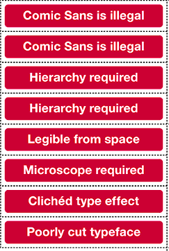
This type of over-hyping has been one of the major perils of democratic design, as well as one of its major benefits: technologies frequently help users adapt designs to their own uses, and to work with experienced designers in creating better designs. Sometimes this is great—programs like FrontPage and Dreamweaver can make everyday citizens publishers. And if you look around on the web, non-expert designers/writers do some frankly amazing and important things, on occasion. Does that make them expert designers? Not usually. Is that a problem? Sometimes. Actually, frequently. Especially when innovation in technology is taken to equal innovation in design expertise—Word's grammar checker substituting for writing ability; MovableType's templates substituting for page layout ability; a boatload of cash for a guide and some swanky North Face and Helly Hansen gear substituting for high-elevation mountain climbing experience.

March 20, 2007

CCCC Talk

spimes.jpg

Here are the slides and notes to my CCCC talk. They're rough, and I'll probably heavily modify them on the train to NYC and then again in the hotel room. But it's a start... [.pdf (9 MB).]

March 18, 2007

Reading Online: Structure and Attention

Cory Doctorow offers some useful ideas about why people—even people who use computers all day to read various sorts of things—say they don't read novels onscreen. And he says that the comparatively low resolution of screen compared to print—the usual culprit—is just a red herring.

"I don't like reading off a computer screen" — it's a cliché of the e-book world. It means "I don't read novels off of computer screens" (or phones, or PDAs, or dedicated e-book readers), and often as not the person who says it is someone who, in fact, spends every hour that Cthulhu sends reading off a computer screen. It's like watching someone shovel Mars Bars into his gob while telling you how much he hates chocolate.

But I know what you mean. You don't like reading long-form works off of a computer screen. I understand perfectly — in the ten minutes since I typed the first word in the paragraph above, I've checked my mail, deleted two spams, checked an image-sharing community I like, downloaded a YouTube clip of Stephen Colbert complaining about the iPhone (pausing my MP3 player first), cleared out my RSS reader, and then returned to write this paragraph.

[...]

The novel is an invention, one that was engendered by technological changes in information display, reproduction, and distribution. The cognitive style of the novel is different from the cognitive style of the legend. The cognitive style of the computer is different from the cognitive style of the novel.

[via Boing Boing]

March 15, 2007

Remix: Someone in Congress Gets It

Some almost surreal comments at the "Future of Radio" House Telecom and Internet Subcommittee Hearing voiced by Rep. Mike Doyle (D-PA) on the importance of remixing as a creative act (and contrary to existing IP law):

Congressman Doyle: Mr. Chairman, I want to tell you a story of a local guy done good. His name is Greg Gillis and by day he is a biomedical engineer in Pittsburgh. At night, he DJs under the name Girl Talk. His latest mash-up record made the top 2006 albums list from Rolling Stone, Pitchfork and Spin Magazine amongst others. His shtick as the Chicago Tribune wrote about him is "based on the notion that some sampling of copyrighted material, especially when manipulated and recontextualized into a new art form is legit and deserves to be heard."

[..]

I hope that everyone involved will take a step back and ask themselves if mash-ups and mixtapes are really different or if it's the same as Paul McCartney admitting that he nicked the Chuck Berry bass-riff and used it on the Beatle's hit "I Saw Her Standing There."

There's much more in the full (unofficial) transcript at The 463: Inside Tech Policy weblog. There's also video available.

[via Fimoculous.com]

March 13, 2007

NYT Select Free for Faculty and Students

The NYT is offering free access to TimeSelect features (including articles normally restricted from free viewing and archives) to faculty and students at educational institutions. You'll need a .edu email address to register.

[via metafilter.com]

March 11, 2007

Cornell Study on Multitasking

A brief mention of an interesting study on multitasking from Cornell University. This is only a press release (the article was apparently published in Psychological Science in October 2006):

A new Cornell study shows that people are pretty good at perceptual multitasking -- except when multiple sources of incoming stimuli are of the same type. Morten Christiansen, associate professor of psychology, co-authored the study with Christopher Conway, a National Institutes of Health research fellow at Indiana University.

Note that this sort of multitasking—simultaneous streams of information—differs from the widely (and mistakenly, I think) criticized sequential-task work that people commonly do on computers—moving back and forth between applications but only working in one at a time.

All of these, of course, beg the question of quality. Work in such studies is constructed as an assembly line activity with the simple goal of processing information as efficiently as possible. One factory worker trying to put a nut on a gizmo on conveyor belt a and trying to put a washer on a widget on conveyor belt b spends a lot of time running back and forth between the belts.

But that sort of metaphor doesn't do "work" justice (any more than it does justice to the intelligence of a factory worker). Most people who do a lot of knowledge work are familiar with the feeling of being in the zone (or "flow," to use Csikszentmihalyi's term). Dealing with a complex problem often requires moving across applications and information spaces, the display of multiple fields of information, and even different modes of work. So there may be some cognitive load to switching among tasks or applications, but it's an "opportunity cost": the quality of work may benefit enough from the task switching and multitasking that the added cognitive load are worth it.

[via Project NML]

March 10, 2007

Rediscovering Fire: Email Flame Research

Has anyone else been puzzled by dramatic flurry of activity on blogs pointing to Daniel Goldman's NYT article on the social neuroscience of email flaming? Here's a clip:

In a 2004 article in the journal CyberPsychology & Behavior, John Suler, a psychologist at Rider University in Lawrenceville, N.J., suggested that several psychological factors lead to online disinhibition: the anonymity of a Web pseudonym; invisibility to others; the time lag between sending an e-mail message and getting feedback; the exaggerated sense of self from being alone; and the lack of any online authority figure. Dr. Suler notes that disinhibition can be either benign — when a shy person feels free to open up online — or toxic, as in flaming.

I thought Internet researchers had pretty well established all of these things back in, say, 1985 or so. Goldman does allow that people have recognized the phenomenon of flaming for quite some time, but never mentions that researchers in communication, sociology, composition & rhetoric, and other fields have already done mountains worth of research on this topic and reached pretty much the same conclusions that are discussed in the "new" research. I suppose it's interesting that neuro researchers are looking at the functional aspects of how these things work cognitively, but I'm not sure that adds much (or if it does add something, Goldman doesn't make it clear what's news about this).

March 08, 2007

Satire: Speculative Grammar Journal

This has been around for some time apparently, but I hadn't seen it yet: Speculative Grammar, an online (satirical) journal [archives are here]. Articles include How to Make a Linguistic Theory, The Black Market in Ill-Gotten Morphemes, and Gavagai with Peppers (serves 4).

[via metafilter.com]

March 06, 2007

Tweaking EQ

If you're like most people, you don't really have a sense of what those little sliders in an equalizer do, except for the fact that the ones to the left are the ones you crank up to make things on your shelves shake. Methodshop has a great overview of how to tweak the equalizer settings in iTunes (or, by extension, any standard EQ) to get the sound you want. The examples provided make the overview extremely useful:

8K: This is getting into the high end, where the majority of cymbals and hi-hats are, as well as upper range of synths, pianos and guitars. Many vocals have a lot of information in this range.

This knowledge isn't going to turn you into an audio engineer or producer, but it'll probably make your audio sound better than it does now.

[via Lifehacker]

Baudrillard Simulates a Dead Person

(Sorry, I couldn't control myself.)

Jean Baudrillard, the postmodern theorist who made my head hurt in grad school and long after, died in Paris recently [BBC News obit, [wikipedia entry].

Today, everything has changed: no longer is meaning in short supply, it is produced everywhere, in ever increasing quantities -- it is demand which is weakening. And it is the production of this demand for meaning which has become crucial for the system. Without this ... power is nothing but an empty simulacrum and an isolated effect of perspective...

In the Shadow of the Silent Majorities

[via pinguerin]

March 04, 2007

Technical Writing, 1400-1600 A.D.

"Der Meister sol auch kennen schreiben und lesen: Writings about Technology ca. 1400-ca. 1600 A.D. and their Cultural Implications," is the transcript of a talk by Bert S. Hall given at UT-Austin c. 1976. I haven't had a chance to dig too deeply into this, but it looks interesting.

Another aspect of the culture of technology emerges if we ask about the way such works were used by their audiences. Obviously no one writes a book without some sort of user in mind (except, of course, for such purely private jottings as we see in Leonardo's Notebooks). It is difficult for us to place ourselves imaginatively in the milieu of the authors and to see just exactly who they had in mind when composing their works. At times the question is answered for us. Feuerwerkbuch, for example, is obviously by a gunner for the use of other gunners. Most of its contents have nothing to do with mechanics or ballistics as a science, but instead seem to have served as a sort of cookbook for the gunner, and some of the copies I have examined show stains and charring to indicate that they were used in just such a fashion in the workshop or arsenal.

The question becomes more involved when we turn to other works. The German tradition stemming from Kyeser seems to have almost no respect for what we consider authorship or textual integrity. Kyeser himself is, next to Leonardo, the most idiosyncratic and self-possessed of authors. His work is shot through with his personal likes and dislikes, leaning heavily toward the latter, and he even offers us his portrait and self-composed epitaph. (His is the first realistic portrait of an author since antiquity, by the way.) His followers, however, were of a different stripe. They tended to decompose, recompose, alter, edit, and delete old texts and then mix the result with new material from available sources. This chaotic blend of traditional and novel contents is the absolute despair of the orderly-minded historian, who wants his "texts" in neat rows suitable for making charts in introductions, but the Germans at least preferred a kaleidoscopic approach to such matters. We do find an occasional name attached to a work, usually a Buechsenmeister's, but it merely refers to the compiler, not the author in most cases. The epitome of the compilation approach is reached when we find deluxe encyclopedias of technology compiled from many sources and obviously made under noble patronage by highly skilled illuminators to grace the palace library, in fact one can sometimes trace the same drawing as it climbs the social scale from crude original to final entombment in a deluxe copy within two or three generations. The fact that aristocrats were interested enough in technological writings to purchase manuscript copies or to patronize "improved" editions is an index of the rising social status of technical authors and their subject matter, We should also note that the deluxe copies, like the "picture book" presented to Emperor Sigismund, seem slightly biased toward military technology' this suggests that a certain selectivity in what was patronized may have contributed to the military character of the later German tradition. In any event, the German evidence shows what we might call a "semi-public" literature of technology in which texts, drawings, and ideas are considered common property. They are circulated among interested parties and are available to anyone who wishes to copy or use them, without any apparent legal or social inhibitions.

[via things magazine]

March 03, 2007

The Principles of Economics, Translated

The Standup Economist riffs on Mankiw's 10 Principles of Economics. This is several orders of magnitude funnier than it sounds. (Youram Bauman's Standup Economist website is here.)

[via metafilter.com]

March 01, 2007

Sugar: The $100 Laptop OS

BusinessWeek reviews (and offers screenshots) the Sugar OS/interface that runs on the $100 Laptop (now officially called "XO".

Sugar offers a brand new approach to computing. Ever since the first Apple Macintosh was launched in 1984, the user interfaces of personal computers have been designed based on the same visual metaphor: the desktop. Sugar tosses out all of that like so much tattered baggage. Instead, an icon representing the individual occupies the center of the screen; "zoom" out like a telephoto lens and you see the user in relation to friends, and finally to all of the people in the village who are also on the network.

As the article notes, Sugar has been criticized for its development process, which included no feedback from kids who might actually use the computer (the article says that some testing is planned in the next few weeks, but that's a little late). Designing objects without user input can be successful (look at the iPod), but it's an extraordinarily iffy process. The XO project seems far too high-profile for that sort of approach, so it will be interesting to see how well this works out.

[via the IxD Discussion List]

Visualizing Overuse of Adverbs in Your Writing

Lifehacker has published a free Greasemonkey script you can add to Firefox that will highlight all of the words ending in "ly" on a webpage. Which seems odd, unless you remember your Strunk & White advice about reducing the number of adverbs in writing to make it more direct and powerful (most adverbs end in -ly). (Not all -ly words are adverbs, but many are.) OK, even then it's a little odd.

It might seem like you could do this before creating the .html file to check in Firefox, but in most word processors, you can't highlight all of the -ly words visually and simultaneously—you can just search for them sequentially. And then you have to deal with -lys with spaces after them, and periods, and, whatever, or come up with a grep expression (a task not within the grasp of many writers.)

There's not anything wrong with adverbs in themselves, but seeing all of them lit up at once might be a good cue to examine the prose to make sure they're not being overused. Take it with a grain of salt—seems like a useful experiment, anyway. More details, download links, and install instructions at Lifehacker. (Now I just need to modify the script so I can search for overuse of parentheses.)

[via Lifehacker]

February 28, 2007

Swingline: RFIDs in Staples

The Future of Work claims that Swingline is working on a stapler that uses staples with embedded RFIDs (click the slideshow link on the right side of that page). So if lose a report that you've stapled together with the RFID staples, you can locate it. I'm waiting for an inexpensive system that will let me tag my damned books. Or some of this RFID powder from Hitachi (.05 mm in diameter).

[via Gizmodo]

February 27, 2007

Web Design Inspiration

Patrick Haney has posted more than 300 screenshots of cool website designs, which he hopes will inspire other web designers in their work. Cool idea.

[via things magazine]

Art Threat

This looks promising: Art Threat is a new web and print magazine about political art.

Art Threat is a journal of political art. We embrace art that confronts, interrogates, or even shrugs off the status quo. Art Threat looks for creativity that threatens the conventional wisdom with progressive ideas. By highlighting political artists and their work, and by challenging those who deny the political, Art Threat supports the creation of critical culture and strives to inspire people to act.

[via Drawn!]

February 26, 2007

Information Visualization, Writ Large

kc_power_and_light.jpg

Pruned has a collection of information displays in high-end control rooms that that Filmoculous accurately describes as "data porn." Above is an image from Kansas City's Power and Light center.

[via Fimoculous.com]

February 25, 2007

Start, Finish: Best Opening or Closing Lines of an Academic Text

Crooked Timber has a post gathering the best opening or close lines of academic texts. Here is one submission, from the opening lines of Claude Levi-Strauss, Tristes Tropiques:

Travel and travellers are two things I loathe—and yet, here I am, all set to tell the story of my expeditions. But at least I’ve taken a long while to make up my mind to it: fifteen years have passed since I left Brazil for the last time and often, during those years, I’ve planned to write this book, but I’ve always been held back by a sort of shame and disgust. So much would have to be said that has no possible interest: insipid details, incidents of no significance. Anthropology is a profession in which adventure plays no part; merely one of its bondages, it represents no more than a dead weight of weeks or months wasted en route; hours spent in idleness when one’s informant has given one the slip; hunger, exhaustion, illness as like as not; and those thousand and one routine duties which eat up most of our days to no purpose and reduce our “perilous existence” in the virgin forest to a simulacrum of military service…

The best ending section I have written is still probably from Nostalgic Angels, my first book; it is a little over-wraught, but at the ending, you get like that:

Imperfect angels, nostalgic for a past that never was, we might instead learn to live as cyborgs. In mapping hypertext use we do not create a new world from nothing, but we do create discourses in which old worlds might be transformed.

Or there is this text I cribbed from Jeff Noon’s Falling Out of Cars, which ends the last chapter of Datacloud (a chapter completely comprised of quotations from other texts):

Tupelo sleeps on the other bed, breathing gently, and sometimes sighing. I have covered the lamp with an old shirt from my bag; now the light barely touches the girl, but falls steadily on the notebook as I write. I have taken advantage of the needle’s sweetness, to hold the day in words; and the pages I have just written, and the pages already written, they seem to make a kind of sense now. I have knowledge of the story once more, my own story, my place in the story.

[via metafilter.com]

February 23, 2007

Fair Use and Documentary Film

Lessig’s Stanford CIS Fair Use Project, Media/Professional, and Michael Donaldson has announced the they will offer insurance to documentary filmmakers who are using video/audio clips in their work under fair use guidelines (a tricky situation that often prevents documentaries from being released due to overly cautious distributors and their lawyers—see, for example Downhill Battle’s activism on the part of the PBS civil rights documentary, Eyes on the Prize). Documentaries that follow American University’s Center for Social Media Documentary Filmmakers’ Statement of Best Practice in Fair Use. (Services will either be pro bono or at reduced rates.)

[via Boing Boing]

February 22, 2007

A Defense of Wikipedia

At the Guardian UK, Brian Whitaker defends the use of Wikipedia as a research source, after some readers complained about his use of Wikipedia for an article he published on the site. I think he's right about this. Wikipedia gets slammed by people (usually teachers) as not being suitable as a more traditional source. But the problem's not so much with Wikipedia; it's with how people use it. Is a Wikipedia article about gender studies as complex and well-researched as a peer-reviewed journal article? Maybe. Or maybe not. It depends on the context that the writing is being done in and for, the intended readers, the goals of the writing, and the content of the specific bit of research being used. Writers are supposed to learn how to evaluate the reliability and usability of their resources; banning Wikipedia use for students (or others) is itself a form of pedagogical laziness.

Yes, I know Wikipedia isn't perfect and there are pitfalls for the unwary. But so long as you use it carefully, I can't see the problem. Overall, it's an invaluable resource.

Yesterday, looking for a handy and straightforward explanation of "male hijab" for the uninitiated, I did a Google search and came across the Wikipedia article.

I read the article, and it seemed to provide what I was looking for, so I quoted a bit of it and provided a link to the page (which of course contained plenty of links to a variety of other sources for anyone who might want to pursue it in more detail).

If you read a lot of Wikipedia articles it becomes fairly easy to judge whether or not the authors know what they are talking about. The bit I quoted had obviously been written with some care and, more importantly, it tallied with what I had learned from off-line sources which are impossible to link to.

[via things magazine]

February 21, 2007

Arranging Things: A Rhetoric of Object Placement

Leonard Koren's Arranging Things: A Rhetoric of Object Placement looks at, well, the meaning of object arrangement [amazon link]. Which I've always found is harder to do well than it looks. I tend to just stack things up in large piles that sit there, unartfully and unrhetorically, snoring. (Rhetoric scholars, I've discovered, are among the least rhetorically skilled people I know.)

This book started out as an attempt to understand what made the arrangements I saw in a San Francisco store, Japonesque, so extraordinary. For years I visited Japonesque and enjoyed the unique arrangements of ceramic, rock, old wood, plant materials plus other sundry and eclectic objects and wondered what it was that gave them their imaginative vitality. Of course I asked the proprietor/arranger (Koichi Hara) how he did what he did. But after a few conversations it became obvious that he was either unable, or unwilling, to articulate his secrets.[...] I pragmatically concluded that there was no algorithm or formula for exceptional arrangement design, yet I suspected that the conceptual principles of superior arrangement must exist or could be manufactured and that I could find them if I just persisted. So I changed my methodology. Instead of relying on arrangement practitioners for insights, I attacked the literature of art, art history, criticism, merchandising display, communication theory, literary theory . . . until I chanced upon rhetoric (see page 24). Anyway, I had my rhetoric epiphany six months after I had commissioned the paintings. . . .

Going Big: Multi-Story Laser Graffiti

tags.jpg

Graffiti Research Labs comes up with a guerrilla method for for using lasers to draw enormous (temporary) tags on tall buildings.

[via Gizmodo]

February 18, 2007

Tech Support for the Book Migration Project

Circa 1500, a monk receives tech support help learning how to use a book. Hilarity ensues. (In Norwegian, with Dutch and English subtitles.)

Advice on Survey Design

Vol. 2: Design-Management posts some useful links to resources for designing surveys, including Survey System's tutorial on how to design a good survey.

February 15, 2007

Dashboard Spy: Business Information Displays

dashboard-spy.gif

The weblog Dashboard Spy gathers examples of information displays and other information visualizations used by business people.

Welcome to the Dashboard Spy's famous collection of screenshots of executive dashboards, balanced scorecards, business widgets, or whatever the latest name is for visually-oriented business intelligence tools meant to assist in corporate decision-making.

Here you will find screen after screen of dashboard concepts, implemented projects, and other tools to help you conceptualize, design and implement your business dashboard.

In the spirit of "a picture is worth a thousand words", use this site as a source book for inspiration. If you are struck by a particular screenshot, please enter a comment. Your input and observations may help someone else. Plenty of comments will make this a more useful community.

February 13, 2007

Tweaking Punctuation

Mostly of interest to font geeks, but U&lc has some tips (and reasons) for adjusting punctuation typography.

Sometimes a subtle adjustment in a character’s position can make a big difference in the visual balance of your typesetting. Case in point: hyphens, en- and em-dashes, parentheses, braces and brackets will often look fine in lowercase settings, but can appear too low when set next to caps and lining figures. The larger the setting (in headlines, for example), the more noticeable this will be.

Media, Education, Web

Henry Jenkins speculates about the future of media studies and web culture in higher education (long quote, but it's a long—and useful—article):

[M]edia studies needs to reflect the ways that the contemporary media landscape is blurring the lines between media consumption and production, between making media and thinking about media. A recent study from the Pew Internet & American Life Project found that 57 percent of teens online have created their own media content. As our culture becomes more participatory, these young people are creating their own blogs and podcasts; they are recording their lives on LiveJournal and developing their own profiles on MySpace; they are producing their own YouTube videos and Flickr photos; they are writing and posting fan fiction or contributing to Wikipedia; they are mashing up music and modding games. Much as engineering students learn by taking apart machines and putting them back together, many of these teens learned how media work by taking their culture apart and remixing it.

In such a world, the structural and historical schisms separating media production and critical-studies classes no longer seem relevant. Students around the country are pushing to translate their analytic insights about media into some form of media production. And they are correctly arguing that you cannot really understand how these new media work if you don't use them yourself. Integrating theory and practice won't be simple. Some students in the entering classes in the program in comparative media studies have had little or no access to digital tools, and others have been designing their own computer games since elementary school. Even among those who have media-production experience, they have worked with very different production tools or produced very different forms of media content in very different contexts.

Responding to these wildly divergent backgrounds and expectations requires us to constantly redesign and renegotiate course expectations as we try to give students what they need to push themselves to the next level of personal and professional development. We have encouraged faculty members to incorporate production opportunities in their courses so that students in a children's-media class, for example, are asked to apply the theories they have learned to the design of an artifact for a child (medium unspecified), then write a paper explaining the assumptions behind their design choices. We may have students composing their own children's books, building and programming their own interactive toys, shooting photo essays, producing pilots for children's shows, or designing simple video games or Web sites.

Before we started our master's program, I went on the road to talk with representatives of more than 50 companies and organizations. They told me that they value the flexibility, creativity, and social and cultural insights liberal-arts majors bring to their operations. They also shared a devastating list of concerns — liberal-arts students fall behind other majors in terms of teamwork, leadership, project completion, and problem solving. In other words, they were describing the gap between academic fields focused on fostering autonomous learners and professional contexts demanding continuing collaborations. Those desired skills were regularly fostered in other disciplines that have laboratory-based cultures that test new theories and research findings through real-world applications. At a university with strong traditions of applied physics or applied mathematics, we needed to embrace the ideal of applied humanities. And as a result, we have created a context where our students put their social and cultural knowledge to work through real-world applications such as designing educational games, developing media-literacy materials, or consulting with media companies about consumer relations.

[via The Chronicle of Higher Education]

February 12, 2007

Bad Usability Calendar 2007

usability-cal.jpg

IAllenkelhet/Netlife Research has this year's Bad Usability Calendar in PDF format (Creative Commons licensed). Not very useful for telling what day it is, but that's sort of the point.

The print size is A3, so US geeks may have to resize it to print it. Source material available in .eps, .svg, .swf, and Illustrator if you want to demonstrate your CC remixing/transforming chops.

Update: Eidar has kindly created several new versions for people like me who don't abide by international standard paper sizes (i.e., US letter and US tabloid), and posted links to them on the same page as the others.

February 08, 2007

Virtual Architecture

The ARCH is a weblog that covers virtual architecture (Second Life, The Sims, etc.). Looks interesting.

[via things magazine]

Love and Theft: Lethem on Plagiarism

(As you can tell, I'm interested in how plagiarism, something academics tend to paint with a very broad, monochromatic brush, functions as a creative act in different disciplines.) In this Harper's piece, Jonathan Lethem explores the act of borrowing (in theory and practice) in Bob Dylan's lyrics, Thomas Jefferson's politics, T.S. Eliot's "The Waste Land," and more.

[via Fimoculous.com]

February 05, 2007

We Are the Machine: From Paper to Web 2.0

Michael Wesch's "We Are the Machine" [YouTube] is a wild visual ride from pencil and paper through Web 2.0.

[via Kairosnews]

February 04, 2007

Spatial Stories

gothamberg.jpg

Gothamberg Apartment Stories is structured hypertextually and architecturally, in something like an organized tag cloud.

Everyone who has lived in an apartment has a story to tell. Gothamberg is a place to read, interact and exchange stories of lives in apartment buildings. Together, these tales of sounds and smells, lobbies and bathrooms, laundry room gossip and unexpected favors form a single collective building, Gothamberg. Their experiences form the elliptical threads of inhabitation, a mnemonic quality expressing something of the shared nature of dwelling.

[via information aesthetics]

Interface Space

desktop-desktop.jpg

Interface Space discusses various interface elements translated into physical space. Includes Hans Gremmen and Monique Gofer's "Empty Trashcan" (shown above), neon-lit scrollbars, and more.

[via Design Observer/a>]

February 03, 2007

Pretending Reality

To pretend, I actually do the thing: I have therefore only pretended to pretend.

— Jacques Derrida

[via underdog]

February 02, 2007

Database Cinema

soft-cinema.jpg

Lev Manovich's new project, the DVD Soft Cinema: Navigating the Database, sounds promising. Manovich teams with new media artist Andreas Kratky and several key new media folk:

What kind of cinema is appropriate for the age of Google and blogging? Automatic surveillance and self-guided missiles? Consumer profiling and CNN? To investigate answers to this question Lev Manovich - one of today’s most influential thinkers in the fields of media arts and digital culture – has paired with award-winning new media artist and designer Andreas Kratky to create the Soft Cinema project. They have also invited contributions from leaders in other cultural fields: DJ Spooky, Scanner, George Lewis and Jóhann Jóhannsson (music), servo and Andreas Angelidakis (architecture), Schoenerwissen/Office for Computational Design (data visualization), and Ross Cooper Studios (media design).

SOFT CINEMA: Navigating the Database is the Soft Cinema project’s first DVD published and distributed by The MIT Press (2005). Although the three films presented on the DVD reference the familiar genres of cinema, the process by which they were created and the resulting aesthetics fully belong to the software age. They demonstrate the possibilities of soft(ware) cinema - a 'cinema' in which human subjectivity and the variable choices made by custom software combine to create films that can run infinitely without ever exactly repeating the same image sequences, screen layouts and narratives.

'Mission to Earth' is a science fiction allegory of the immigrant experience. It adopts the variable choices and multi-frame layout of the Soft Cinema system to represent ‘variable identity’. 'Absences' is a lyrical black and white narrative that relies on algorithms normally deployed in military and civilian surveillance applications to determine the editing of video and audio. 'Texas' is a ‘database narrative’, which assembles its visuals, sounds, narratives, and even the identities of its characters from multiple databases.

The DVD was designed and programmed so that there is no single version of any of the films. All the elements – including screen layout, the visuals and their combination, the music, the narrative, and the length – are subject to change every time the film is viewed.

[via Bruce Sterling]


January 25, 2007

Many Eyes: Information Visualization

dataviz.jpg

The IBM Visual Communication Lab has released an alpha version of Many Eyes, a public, shared visualization tool. You can upload datasets, create visualizations, share them, and post comments.

(I grabbed this from information aesthetics, which has links to several other free visualization tools.)

[via information aesthetics]

January 24, 2007

Graphs are the new narratives

isthenew.jpg

Leisure Arts has a nice chart documenting uses of "x is the new y" from (unspecified) media sources. A small chunk of it's shown above.

[via Noisy Decent Graphics]

January 23, 2007

Fluid Time

I stopped wearing a watch or paying much attention to the clock a decade or so back, but I still like the idea of this Procrastinator's Clock (available for Mac, Win, and as a web app), designed by David Seah.

Enter the Procrastinator’s Clock. It’s guaranteed to be up to 15 minutes fast. However, it also speeds up and slows down in an unpredictable manner so you can’t be sure how fast it really is. Furthermore, the clock is guaranteed to not be slow, assuming your computer clock is sync’d with NTP; many computers running Windows and Mac OS X with persistent Internet connections already are.

So why go through all this trouble to make a clock that’s sometimes fast and sometimes not? FEAR, UNCERTAINTY and DOUBT, my friends! If you use this clock to keep appointments and deadlines, and you really care about being on time, you have to assume that the clock might actually be telling the correct time though it’s likely to actually be up to 15 minutes fast. Yikes! All that anxiety should give you a good kick in the pants to get moving, because you can’t really trust the clock to be anything but on time, even though it probably is fast.

The banner for David Seah's website also prominently features a bottle of Knob Creek, which is always a telling sign of an inveterate procrastinator.

[via Lifehacker]

January 20, 2007

Organizing Workspace

before.jpg

(This isn't my workspace.) Noisy Decent Graphics publishes before (see above) and after images of getting their desktop organized. An admirable job.

In my own workspace, I only take this sort of deck-claring organizing work every four or five months, and it usually involves putting sixty or eight books back on the shelves, tossing out seven or eight pounds of printouts that I thought I might need (and never did), and stacking all those external hard drives back up (I have four, all oriented vertically to the right side of my desk, and they tend to tip over when I stack papers up on them).

I save this activity for launching major things—the drafting stages of a new project (after having completely destroyed my office during the massive information-gathering phases that always precedes writing for me), or the start of summer break.

For me at least, this massive organization impulse is a delicate thing. There's some level of mental activity I need to have worked through—slightly more information than I can handle, sustained over several months. And then an impending need to clear my mind and hold as much information in as I can, over an equally long amount of time to actually put some of the ideas down into tangible/visible form. If I do it too frequently, I can't find things—I don't have a formal organizational system, but I remember where things are stacked in visual images I have in my mind. So clearing the decks before a new project tends to simultaneously clear my mind of other things, but also push all those other things—some of which are periodically important—off into the margins. I'm not at the borders of anything major right now, so my desk still looks more or less like the image I posted last month. (Actually, a little more crowded with papers, cables, and books. And I still haven't quite recovered from writing the last book, so my walls are still filled with notes and quotes I drew on them in whiteboard marker when I was starting Datacloud. I think I'll have to crack open a can of paint to clear that out.)

January 19, 2007

Architecture & Criticism

Johnathan Glancey has an interesting meditation on the symbiotic connection between architects and critics at Guardian UK. He makes some points (as you might expect) that are relevant to any complex design work—software, products, cooking—that people actually use:

[A]rchitecture is a process. The critic is a part of that process, too, and always has been. Even if negative, criticism plays its part in the course of architectural thinking. There are critics who love to be an intimate part of the architectural process and who might well be good friends with the architectural profession. Equally, there are those who are largely detached from everyday professional concerns, yet who make architects, and those who experience their buildings, think in ways outside their own approaches and prejudices.

[via things magazine]

January 18, 2007

Tokyo HDR Shot

tokyo.jpg

I've had to extremely downsample this to make it fit (in terms of both size and compression), but you should check out this HDR (High Dynamic Range) cityscape of Tokyo in the largest size your monitor will allow. It's the closest thing to a Bladerunner shot I've seen in a long time.

HDR shots involve taking multiple shots of a scene, stepping up and down the exposure by several notches for each shot, then combining them all to give a wider range of exposures in a single shot. You can see more examples of the technique at the Flickr HDR Pool.

[via Gizmodo]

January 16, 2007

Understanding Comics Recursion

The weblog Drawn! points to a 37 Signals discussion of Scott McCloud's Understanding Comics.

I read Understanding Comics several years ago, on the advice of a videogame designer. I was a little skeptical, but McCloud's analysis of how comics work is remarkably insightful about communication in general: not just in how things are created, but how to design things that people can engage with. We're using the text in my Narrative for New Media course this semester; we're just starting, so I'm not sure how it will go, but the students said it looked interesting.

January 15, 2007

Workspaces for Gamers

Kotaku posts images from the game rooms of five hardcore players. Sort of frightening in its range of obsessiveness (some due to the meticulous arrangement of monitors and high-end seating, others due to the anit-meticulous arrangement of empty Coke bottles and food containers). "Game" is probably an inappropriate term here; "lifestyle" would be more accurate.

[via Kotaku]

January 13, 2007

Gen Next: Social Gaming and Ethics

Clickable Culture points to a new Pew Research report on "Generation Next [PDF]" ("Generation Next" is apparently 18-25). The report's pretty wide ranging: 1. Outlook and World View, 2. Technology and Lifestyle, 3. Politics and Policy, and 4. Values and Social Issues. Most of the news I've read on this focuses on tech issues, such as this:

69% of Gen Nexters say new technologies make it easier to make new friends, compared to 53% of Gen Xers.
86% of Gen Nexters are at least occasional internet users, compared to 91% of Gen Xers, 73% of Baby Boomers, and 46% of Seniors.
51% of Gen Nexters say they sent or received an instant message in the past 24 hours, compared to 22% of Gen Xers.
54% of Gen Nexters have used a major social networking site such as MySpace, 38% say they use it once a day, 38% say they use it once a week. 44% have created a social site profile.
49% of Gen Nexters say they play console-based videogames, compared to 35% of Gen Xers, 13% of Baby Boomers, and 3% of Seniors.
36% of Gen Nexters say they've played videogames in the past 7 days (of that 36%, 51% were males).

But I noticed this fairly troubling chart:

gennext.gif

So, Generation Next is much more interested in making friends online, way likely to communicate online, and plays videogrames. And is majorly profit-driven, fame-driven, and less likely to help people out, be a leader in their community, or feel spiritual. Damn, the luddites were right

[via Raph Koster's Website]

January 09, 2007

Media Diaries

NY Magazine asked three New Yorkers to keep media diaries for three days. Here's a day's entries for one (typical) participant:

7:30–8:30 a.m. “Morning Edition” (NPR) at home.
9–9:20 AM New York on subway.
9:25 AP and USA Today headlines on a screen in office elevator.
9:40–9:55 E-mail accounts (Gmail, work, NYU e-mail, Hotmail), Gawker.
1:20–4:30 p.m. Gawker, TMZ, “Rush & Molloy” online, Nytimes.com, Facebook, Google, Nysun .com.
5:30–6 iPod on subway: “London Bridge,” by Fergie; “Save Room,” by John Legend; “Steady, As She Goes,” by the Raconteurs; “Ain’t No Other Man,” by Christina Aguilera; “Plástico,” by Willie Colón & Rubén Blades.
7–8 iPod at gym: Ministry of Sounds Session, by Max Graham.
9:10–9:25 Gmail, AccuWeather .com at home.
10:45–11:30 Grey’s Anatomy on laptop (purchased on iTunes).

Which was notable for a couple of reasons. First, "media" here gets defined as "big media." I have my mass media students keep a media diary for a single 24-hour period, and they normally run 30 - 50 entries. In addition to about twice as many "big media" entries, they also track less monolithic media such as billboards, flyers, textbooks. As I say to my students, in a joke none of them get because they're not old, "You're soaking in it!"

But even weirder is that the diaries in NY Magazine only list a scant handful of websites. NY Mag's intro to the piece hypes these media consumers (and they're all consumers rather than producers, if the media diaries are to be believed—which is weird, given that the entries above are from a copy editor for a large, commercial magazine) as if they're on the cutting edge of Time's much-discussed "You" of the year. These people, though, seem relatively oblivious to the mediated world around them. Or maybe it's just me, being too mediated.

[via Fimoculous.com]

January 07, 2007

Futurescapes of Work

Anab Jain interviewed people in the various "show us your workspace" groups on Flickr, then created composite fictional characters, jobs, and spaces in the world of 2012.

Alice now often visits one of the coldzones in Little Brinkland to work and meet people. Coldzones are physical, transient spaces where the digitally exhausted Brinklanders can go offline, and stay away from surveillance and constant tracking.

A short video and interview are available at onoffice.

[via anne]

January 04, 2007

How To Choose a Good Font

type.jpg

Typography has an extremely well-done explanation of typography basics, one of the best brief intros to type I've seen on the web. (There are better books on type—buy Bringhurst if you get serious about this. But this the best short web intro I've seen.)

All this stuff—counters, x-height, kerning—seems really mysterious and unimportant at first, but once you get through Typography's demo, you'll see how important all this stuff is; the scales on your eyeballs will fall, you infidels.

[via Lifehacker]

January 02, 2007

CSS cheat sheet

I'm updating resources for my intro to web design class this semester, and I found a handy, single-page CSS Cheat Sheet created by Leslie Franke. It's an advanced-novice tool (it'd be difficult to leap straight into CSS with just the cheat sheet) but it will likely be useful to designers who have had an intro to CSS and are now starting to code. Or people like me, who have been using CSS for a while but have no long-term memory.

[via Lifehacker]

Microsoft-Speak Tag Cloud

The Seattle PI blog has an interactive tag cloud drawn from key Microsoft pronouncements going back three decades. A tag cloud from a 1991 Gates memo, "Challenges and Strategy," highlights terms like "patents", "windows", "challenges", and "IBM". A Ballmer talk at a financial analyst meeting forefronts "innovation", closely followed by "blah".

ms.jpg

I'm of mixed feelings about tag clouds: I think they're useful snapshots of discursive space, but they're also frequently misleading. What does it mean that "blah" is nearly as large as "innovation" in the Ballmer financial analyst talk? That the market is blah? That Ballmer feels blah? It requires a quick skim of the article to see that he's using the phrase, "blah, blah, blah" at the start of the speech in order to create a rhetorical backdrop against which his actual talk that day stands in supposedly sharp contrast:

It's a real honor and privilege for me to have a chance to be here with you today, I have to say. I think it's the first analyst meeting I've been super pumped up for basically since I became CEO. And I was trying to think why is that, why this meeting, why are you so fired up? And I said, well, I became CEO, some people may remember, in 2000, kind of the peak of the dot-com bubble, blah, blah, blah, we went through that and we were busy transitioning and retooling the way we worked, and I'd get up here and I'd talk about internal stuff and blah, blah, blah, and it just wasn't really all that—Open Source, blah, blah, blah, everything changed. We weren't really talking kind of about—I at least—wasn't getting up here and giving speeches about stuff that I kind of really wanted to talk to you about.

And I just feel like today is a very different day, it's a very different day.

So a tag cloud doesn't portray the relationships among terms very well (aside from raw frequency), or their rhetorical meaning as the terms relate to each other and to context. And they require users to scan a two-dimensional space and compare sizes among different terms that aren't next to each other: is the x-height of the "h" in "blah" larger or smaller than the x-height of the "e" in "value"; and does "innovation" get more screen real estate than it's earned just by having more letters than other words?

It seems like a simple bar chart would be more accurate and easy to use. Still, tag clouds are fun, and they're potentially useful in the way that basic discourse analysis—simple things like word counts—which is what they are—are useful And they look cool.

[via Slashdot]

December 28, 2006

Gendered Text

The Gender Genie (sounds like a lost Bowie tune) analyzes passages of text and categorizes them according to whether the algorithm thinks the author is male or female. Looks to be a simple count of gendered words ("with" is tagged feminine, "around" as masculine), and Gizmodo writers reported mixed results.

Similar analyses have been around awhile (we used Walker Gibson's Tough, Sweet, and Stuffy in grad school). Gender Genie isn't any more controversial than other theories of gender and surface-level behavior; whether or not there's a strict biological basis, our culture tags certain behaviors as masculine and others as feminine, so it makes sense that certain patterns of writing and word choice would fall into those rough categories (and, at the same time, be open to border crossing by some writers). If nothing else, it's an interesting conversation starter or writing class activity.

[via Gizmodo]

December 27, 2006

What eCommerce Really Looks Like

The Web seems, to most of us, like a substance-less space, bits rather than bricks. But in large part, when you come down to it, it's bricks (and books and CDs and PlayStations) landing with a substantial thud on the bottom line.

Here's an Amazon UK facility during the Christmas rush.

amazon.jpg

[via Gizmodo]

December 21, 2006

Grading Tips

papers.jpg

Daniel J. Solove at Concurring Opinions has a detailed guide to grading exams (which could also be applied to any printed assignment such as essays or reports). I've long used this method and can attest to its value for making the grading process extremely efficient and streamlined. Solove's instructions provide both extensive illustrations (such as the one above) and useful tips on borderline cases (such as a paper on the edge of the step between A- and B+).

The comments section of Solove's post has a plethora of additional advice, refinements to the techniques, and alternate approaches.

Collaboratively Annotating the Iraq Study Group Report

Lapham's Quarterly and the Institute for the Future of the Book are hosting an (ongoing) collaboratively annotated version of the Iraq Study Group Report online. The just-launched project only has a handful of annotations at this point, but the design and process of the Website seem very well done for this sort of work. The first round of annotations are being provided by a long list of (mostly leftist/liberal) social critics (Barbara Ehrenreich, Daniel Ellsburg, Stanley Fish, Ralph Nader, etc.), but a second round in January will open the process to everyone.

December 19, 2006

Sonic Youth: Schizophrenia

A group of senior citizens bravely perform Sonic Youth's Schizophrenia [YouTube].

[via Fimoculous.com]

December 18, 2006

Art Basel Audio from Paul Miller's Talk on Rhythm Science

I think I exhausted about all crucial information in the title to this post, so here's just a link to the mp3 [28.25m]. If you want more links, hit the artcast page I grabbed this from.

[via art cast]